Archived
Understanding CSS Grid: Grid Lines
Understanding CSS Grid: Grid Lines
Rachel Andrew 2020-01-10T11:30:00+00:00
2020-01-10T12:37:05+00:00
In the first article in this series, I took a look at how to create a grid container and the various properties applied to the parent element that make up your grid. Once you have a grid, you have a set of grid lines. In this article, you will learn how to place items against those lines by adding properties to the direct children of the grid container.
We will cover:
- The placement properties
grid-column-start,grid-column-end,grid-row-start,grid-row-endand their shorthandsgrid-columnandgrid-row. - How to use
grid-areato place by line number. - How to place items according to line name.
- The difference between the implicit and explicit grid when placing items.
- Using the
spankeyword, with a bit of bonussubgrid. - What to watch out for when mixing auto-placed and placed items.
Basic Concepts Of Line-Based Positioning
To place an item on the grid, we set the line on which it starts, then the line that we want it to end on. Therefore, with a five-column, five-row grid, if I want my item to span the second and third column tracks, and the first, second and third row tracks I would use the following CSS. Remember that we are targetting the line, not the track itself.
.item {
  grid-column-start: 2;
  grid-column-end: 4;
  grid-row-start: 1;
  grid-row-end: 4;
}
This could also be specified as a shorthand, the value before the forward slash is the start line,m the value after is the end line.
.item {
  grid-column: 2 / 4;
  grid-row: 1 / 4;
}
On CodePen you can see the example, and change the lines that the item spans.
See the Pen Grid Lines: placement shorthands by Rachel Andrew (@rachelandrew) on CodePen.
Note that the reason our box background stretches over the entire area is because the initial values of the alignment properties align-self and justify-self are stretch.
If you only need your item to span one track, then you can omit the end line, as the default behavior is that items span one track. We see this when we auto place items as in the last article, each item goes into a cell – spanning one column and one-row track. So to cause an item to span from line 2 to 3 you could write:
.item {
  grid-column: 2 / 3;
}
It would also be perfectly correct to miss off the end line:
.item {
  grid-column: 2;
}
The grid-area Shorthand
You can also place an item using grid-area. We’ll encounter this property again in a future article, however, when used with line numbers it can be used to set all four lines.
.item {
  grid-area: 1 / 2 / 4 / 4;
}
The order of those line numbers is grid-row-start, grid-column-start, grid-row-end, grid-column-end. If working in a horizontal language, written left to right (like English), that’s top, left, bottom, right. You may have realized this is the opposite of how we normally specify shorthands such as margin in CSS – these run top, right, bottom, left.
The reason for this is that grid works in the same way no matter which writing mode or direction you are using, and we’ll cover this in detail below. Therefore, setting both starts then both ends makes more sense than mapping the values to the physical dimensions of the screen. I don’t tend to use this property for line-based placement, as I think the two-value shorthands of grid-column and grid-row are more readable when scanning through a stylesheet.
Lines On The Explicit Grid
I mentioned the explicit versus the implicit grid in my last article. The explicit grid is the grid that you create with the grid-template-columns andgrid-template-rows properties. By defining your column and row tracks, you also define lines between those tracks and at the start and end edges of your grid.
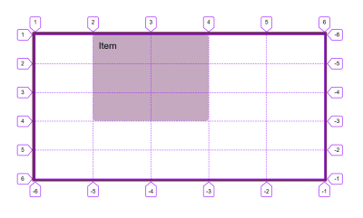
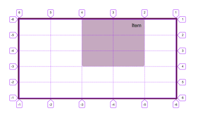
Those lines are numbered. The numbering starts from 1 at the start edge in both the block and inline direction. If you are in a horizontal writing mode, with sentences which begin on the left and run towards the right this means that line 1 in the block direction is at the top of the grid, and line 1 in the inline direction is the left-hand line.
If you are working in a horizontal RTL language – as you might be if working in Arabic – then line 1 in the block direction is still at the top, but line 1 in the inline direction is on the right.
If you are working in a Vertical Writing Mode, and in the image below I have set writing-mode: vertical-rl, then line 1 will be at the start of the block direction in that writing mode, in this case on the right. Line 1 in the inline direction is at the top.
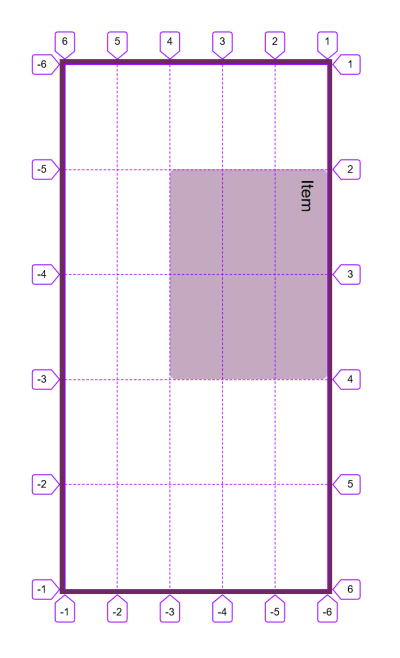
Therefore, grid lines are tied to the writing mode and script direction of the document or component.
The end line of your explicit grid is number -1 and lines count back in from that point, making line -2 the second from the last line. This means that if you want to span an item across all tracks of the explicit grid you can do so with:
.item {
  grid-column: 1 / -1;
}
Lines On The Implicit Grid
If you have created implicit grid tracks then they also count up from 1. In the example below, I have created an explicit grid for columns, however, row tracks have been created in the implicit grid, where I am using grid-auto-rows to size these to 5em.
The item with a class of placed has been placed to span from row line 1 to row line -1. If we were working with an explicit grid for our two rows, then the item should span two rows. Because the row tracks have been created in the implicit grid, line -1 resolved to line 2, and not line 3.
See the Pen Grid Lines: explicit vs. implicit grid by Rachel Andrew (@rachelandrew) on CodePen.
There is currently no way to target the last line of the implicit grid, without knowing how many lines you have.
Placing Items Against Named Lines
In the last article I explained that in addition to line numbers, you can optionally name lines on your grid. You name the lines by adding a name or names inside square brackets between your tracks sizes.
.grid {
  display: grid;
  grid-template-columns: [full-start] 1fr [main-start] 2fr 2fr [main-end full-end];
}
Once you have some named lines, you can swap out the line number for a name when placing your items.
.item {
  grid-column: main-start / main-end;
}
See the Pen Grid Lines: naming lines by Rachel Andrew (@rachelandrew) on CodePen.
If your line has several names, you can pick whichever one you like when placing your item, all of the names will resolve to that same line.
Note: There are some interesting things that happen when you name lines. Take a look at my article “Naming Things In CSS Grid Layout” for more.
What Happens If There Are Multiple Lines With The Same Name?
You get some interesting behavior if you have multiple lines that have the same name. This is a situation that could happen if you name lines within repeat() notation. In the example below I have an 8 column grid, created by repeating 4 times a pattern of 1fr 2fr. I have named the line before the smaller track sm and the larger track lg. This means that I have 4 lines with each name.
In this situation, we can then use the name as an index. So to place an item starting at the second line named sm and stretching to the third line named lg I use grid-column: sm 2 / lg 3. If you use the name without a number that will always resolve to the first line with that name.
See the Pen Grid Lines: naming lines by Rachel Andrew (@rachelandrew) on CodePen.
Using The span Keyword
There are situations where you know that you want an item to span a certain number of tracks, however, you don’t know exactly where it will sit on the grid. An example would be where you are placing items using auto-placement, but want them to span multiple tracks rather than the default 1. In this case, you can use the span keyword. In the example below, my item starts on line auto, this is the line where auto-placement would put it, and it then spans 3 tracks.
.item {
  grid-column: auto / span 3;
}
See the Pen Grid Lines: span keyword by Rachel Andrew (@rachelandrew) on CodePen.
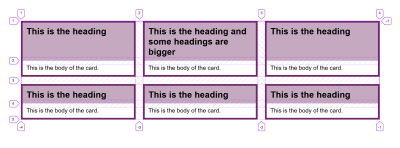
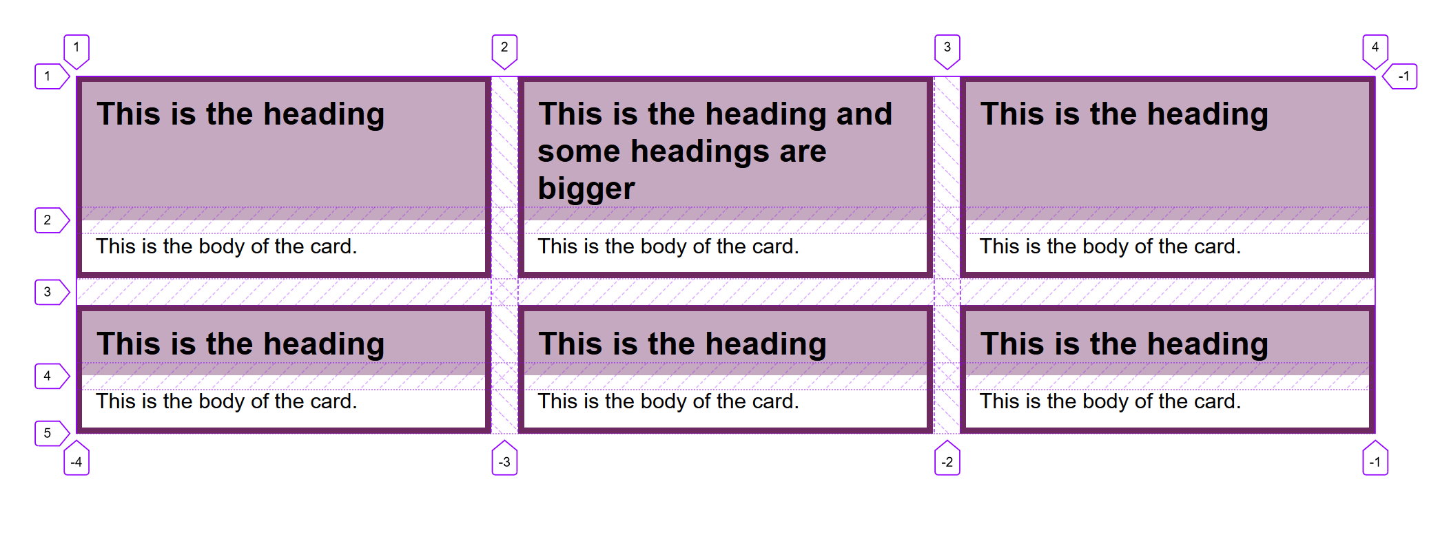
This technique will become very useful once we have wide support of the subgrid value for grid-template-columns and grid-template-rows. For example, in a card layout where the cards have a header and main content area in which you want to align with each other, you can cause each card to span 2 rows, while still allowing for the usual auto-placement behavior. The individual cards will use subgrid for their rows (i.e. getting two rows each). You can see this in the below example if you use Firefox, and read my article CSS Grid Level 2: Here Comes Subgrid to learn more about subgrid.
See the Pen Grid Lines: span keyword and subgrid by Rachel Andrew (@rachelandrew) on CodePen.
/
Layering Items With Line-Based Placement
Grid will auto-place items into empty cells on the grid, it won’t stack items into the same cell. However, by using line-based placement you can put items into the same grid cell. In this next example, I have an image that spans two-row tracks, and a caption which is placed in the second track and given a semi-transparent background.
See the Pen Grid Lines: card with layered elements by Rachel Andrew (@rachelandrew) on CodePen.
Items will stack up in the order that they appear in the document source. So in the above example, the caption comes after the image and therefore displays on top of the image. If the caption had come first then it would end up displaying behind the image and we wouldn’t be able to see it. You can control this stacking by using the z-index property. If it was important for the caption to be first in the source, then you can use z-index, with a higher value for the caption than the image. This would force the caption to display on top of the image so that it can be read.
Mixing Line-Based And Auto-Placement
You need to take a little extra care if you are mixing placed items with auto-placed ones. When items are fully auto-placed in grid, they will place themselves sequentially onto the grid, each finding the next available empty space to put themselves into.
See the Pen Grid Lines: auto-placement by Rachel Andrew (@rachelandrew) on CodePen.
The default behavior is always to progress forwards, and to leave a gap if an item does not fit on the grid. You can control this behavior by using the property grid-auto-flow with a value of dense. In this case, if there is an item that fits a gap already left in the grid, it will be placed out of source order in order to fill the gap. In the example below using dense packing, item 3 is now placed before item 2.
See the Pen Grid Lines: auto-placement and dense packing by Rachel Andrew (@rachelandrew) on CodePen.
Note that this behavior can cause problems for users who are tabbing through the document as the visual layout will be out of sync with the source order that they are following.
Auto-placement works slightly differently if you have already placed some items. The placed items will be positioned first, and auto-placement will then look for the first available gap to start placing items. If you have left some whitespace at the top of your layout by way of an empty grid row, then introduce some items which are auto-placed, they will end up in that track.
To demonstrate in this final example I have placed with the line-based positioning properties, items 1 and 2 leaving the first row empty. Later items have moved up to fill the gaps.
See the Pen Grid Lines: auto-placement mixed with placed items by Rachel Andrew (@rachelandrew) on CodePen.
This behavior is worth understanding, as it can mean that items end up in strange places if you introduce some new elements to your layout which haven’t been given a placement on the grid.
Wrapping Up
That is pretty much all you need to know about grid lines. Remember that you always have numbered lines, no matter how else you are using grid you can always place an item from one line number to another. The other methods we will look at in future articles are alternate ways to specify your layout, but are based on the grid created by numbered lines.
(il)
From our sponsors: Understanding CSS Grid: Grid Lines


