Archived
Things We Can’t (Yet) Do In CSS
Things We Can’t (Yet) Do In CSS
Rachel Andrew 2019-11-01T17:00:00+02:00
2019-11-02T12:36:00+00:00
Building “magazine-style layouts” by using CSS Grid has become something of a pastime of CSS fans, keen to play with the capabilities of new Grid Layout. It’s something I’ve done myself as well as with people who’ve attended my workshops. However, I always have to pick the layouts carefully because, in truth, there are a number of very common print layout patterns that we can’t currently do on the web.
In a lot of cases, however, we can do these things with CSS —just not on the web. If you have read some of my previous articles, such as “Designing For Print With CSS”, you’ll be aware that CSS is also used for print formatting via user agents designed for outputting to PDF. These user agents have often implemented specifications or extensions to specifications that have never been implemented in continuous media, such as the scrolling and non-paged content that we have on the web.
In addition, we have some CSS specifications that haven’t yet been implemented by a browser or have only been implemented in an experimental way on one browser. We also have some things which are just at the discussion phase, perhaps as a note in the current level of a spec as to where we might take it in future.
So while most of my articles are about things we can do, this one is about things we can’t but that perhaps we might be able to do in the future. Take a look.
Floating Things From Specific Points
On the web, a floated element is taken out of flow and following text wraps around it (due to the line boxes of the following text becoming shortened). Therefore, you only have the option to float a thing to the left or right.
In print, however, you often need to float items to specific places on the page. For example, by floating an element to the top or bottom of a page.
When creating a printed document, you define the size of your pages by using the @page rule, and then your content flows into those pages. By increasing the amount of content or the font size of the text, more pages will be created. Therefore, you might have an element that you know you want to display at the top of the page it appears in, but don’t know exactly on which page it will be.
The CSS Specification that deals with this behavior is called Page Floats. Your image would display in the normal flow of the content — just as on the web — except that the content is fragmented into pages. When the page with the image is encountered, the image is moved out of the normal flow and floated to the top of the page where it appears on. (Content that would have been above the image will display below it and normal flow resumes.)
img {
    float-reference: page;
    float: top;
}
There is an issue raised against the Page Floats specification to rename it, as there are use cases for this kind of pattern continuous media, e.g. in a multicolumn layout. Currently, if you float an item inside a column, it behaves in the same way as a float in regular normal flow. Assuming there is room, the line boxes of the following items will be shortened and text will wrap around the float within the column.
By using a “page float”, we could float an item to the top of the column that could give you much more control over the placement of elements within the flow of content in a multicolumn context.
Columns are essentially just like pages; we fragment our content between column boxes in the same way that we fragment our content between pages. Therefore, a more generic name would make sense in terms of this behavior being the same for columns and pages.
There are more examples of Page Floats in the excellent exploration of the subject, “Paged Media Approaches: Page Floats” by Julie Blanc.
Overflow In The Block Dimension For Multicol
The concept of “page” floats, would be even more necessary if we were to implement block dimension overflow columns in Multicol. Currently, if you fix the height of a multicol container, additional columns will be created in the inline direction causing an inline scrollbar.
See the Pen Smashing Multicol: overflow columns by Rachel Andrew (@rachelandrew) on CodePen.
As I describe in my article “When And How To Use Multiple-Column Layout”, in the CSS Working Group we have considered how we might specify overflow in the block dimension. This would allow us to fix the height of the multicol container in the block dimension, and if there was more content that could fit, create another row of columns below and fill that with content.
How does this tie into Page Floats? Well, in this scenario, you would want more control over where images and other elements end up in these rows of columns. I wouldn’t want, for example, an image to have one line of text below it before the content, and then fragmented to form the next row of columns. Page Floats would enable me to specify that images in that situation would be floated to the bottom of the column or to the top of the first column in the new row.
Spanning n Columns
In the next version of Firefox (Firefox 71), the column-span property from the Multiple-Column Layout specification is implemented, meaning that all of our web browsers implement column-span. The column-span property can take one of two values, all or none. If the value is all, it spans all of the columns; if it is none (which is the initial value), it doesn’t span.
What about multi-column layouts with elements that span some columns? This is a pattern I find in print design quite frequently. The spanning element will generally be at the top or bottom of the page, shortening the columns below or above it.
This is not currently possible on the web, and we don’t have a spec yet for this behavior, however, some print user agents have already implemented an extension to the spec to do this. By using Prince, I can use the following CSS to span two columns:
img {
    float: column-top-corner;
    column-span: 2;
}
This would enable an element to be floated to the top corner using the Prince version of Page Floats, and then span two of the columns. The rest of the content flows into column boxes as is normal when using multicol. In Prince, the spanning of some columns is tied to floated elements; non-floated elements behave as per the Level 1 multicol spec and can only span all or none.
Specifying this raises some interesting issues. Currently, when we introduce a spanner in multicol, the spanning element essentially creates a row of column boxes above it, and a row of column boxes below. The content doesn’t jump over the spanning element and continue — as you can see in his next CodePen.
See the Pen Smashing Multicol: column-span by Rachel Andrew (@rachelandrew) on CodePen.
What should happen if we have an item spanning two out of three columns that is placed in the middle of the content? In many of the print examples I have seen, the content jumps the spanner when encountering these partial spans, rather than behaving as multicol does today.
There are further explorations of column-spanning and extensions ot floats in the CSS Figures Living Idea document. In an older post of mine, I also explored some of these ideas, “Thinking About Page Floats, Figures, Regions And Grids”.
Different Sized Columns In Multicol
Both Flexbox and Grid Layout give us the ability to do columns which are of different sizes that remain in proportion to one another as they flex. Multicol, however, can only split content into equal-sized columns. It is common in print design to have columns of unequal sizes.
Now that Flexbox and Grid have this behavior it makes sense that multicol should follow suit and allow for different column sizes. Perhaps something to consider for level 2 of the Multicol specification.
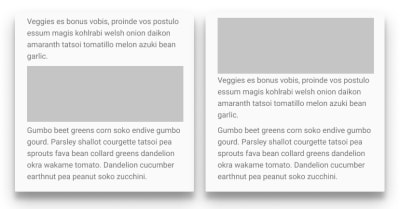
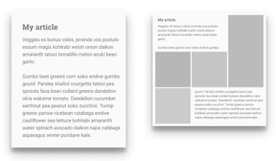
Text Wrapping All Sides Of An Element
You will have trouble opening a magazine and not spotting something like the image below. Content wrapping all sides of a quote, callout or image. It is a very common pattern and seems reasonable as a pattern we might want to use on the web.

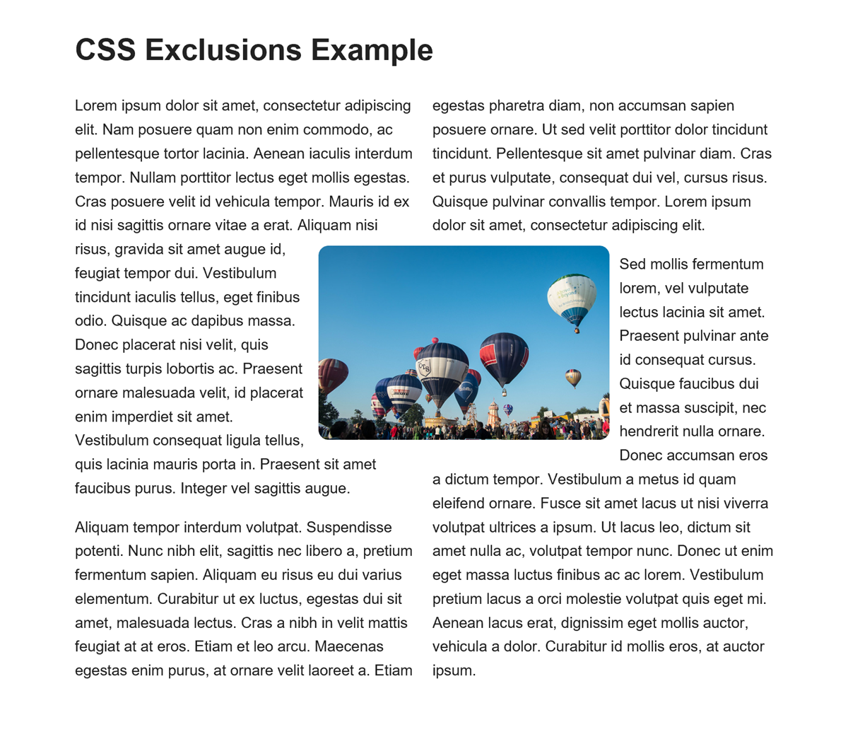
We do have a CSS Specification that enables this behavior. CSS Exclusions, at one time bundled with the CSS Shapes specification as CSS Exclusions and Shapes, defines the wrap-flow and wrap-through properties. Exclusions doesn’t define positioning. Instead, you would use it with another positioning method — most likely CSS Grid Layout. This enables a pattern such as in the image below (taken in IE11):

Note: If you have a pre-Chromium Edge or Internet Explorer 11 installed, see the CodePen example.
The above example works in Internet Explorer 11 (or pre-Chromium Edge) using the -ms prefixed grid version. Internet Explorer is the only browser to have attempted to implement the property. I am very keen to see implementations of exclusions. I think it solves a number of issues that we have with editorial layouts on the web.
Note: For more, see my post “Editorial Layouts, Exclusions and Grid” or read this issue on the CSS Working Group Drafts repository.
Disconnected Text Flows
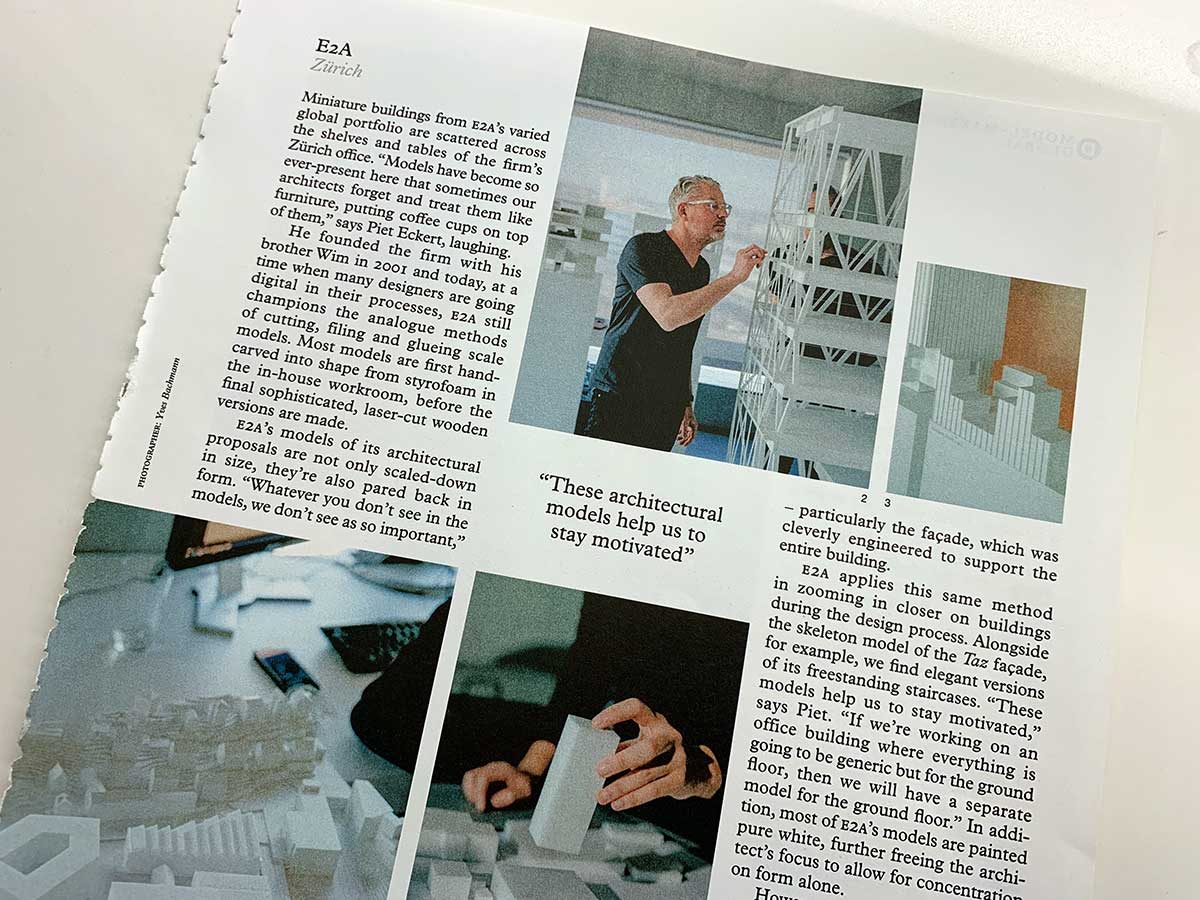
Print design often includes content that flows in a similar way to multicol, however, the content boxes are not connected to each other.
You can see an example below from the magazine Monocle:
This is very difficult to do on the web. If you know how much content you are likely to have, you can make these layouts using Grid in many cases. However, they are then fairly fragile; they rely on us understanding how much content we have and in breaking it up into separate HTML elements. This will usually require us to wrap chunks of content in a div in order to have an element to position on the grid.
A more ideal scenario would be to keep the article as one (properly marked-up thread of content) which could flow into defined areas in the layout.
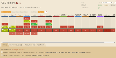
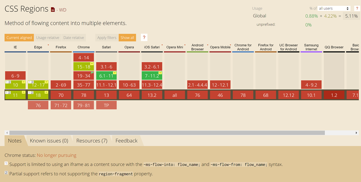
We do have a specification that details something like this: the CSS Regions specification. This was implemented in IE10 (and is therefore in pre-Chromium Edge), and was also in Chrome and WebKit before being removed. Can I use shows the state of affairs.
There were some significant issues with the Regions specification in that it required HTML elements to be present to flow the content into. Unlike multicol, in which anonymous column boxes are generated to hold the content, Regions requires an existing HTML element to host the content. So while you did get the nice behavior of content flowing through these disconnected boxes, you still had to work out how many boxes you needed and create empty divs to hold that content.
Your solution for more content than would fit would be to have a final auto-sized element to “mop up” this extra content without a home. This doesn’t seem like a very elegant solution!
For more information on the problems with the Regions spec as it currently stands, see “CSS Regions Considered Harmful.”
A Future For Regions?
I would be very keen to see something like Regions make a comeback. I think that we know more now about the sorts of layouts that we want to build — now that we have Grid Layout. Regions would enable a sensibly marked-up article to flow through defined boxes in a grid layout, and enable exactly the sort of layouts we see in magazines. From the very simple — skipping a center column that contains a quote or image — to complex sets of boxes and images.
In the Paged Media specification, we have a model for a defined box which is duplicated over and over to create as many pages as needed for the content we have — you don’t need to define those pages upfront. In the developing idea for block dimension overflow columns in multicol, we are considering a model where new rows of columns can be created, as many as are needed until we run out of content. Could we see a future for Regions where we can define a pattern of areas and keep repeating that pattern until we run out of content to fill it?

Whatever solution is found for Regions, it would reply on solid support for Fragmentation in browsers. Once you break your content across Regions, you will be keen to avoid things like a heading becoming the last thing in a Region — with the associated content somewhere completely disconnected. As with the multicol ideas, I think it would also require support for Page Floats so that we’re able to better control how certain elements display in a Region and stop orphan lines displaying below an image as the content fragments to another Region. In addition Regions would add to the potential of confusing content re-ordering on the web, therefore I think there are a number of related things to get right before we could see a robust and elegant solution to this problem.
Share Your Use Cases
I would love to know if you have use cases for any of the above types of layouts, or if there are other layouts you would love to do but are impossible (or only possible in a fragile way). Let me know in the comments — or even better — write up the issue on your own site and drop a link into the comments section below. Adding new features to CSS starts with understanding what the use cases and requirements are.
You can also follow the discussion on all CSS specifications at the CSS Working Group GitHub repo and Issues List.
(il)
From our sponsors: Things We Can’t (Yet) Do In CSS


