Archived
The CSS Working Group At TPAC: What’s New In CSS?

The CSS Working Group At TPAC: What’s New In CSS?
The CSS Working Group At TPAC: What’s New In CSS?
Rachel Andrew
2018-10-26T22:30:30+02:00
2018-10-30T11:31:57+00:00
Last week, I attended W3C TPAC as well as the CSS Working Group meeting there. Various changes were made to specifications, and discussions had which I feel are of interest to web designers and developers. In this article, I’ll explain a little bit about what happens at TPAC, and show some examples and demos of the things we discussed at TPAC for CSS in particular.
What Is TPAC?
TPAC is the Technical Plenary / Advisory Committee Meetings Week of the W3C. A chance for all of the various working groups that are part of the W3C to get together under one roof. The event is in a different part of the world each year, this year it was held in Lyon, France. At TPAC, Working Groups such as the CSS Working Group have their own meetings, just as we do at other times of the year. However, because we are all in one building, it means that people from other groups can more easily come as observers, and cross-working group interests can be discussed.
Attendees of TPAC are typically members of one or more of the Working Groups, working on W3C technologies. They will either be representatives of a member organization or Invited Experts. As with any other meetings of W3C Working Groups, the minutes of all of the discussions held at TPAC will be openly available, usually as IRC logs scribed during the meetings.
The CSS Working Group
The CSS Working Group meet face-to-face at TPAC and on at least two other occasions during the year; this is in addition to our weekly phone calls. At all of our meetings, the various issues raised on the specifications are discussed, and decisions made. Some issues are kept for face-to-face discussions due to the benefits of being able to have them with the whole group, or just being able to all get around a whiteboard or see a demo on screen.
When an issue is discussed in any meeting (whether face-to-face or teleconference), the relevant GitHub issue is updated with the minutes of the discussion. This means if you have an issue you want to keep track of, you can star it and see when it is updated. The full IRC minutes are also posted to the www-style mailing list.
Here is a selection of the things we discussed that I think will be of most interest to you.
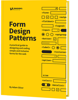
Web forms are such an important part of the web, but we design them poorly all the time. The brand new Form Design Patterns book is our new practical guide for people who design, prototype and build all sorts of forms for digital services, products and websites. The eBook is free for Smashing Members.
Check the table of contents ↬
CSS Scrollbars
The CSS Scrollbars specification seeks to give a standard way of styling the size and color of scrollbars. If you have Firefox Nightly, you can test it out. To see the examples below, use Firefox Nightly and enable the flags layout.css.scrollbar-width.enabled and layout.css.scrollbar-color.enabled by visiting http://about:config in Firefox Nightly.
The specification gives us two new properties: scrollbar-width and scrollbar-color. The scrollbar-width property can take a value of auto, thin, none, or length (such as 1em). It looks as if the length value may be removed from the specification. As you can imagine, it would be possible for a web developer to make a very unusable scrollbar by playing with the width, so it may be better to allow the browser to decide the exact width that makes sense but instead to either show thin or thick scrollbars. Firefox has not implemented the length option.
If you use auto as the value, then the browser will use the default scrollbars: thin will give you a thin scrollbar, and none will show no visible scrollbar (but the element will still be scrollable).

In this example I have set scrollbar-width: thin.(Large preview)
In a browser with support for CSS Scrollbars, you can see this in action in the demo:
See the Pen CSS Scrollbars: scrollbar-width by Rachel Andrew (@rachelandrew) on CodePen.
The scrollbar-color property deals with — as you would expect — scrollbar colors. A scrollbar has two parts which you may wish to color independently:
- thumb
The slider that moves up and down as you scroll. - track
The scrollbar background.
The values for the scrollbar-color property are auto, dark, light and .
Using auto as a keyword value will give you the default scrollbar colors for that browser, dark will provide a dark scrollbar, either in the dark mode of that platform or a custom dark mode, light the light mode of the platform or a custom light mode.
To set your own colors, you add two colors as the value that are separated by a space. The first color will be used for the thumb and the second one for the track. You should take care that there is enough contrast between the colors, as otherwise the scrollbar may be difficult to use for some people.

In this example, I have set custom colors for the scrollbar elements. (Large preview)
In a browser with support for CSS Scrollbars, you can see this in the demo:
See the Pen CSS Scrollbars: scrollbar-color by Rachel Andrew (@rachelandrew) on CodePen.
Aspect Ratio Units
We’ve been using the padding hack in CSS to achieve aspect ratio boxes for some time, however, with the advent of Grid Layout and better ways of sizing content, having a real way to do aspect ratios in CSS has become a more pressing need.
There are two issues raised on GitHub which relate to this requirement:
- Aspect Ratio Units Needed
- Aspect Ratio.
There is now a draft spec in Level 4 of CSS Sizing, and the decision of the meeting was that this needed further discussion on GitHub before any decisions can be made. So, if you are interested in this, or have additional use cases, the CSS Working Group would be interested in your comments on those issues.
The :where() Functional Pseudo-Class
Last year, the CSSWG resolved to add a pseudo-class which acted like :matches() but with zero specificity, thus making it easy to override without needing to artificially inflate the specificity of later elements to override something in a default stylesheet.
The :matches() pseudo-class might be new to you as it is a Level 4 Selector, however, it allows you to specify a group of selectors to apply some CSS, too. For example, you could write:
.foo a:hover,
p a:hover {
  color: green;
}
Or with :matches()
:matches(.foo, p) a:hover {
  color: green;
}
If you have ever had a big stack of selectors just in order to set the same couple of rules, you will see how useful this will be. The following CodePen uses the prefixed names of webkit-any and -moz-any to demonstrate the matches() functionality. You can also read more about matches() on MDN.
See the Pen :matches() and prefixed versions by Rachel Andrew (@rachelandrew) on CodePen.
Where we often do this kind of stacking of selectors, and thus where :matches() will be most useful is in some kind of initial, default stylesheet. However, we then need to be careful when overwriting those defaults that any overwriting is done in a way that will ensure it is more specific than the defaults. It is for this reason that a zero specificity version was proposed.
The issue that was discussed in the meeting was in regard to naming this pseudo-class, you can see the final resolution here, and if you wonder why various names were ruled out take a look at the full thread. Naming things in CSS is very hard — because we are all going to have to live with it forever! After a lot of debate, the group voted and decided to call this selector :where().
Since the meeting, and while I was writing up this post, a suggestion has been raised to rename matches() to is(). Take a look at the issue and comment if you have any strong feelings either way!
Logical Shorthands For Margins And Padding
On the subject of naming things, I’ve written about Logical Properties and Values here on Smashing Magazine in the past, take a look at “Understanding Logical Properties and Values”. These properties and values provide flow relative mappings. This means that if you are using Writing Modes other than a horizontal top to bottom writing mode, such as English, things like margins and padding, widths and height follow the text direction and are not linked to the physical screen dimensions.
For example, for physical margins we have:
margin-topmargin-rightmargin-bottommargin-left
The logical mappings for these (assuming horizontal-tb) are:
margin-block-startmargin-inline-endmargin-block-endmargin-inline-start
We can have two value shorthands. For example, to set both margin-block-start and margin-block-end as a shorthand, we can use margin-block: 20px 1em. The first value representing the start edge in the block dimension, the second value the end edge in the block dimension.
We hit a problem, however, when we come to the four-value shorthand margin. That property name is used for physical margins — how do we denote the logical four-value version? Various things have been suggested, including a switch at the top of the file:
@mode "logical";
Or, to use a block that looks a little like a media query:
@mode (flow-mode: relative) {

}
Then various suggestions for keyword modifiers, using some punctuation character, or creating a brand new property name:
margin: relative 1em 2em 3em 4em;
margin: 1em 2em 3em 4em !relative;
margin-relative: 1em 2em 3em 4em;
~margin: 1em 2em 3em 4em;
You can read the issue to see the various things that are being considered. Issues discussed were that while the logical version may well end up being generally the default, sometimes you will want things to relate to the screen geometry; we need to be able to have both options in one stylesheet. Having a @mode setting at the top of the CSS could be confusing; it would fail if someone were to copy and paste a chunk of the stylesheet.
My preference is to have some sort of keyword value. That way, if you look at the rule, you can see exactly which mode is being used, even if it does seem slightly inelegant. It is the sort of thing that a preprocessor could deal with for you; if you did indeed want all of your properties and values to use the logical versions.
We didn’t manage to resolve on the issue, so if you do have thoughts on which of these might be best, or can see problems with them that we haven’t described, please comment on the issue on GitHub.
Web Platform Tests Discussion
At the CSS Working Group meeting and then during the unconference style Technical Plenary Day, I was involved in discussing how to get more people involved in writing tests for CSS specifications. The Web Platform Tests project aims to provide tests for all of the web platform. These tests then help browser vendors check whether their browser is correct as to the spec. In the CSS Working Group, the aim is that any normative change to a specification which has reached Candidate Recommendation (CR) status, should be accompanied by a test. This makes sense as once a spec is in CR, we are asking browsers to implement that spec and provide feedback. They need to know if anything in the spec changes so they can update their code.
The problem is that we have very few people writing specs, so for spec writers to have to write all the tests will slow the progress of CSS down. We would love to see other people writing tests, as it is a way to contribute to the web platform and to gain deep knowledge of how specifications work. So we met to think about how we could encourage people to participate in the effort. I’ve written on this subject in the past; if the idea of writing tests for the platform interests you, take a look at my 24 Ways article on “Testing the Web Platform”.
On With The Work!
TPAC has added to my personal to-do list considerably. However, I’ve been able to pick up tips about specification editing, test writing, and to come up with a plan to get the Multi-Column Layout specification — of which I’m the co-editor — back to CR status. As someone who is not a fan of meetings, I’ve come to see how valuable these face-to-face meetings are for the web platform, giving those of us contributing to it a chance to share the knowledge we individually are developing. I feel it is important though to then take that knowledge and share it outside of the group in order to help more people get involved with developing as well as using the platform.
If you are interested in how the CSS Working Group functions, and how new CSS is invented and ends up in browsers, check out my 2017 CSSConf.eu presentation “Where Does CSS Come From?” and the information from fantasai in her posts “An Inside View of the CSS Working Group at W3C”.
(il)
From our sponsors: The CSS Working Group At TPAC: What’s New In CSS?


