Archived
Quantitative Data Tools For UX Designers
Quantitative Data Tools For UX Designers
Adonis Raduca 2019-12-19T11:30:00+00:00
2019-12-19T12:36:00+00:00
Many UX designers are somewhat afraid of data, believing it requires deep knowledge of statistics and math. Although that may be true for advanced data science, it is not true for the basic research data analysis required by most UX designers. Since we live in an increasingly data-driven world, basic data literacy is useful for almost any professional — not just UX designers.
Aaron Gitlin, interaction designer at Google, argues that many designers are not yet data-driven:
“While many businesses promote themselves as being data-driven, most designers are driven by instinct, collaboration, and qualitative research methods.”
— Aaron Gitlin, “Becoming A Data-Aware Designer”
With this article, I’d like to give UX designers the knowledge and tools to incorporate data into their daily routines.
But First, Some Data Concepts
In this article I will talk about structured data, meaning data that can be represented in a table, with rows and columns. Unstructured data, being a subject in itself, is more difficult to analyze, as Devin Pickell (content marketing specialist at G2 Crowd, writing about data and analytics) pointed out in his article “Structured vs Unstructured Data – What’s the Difference?.” If the structured data can be represented in a table form, the main concepts are:
Dataset
The entire set of data we intend to analyze. This could be, for example, an Excel table. Another popular format for storing datasets is the comma-separated value file (CSV). CSV files are simple text files used to store table-like information. Each CSV row corresponds to a row in the table, and each CSV row has values separated (naturally) by commas, which correspond to table cells.
Data Point
A single row from a dataset table is a data point. In that way, a dataset is a collection of data points.
Data Variable
A single value from a data-point row represents a data variable — put simply, a table cell. We can have two types of data variables: qualitative variables, and quantitative variables. Qualitative variables (also known as categorical variables) have a discrete set of values, such as color = red/green/blue. Quantitative variables have numerical values, such as height = 167. A quantitative variable, unlike a qualitative one, can take any value.
Creating Our Data Project
Now we know the basics, it’s time to get our hands dirty and create our first data project. The scope of the project is to analyze a dataset by going through the entire data flow of importing, processing and plotting data. First, we will choose our dataset, then we will download and install the tools for analyzing the data.
Cars Dataset
For the purpose of this article, I’ve chosen a cars dataset, because it’s simple and intuitive. The data analysis will simply confirm what we already know about the cars — which is fine, since our focus is on data flow and tools.
We can download a used cars dataset from Kaggle, one of the biggest sources of free datasets. You’ll need to register first.
After downloading the file, open it and take a look. It’s a really big CSV file, but you should get the gist. A line in this file will look like this:
19500,2015,2965,Miami,FL,WBA3B1G54FNT02351,BMW,3
As you can see, this data point has several variables separated by commas. Since we now have the dataset, let’s talk a little about tools.
Tools of the Trade
We will use the R language and RStudio to analyze the dataset. R is a very popular and easy to learn language, used not only by data scientists, but also people in financial markets, medicine and many other areas. RStudio is the environment where R projects are developed, and there’s a free version, which is more than enough for our needs as UX designers.
It’s likely that some UX designers use Excel for their data workflow. If that means you, try R — there is a good chance you’ll like it, since it is easy to learn, and more flexible and powerful than Excel. Adding R to your tool kit will make a difference.
Installing the Tools
First, we need to download and install R and RStudio. You should install R first, then RStudio. The installation processes for both R and RStudio are simple and straightforward.
Project Setup
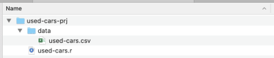
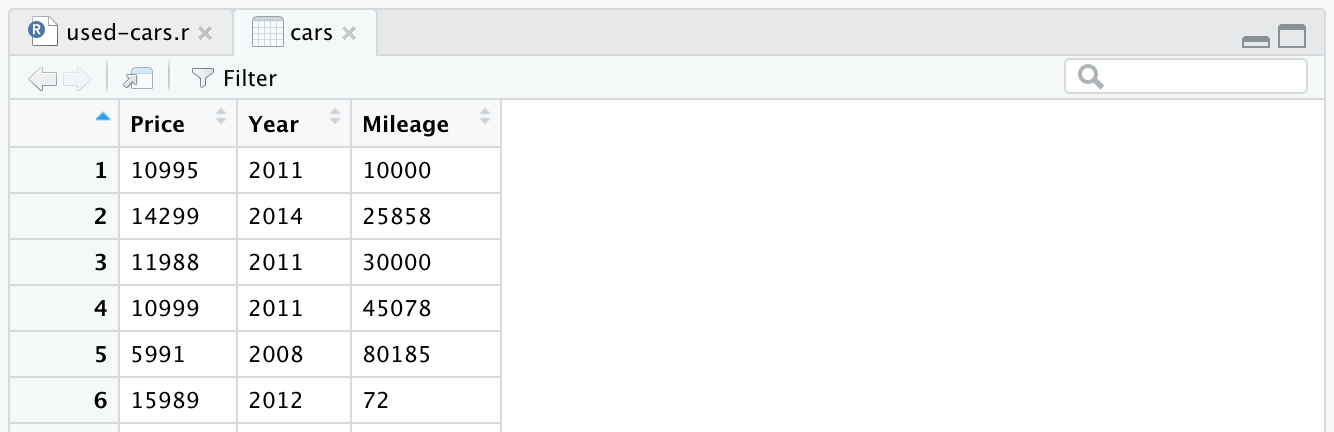
Once the installation is complete, create a project folder — I’ve called it used-cars-prj. In that folder, create a subfolder called data, and then copy the dataset file (downloaded from Kaggle) into that folder and rename it to used-cars.csv. Now go back to our project folder (used-cars-prj) and create a plain text file called used-cars.r. You should end up with the same structure as in the screenshot below.
Now we have the folder structure in place, we can open RStudio and create a new R project. Chose New Project… from the File menu and select the second option, Existing Directory. Then select the project directory (used-cars-prj). Finally, press the Create Project button and you’re done. Once the project is created, open used-cars.r in RStudio — this is the file where we will add all our R code.
Importing Data
We will add our first line in used-cars.r, for reading data from the used-cars.csv file. Remember that CSV files are just plain text files used for storing data. Our first line of R code will look like this:
cars It might look a little intimidating, but it really isn’t — by the way, this is the most complex line in the entire article. What we have here is the read.csv function, which takes three parameters.
The first parameter is the file to read, in our case used-cars.csv, which is located in the data folder. The second parameter, stringsAsFactors=FALSE is set to make sure strings like “BMW” or “Audi” aren’t converted to factors (the R jargon for categorical data) — as you recall, qualitative or categorical variables can have only discrete values like red/green/blue. Finally, the third parameter, sep="," specifies the kind of separator used to separate values in the CSV file: a comma.
After reading the CSV file, the data is stored into the cars data frame object. A data frame is a two-dimensional data structure (like an Excel table), which is very useful in R to manipulate data. After introducing the line and running it, a cars data frame will be created for you. If you look in the top-right quadrant in RStudio, you will notice the cars data frame, in the Data section under the Environment tab. If you double click on cars, a new tab will open in the top-left quadrant of RStudio, and will present the cars data frame. As you might expect, it looks like an Excel table.
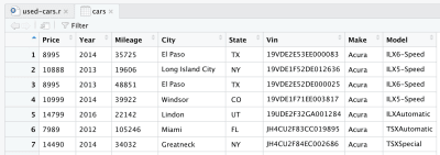
This is actually the raw data we downloaded from Kaggle. But since we want to perform data analysis, we need to process our dataset first.
Data Processing
By processing, we mean removing, transforming or adding information to our dataset, in order to prepare for the kind of analysis we want to perform. We have the data in a data frame object, so now we need to install the dplyr library, a powerful library for manipulating data. To install the library in our R environment, we need to write the following line at the top of our R file.
install.packages("dplyr")
Then, to add the library to our current project, we will use the next line:
library(dplyr)
Once the dplyr library has been added to our project, we can start processing data. We have a really big dataset, and we need only the data representing the same car maker and model, in order to correlate that with price. We’ll use the following R code to keep only data concerning the BMW 3 Series, and remove the rest. Of course, you could choose any other manufacturer and model from the dataset, and expect to have the same data characteristics.
cars % filter(Make == "BMW", Model == "3")
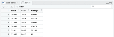
Now we have a more manageable dataset, though still containing more than 11,000 data points, that fits with our intended purpose: to analyze the cars’ price, age and mileage distributions, and also the correlations between them. For that, we need to keep only “Price”, “Year” and “Mileage” columns and remove the rest — this is done with the following line.
cars % select(Price, Year, Mileage)
After removing other columns, our data frame will look like this:
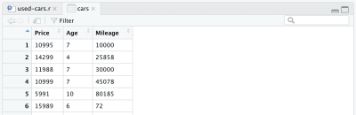
There is one more change we want to make to our dataset: to replace the manufacture year with the age of the car. We can add the following two lines, the first to calculate the age, the second to change the column name.
cars % mutate(Year = max(Year) - Year)
cars % rename(Age = Year)
Finally, our full processed data frame looks like this:
At this point, our R code will look like the following, and that’s all for the data processing. We can now see how easy and powerful the R language is. We’ve processed the initial dataset quite dramatically with only a few lines of code.
install.packages("dplyr")
library(dplyr)
cars = read.csv("./data/cars.csv", stringsAsFactors = FALSE, sep=",")
cars % filter(Make == "BMW", Model == "3")
cars % select(Price, Year, Mileage)
cars % mutate(Year = max(Year) - Year)
cars % rename(Age = Year)
Data Analysis
Our data is now in the right shape, so we can go to make some plots. As already mentioned, we will focus on two aspects: individual variables’ distribution, and the correlations between them. Variable distribution helps us to understand what is considered a medium or high price for a used car — or the percentage of cars above a specific price. The same applies for the age and mileage of the cars. Correlations, on the other hand, are helpful in understanding how variables like age and mileage are related to each other.
That said, we will use two kinds of data visualization: histograms for variable distribution, and scatter plots for correlations.
Price Distribution
Plotting the car price histogram in the R language is as easy as this:
hist(cars$Price)
A small tip: if you are in RStudio you can run the code line by line; for example, in our case, you need run only the line above to display the histogram. It’s not necessary to run all the code again since you ran it once already. The histogram should look like this:
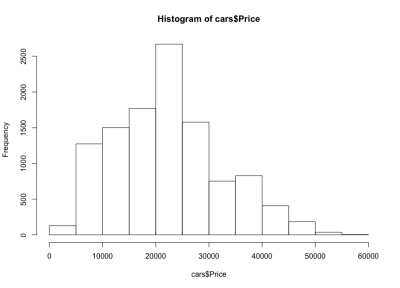
If we look at the histogram, we notice a bell-like distribution of the cars’ prices, which is what we expected. Most of the cars fall in the middle range, and we have fewer and fewer as we move to each side. Almost 80% of the cars are between $10,000 and $30,000 USD, and we have a maximum of more than 2,500 cars between $20,000 and $25,000 USD. On the left side we have probably around 150 cars under $5,000 USD, and on the right side even fewer. We can easily see how useful such plots are to get insights into data.
Age Distribution
Just as for the cars’ prices, we’ll use a similar line to plot the cars’ age histogram.
hist(cars$Age)
And here is the histogram:
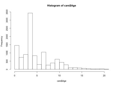
This time the histogram looks counterintuitive — instead of a simple bell shape, we have here four bells. Basically, the distribution has three local and one global maximum, which is unexpected. It would be interesting to see if this strange distribution of the cars’ ages stays true for another car maker and model. For the purpose of this article we’ll stay with the BMW 3 Series dataset, but you can dig deeper into the data if you are curious. Regarding our car age distribution, we notice that more than 90% of the cars are less than 10 years old, and more than 80% less than 7 years old. Also, we notice that the majority of the cars are less than 5 years old.
Mileage Distribution
Now, what can we say about mileage? Of course, we expect to have the same bell shape we had for price. Here is the R code and the histogram:
hist(cars$Mileage)
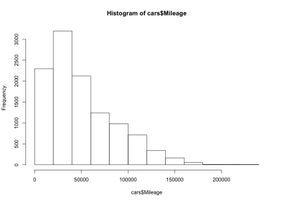
Here we have a left-skewed bell shape, meaning that there are more cars with less mileage on the market. We also notice that the majority of the cars have less than 60,000 miles, and we have a maximum around 20,000 to 40,000 miles.
Age–Price Correlation
Regarding correlations, let’s take a closer look at the cars age–price correlation. We might expect the price to be negatively correlated with the age — as a car’s age increases, its price will go down. We will use the R plot function to display the price–age correlation as follows:
plot(cars$Age, cars$Price)
And the plot looks like this:
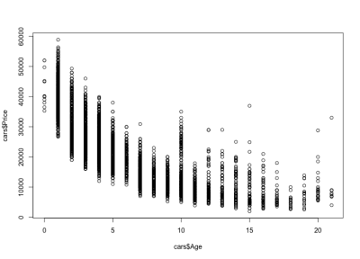
We notice how the cars’ prices go down with age: there are expensive new cars, and cheaper old cars. We can also see the price variation interval for any specific age, a variation that decreases with a car’s age. This variation is largely driven by the mileage, configuration and overall state of the car. For example, in the case of a 4-year-old car, the price varies between $10,000 and $40,000 USD.
Mileage–Age Correlation
Considering the mileage–age correlation, we would expect mileage to increase with age, meaning a positive correlation. Here is the code:
plot(cars$Mileage, cars$Age)
And here is the plot:
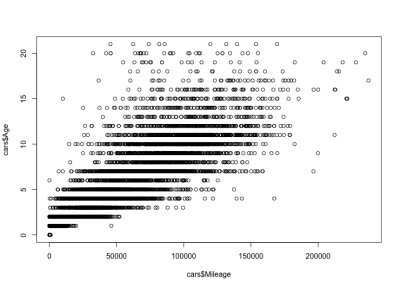
As you can see, a car’s age and mileage are positively correlated, unlike a car’s price and age, which are negatively correlated. We also have an expected mileage variation for a specific age; that is, cars of the same age have varying mileages. For example, most 4-year-old cars have the mileage between 10,000 and 80,000 miles. But there are outliers too, with greater mileage.
Mileage–Price Correlation
As expected, there will be a negative correlation between the cars’ mileage and the price, which means that increasing the mileage reduces the price.
plot(cars$Mileage, cars$Price)
And here is the plot:
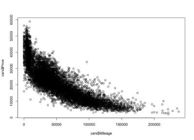
As we expected, a negative correlation. We can also notice the gross price interval between $3,000 and $50,000 USD, and the mileage between 0 and 150,000. If we look closer at the distribution shape, we see that the price goes down much faster for cars with less mileage than it does for cars with more mileage. There are cars with almost zero mileage, where the price drops dramatically. Also, above 200,000 miles range — because the mileage is very high — the price stays constant.
From Numbers To Data Visualizations
In this article, we used two types of visualization: histograms for data distributions, and scatter plots for data correlations. Histograms are visual representations that take the values of a data variable (actual numbers) and show how they are distributed across a range. We used the R hist() function to plot a histogram.
Scatter plots, on the other hand, take pairs of numbers and represent them on two axes. Scatter plots use the plot() function and provide two parameters: the first and the second data variables of the correlation we want to investigate. Thus, the two R functions, hist() and plot() help us translate sets of numbers in meaningful visual representations.
Conclusion
Having got our hands dirty going through the entire data flow of importing, processing, and plotting data, things look much clearer now. You can apply the same data flow to any shiny new dataset that you will encounter. In user research, for example, you could graph time on task or error distributions, and you could also plot a time on task vs. error correlation.
To learn more about the R language Quick-R is a good place to start, but you could also consider R Bloggers. For documentation on R packages, like dplyr, you can visit RDocumentation. Playing with data can be fun, but it is also extremely helpful to any UX designer in a data-driven world. As more data is collected and used to inform business decisions, there is an increased chance for designers to work on data visualization or data products, where understanding the nature of data is essential.
(ah, il, og)
From our sponsors: Quantitative Data Tools For UX Designers


