Archived
How To Increase Mobile Conversions With Category Page Design
How To Increase Mobile Conversions With Category Page Design
Suzanne Scacca 2020-03-26T12:30:00+00:00
2020-03-27T12:43:43+00:00
For e-commerce designers, it’s easy to focus on designing the home page, individual product pages as well as the checkout experience because they’re obvious stepping stones along the mobile shoppers’ journey. Based on the following data, though, category pages also have a role to play — as the intermediary between search engines and e-commerce websites.
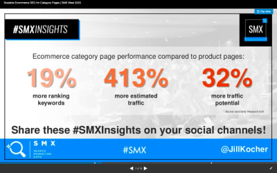
Jill Kocher Brown, the SEO Director of JumpFly, shared the following research at SMX West 2020:
After evaluating the top 30 ecommerce websites, Brown found that product category pages outperform product pages in terms of ranking keywords and traffic.
Considering how many top of funnel customers use mobile search to find what they’re looking for online, we need to put a greater focus on designing ecommerce category pages for mobile.
Today, I’m going to provide you with some tips for designing mobile e-commerce category pages that will get you more visits from search (and, consequently, conversions on-site).
How To Design Ecommerce Category Pages For Mobile
Let’s jump right in:
1. Only Include Essential Elements on the Page
This is more or less what we should aim for when designing e-commerce category pages for mobile:
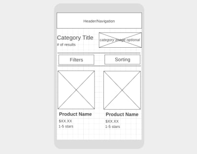
The elements we need to include above the fold are:
- The navigation bar (it can disappear upon scrolling or stick to the top of the page),
- A descriptive category page title,
- The total number of products in the category,
- Filter options,
- Sort settings,
- At least one or two matching products.
As for why these elements need to be above the fold, let me show you an example.
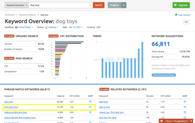
According to SEMrush (and Google), “kong dog toys” is a popular search term that dog toy shoppers are looking for:
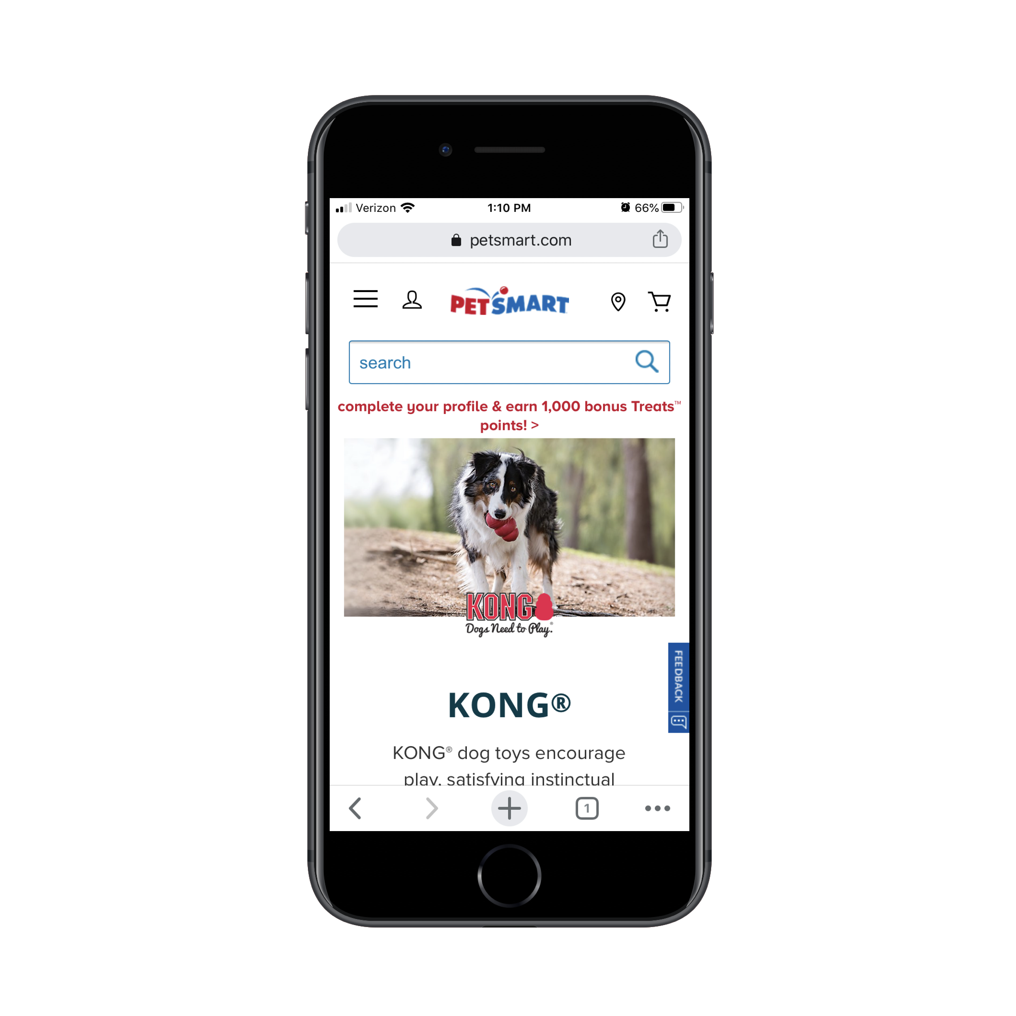
One of the top matching results for the search term is this category/brand page on the PetSmart website:
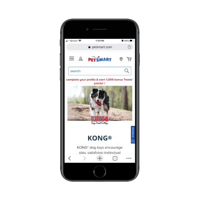
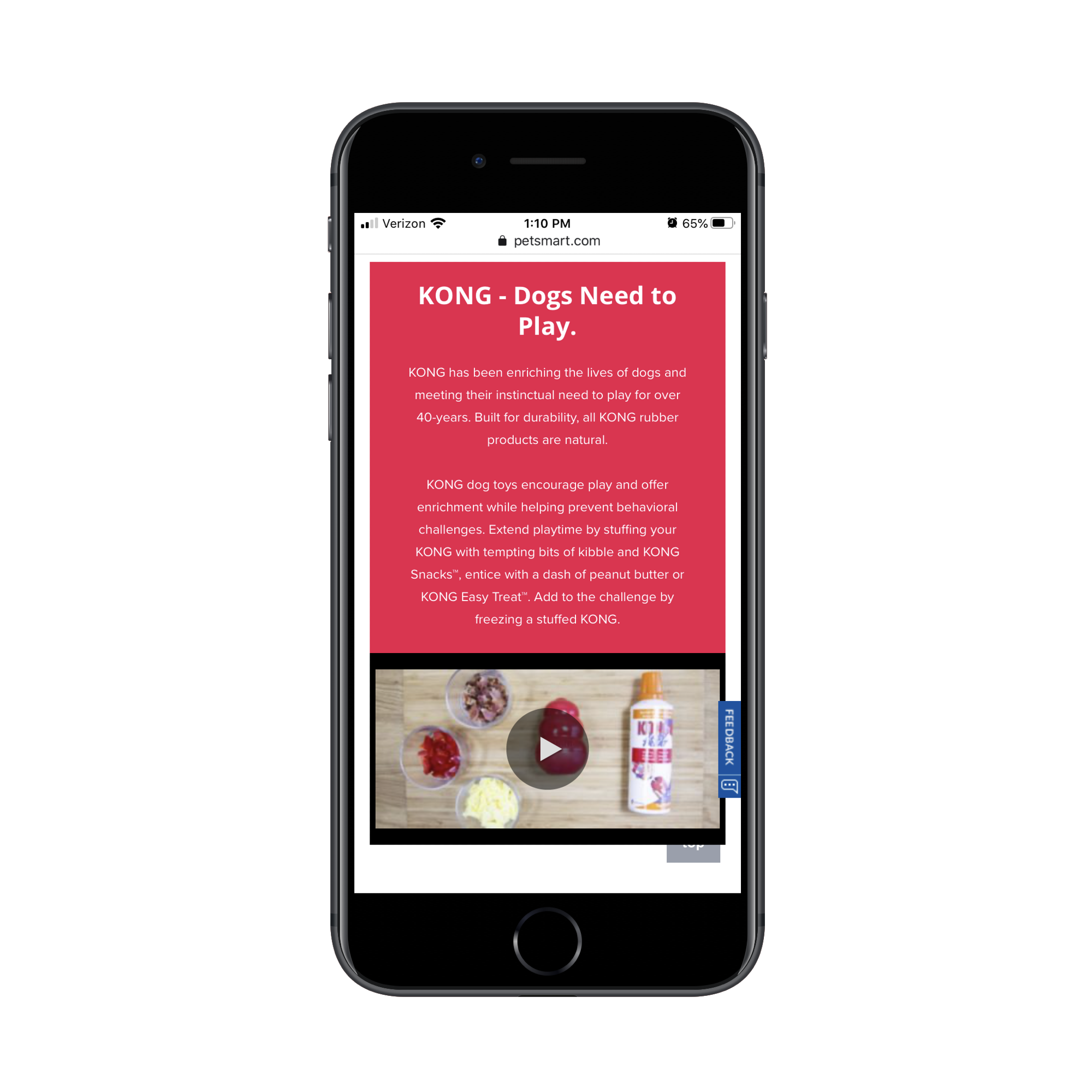
The next four swipes on the page take shoppers through informational sections, videos and subcategories like this:
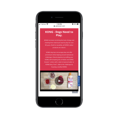
Here’s the problem with this:
For visitors on the website exploring pet products, this information is great as it educates them on the very popular Kong brand. However, for visitors that went out of their way to search for “kong dog toys” in Google, they don’t need all of this information. It’s just getting in the way of the shopping experience.
While I’m not a fan of Best Buy‘s inclusion of an ad above the header or a sponsored product as the first shown, the concise layout for the top of the category page is well done:
![]()
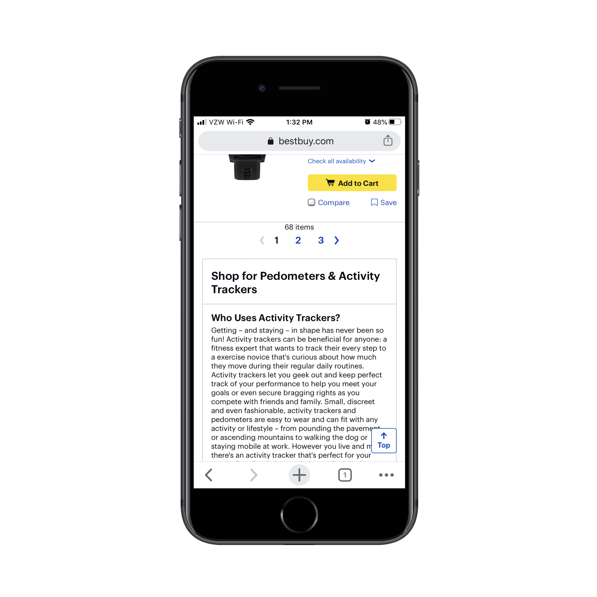
What’s more, Best Buy includes additional category information (just as PetSmart did). However, it wisely places this information below search results:
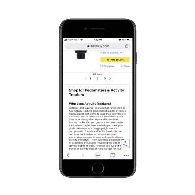
Why does Best Buy do this and why should you?
For one, you want shoppers who are new to a product category or brand to still have this information available to them. And considering how well-trained consumers are to look below-the-fold for more information (thanks, Amazon), this works on mobile.
In addition, this is useful for SEO. Without this category description, you’d have to leave it to your meta title and description to influence the rankability of the page. With a search-optimized informational section like this, you can improve the chances of your category page getting to the top of search.
2. Show the Most Convincing Product Details
As you can see, we don’t have a lot of room on these mobile e-commerce category pages. So, when shoppers finally get to the matching product results, you want to make it as painless as possible for them to find the ones looking for.
Here are the details that should be included with each product listing:
- A crystal-clear and attractive product image,
- The product name (along with a short description if the name/brand doesn’t spell out what it is),
- The price,
- The star rating and number of reviews.
The only one of the elements above that’s optional is the rating/reviews and that’s only the case if your site is new and you don’t want a lack of reviews to turn people off.
As for adding other elements to the product listings, be careful with this. If it doesn’t add any value (in other words, it doesn’t make it easier to choose one product from another), leave it out.
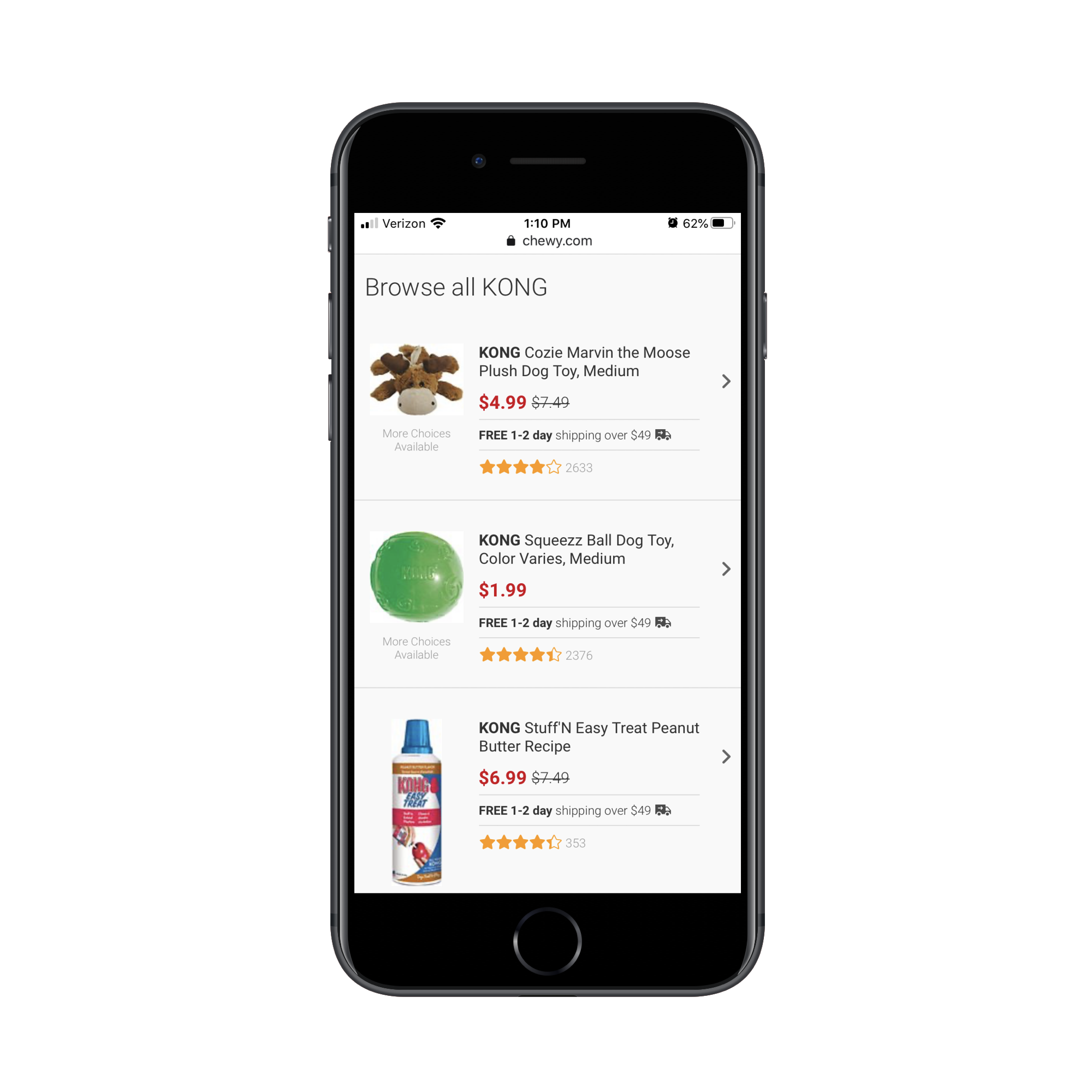
Take, for instance, this “kong dog toy” category page from Chewy:
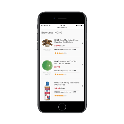
This category page design as a whole is much more concise than how competitor PetSmart handles theirs. However, there’s quite a bit of waste here. Namely, there are two repetitive strings of text that need to go:
- “More Choices Available” under the product images;
- “Free 1-2 day shipping over $49 🚚” between the price and rating.
The free shipping notice could easily appear as a dismissable sticky bar at the top of the site. And “More Choices Available” doesn’t need to be here at all. By tightening up the product details, mobile shoppers can more quickly get through the search results that are available.
Here’s an example from BH Cosmetics of product listings that could stand to be trimmed back:
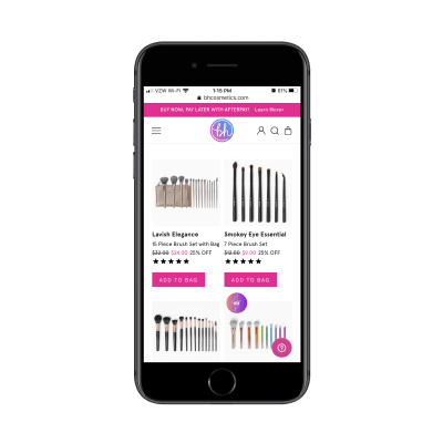
The “Add to Bag” buttons all need to go. Unless shoppers can look at a single product image and know that’s what they need, these buttons are useless on this page.
I also think the “XX% OFF” is unnecessary. There’s no reason to overcomplicate this. The scratched-out original price and new lower price in pink should be enough to call attention to the offer.
This isn’t the only way to display inventory/options on an e-commerce website, so you’ll have to evaluate each product element based on your specific case.
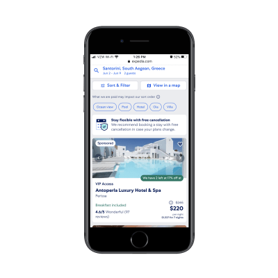
So you can see what I’m talking about, here’s what a search for “Santorini Greece hotels” shows on Expedia:
And on Booking.com:
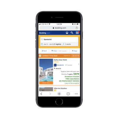
Both include the essential details needed for each listing. However, they include additional details to help users make a decision.
However, there’s a big difference in how this extra information is displayed. On Expedia, users can see that “Breakfast included” is a top feature and that there are only two rooms left at the special price. This is useful information. On Booking.com, however, there’s a mess of details in green displayed directly below the price. It’s difficult to read and I’m not sure all of the details are necessary.
If in doubt, start with the bare minimum. Then, use A/B testing to confirm whether or not other details improve click-through and conversion rates.
3. Manage Your Mobile Category Page Sizes
There are two reasons why we need to be careful about page sizes when designing e-commerce category pages:
- With as many images and data that appears on these kinds of pages, it can severely hurt loading times.
- The more products you display at once, the more analysis paralysis your shoppers will experience.
So, the first thing to do is create a limit on how long the page can get.
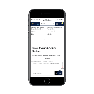
While you might be tempted to use infinite scroll or an auto-load that reveals more product images as visitors scroll down the page, it’s better for performance if you use pagination links like Walmart does:
Another tip you can take from Walmart is its product view setting. By default, products appear in a grid on its category pages:
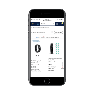
By clicking the button to the left of “Sort & Filter”, users can change the alignment to list view:
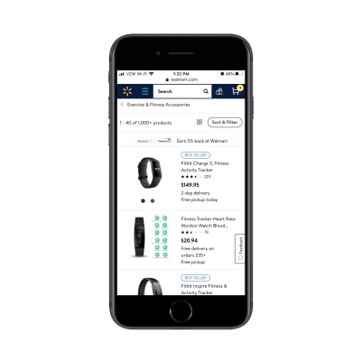
While this is more a matter of personal taste, you can see that the list layout does actually display more products at once, so users might find this choice of layout quite useful in speeding up their shopping experience.
One last thing to think about:
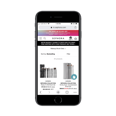
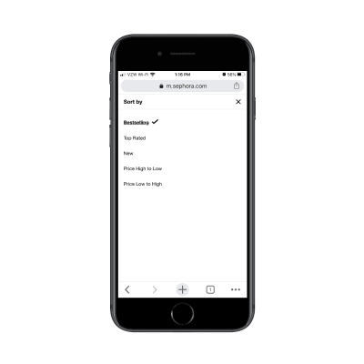
You can’t assume that your default sorting method is what all customers automatically prefer. For example, Sephora‘s default sort is by “Bestselling”:
As we know, consumers have other things they’re concerned about when shopping for things online. Affordability is one of them, so sorting by “Price Low to High” might make more sense. Reviews and ratings are something else they look for, so “Top Rated” might be their preferred sorting method:
And when it comes to filters, don’t be stingy.
Sephora, for instance, only allows customers to filter by two factors:
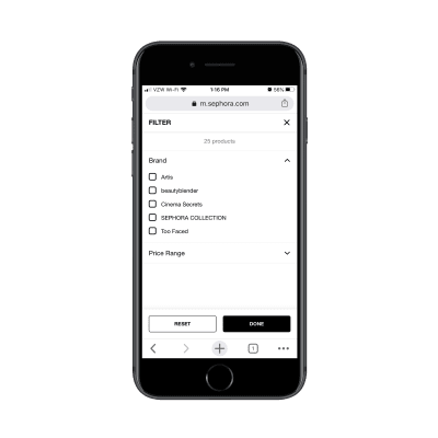
This assumes that customers are familiar with beauty brands. For those that aren’t, this can significantly impair their ability to find the products they’re looking for as it’ll take more time to consider all the options available.
Instead, what you should do is use your own product categories and tags to provide users with more comprehensive filtering options. After all, if that data helps you better organize and sell your inventory, it should do the same for your customers.
Ulta does a good job of this:
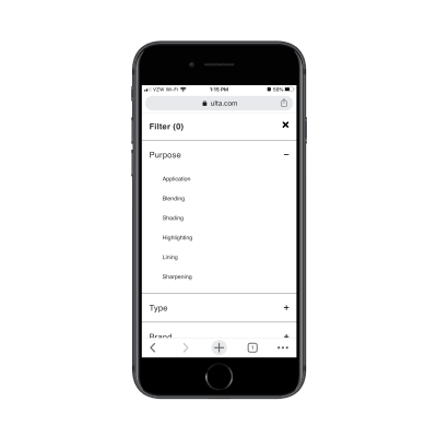
This isn’t just beneficial in terms of user-friendliness either (though that’s a big part of it). By empowering shoppers to create smaller lists of products to peruse, you’re also enabling them to speed up their shopping experience as options are reduced and page loading times improve.
Wrapping Up
In sum, be mindful of how you design your mobile e-commerce category pages. Even though the research shows that these pages enjoy higher click-through rates and visits from search engines than individual product pages, bad design choices will make your website the exception to the rule.
(ra, yk, il)
From our sponsors: How To Increase Mobile Conversions With Category Page Design


