Archived
Equivalent Experiences: Thinking Equivalently
Equivalent Experiences: Thinking Equivalently
Eric Bailey 2020-06-05T12:00:00+00:00
2020-06-05T12:44:09+00:00
This is the second of two articles on the topic of how digital accessibility is informed by equivalency. Previously, we have learned about the underlying biases that inform digital product creation, what isn’t an equivalent experience, the compounding effects of inaccessible design and code, and powerful motivating forces for doing better.
In this article, I will discuss learning how to embrace an equivalent, inclusive mindset. I will also provide practical, robust ways to improve your websites and web apps by providing solutions to common, everyday barriers cited by the people I interviewed.
Setting A Standard
The Web Content Accessibility Guidelines (WCAG) outlines in painstaking detail how to craft accessible digital experiences. While a long and dense document, it is incredibly comprehensive — to the point where it’s been codified as an international standard. For over 10 years, we’ve had a globally agreed upon, canonical definition of what constitutes as usable.
How Would I?
If you need a little help constructing the initial mental framework the WCAG gets at, a question I always ask myself when making something is, “How would I use this if…” It’s a question that gets you to check all the biases that might be affecting you in the moment.
Examples could be:
- How would I use this if…
- …I can’t see the screen?
- …I can’t move my arms?
- …I’m sensitive to flashing and strobing animation?
- …English isn’t my primary language?
- …I have a limited budget for bandwidth?
- …I’ve set a large default type size?
- …and so on.
Focus on these four parameters to improve usability of your web design:
1. Visual – make it easy to see
2. Auditory – make it easy to hear
3. Motor – make it easy to interact with
4. Cognitive – make it easy to understand→ Accessibility goals are also usability goals.
— Alex 🌚 (@alexmuench) January 30, 2020
A Gentle Introduction
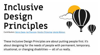
If you’re looking for a more approachable resource for how to dig into what the WCAG covers, the Inclusive Design Principles would be a great place to start. The seven principles it describes all map back to WCAG success criterion.
Learn From The People Who Actually Use It
You don’t have to take my word for it. Here are some common issues cited by the people I interviewed, and how to fix them:
Wayfinding
Headings
Heading elements are incredibly important for maintaining an equivalent, accessible experience.
When constructed with skill and care, heading elements allow screen reader users to quickly determine the contents of a page or view and navigate to content relevant to their interests. This is equivalent to how someone might quickly flit around, scrolling until something that looks pertinent comes into view.
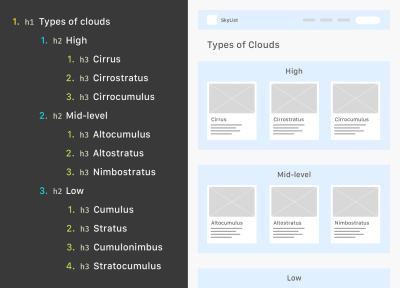
Justin Yarbrough voices poorly-authored heading elements as a concern, and he’s not alone.
WebAIM’s screen reader survey cites headings as the most important way to find information. This survey is well-worth paying attention to, as it provides valuable insight into how disabled people actually use assistive technology.
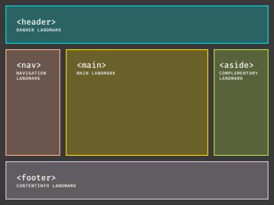
Landmarks
In addition to heading elements, another way to determine the overall structure and layout are landmarks. Landmarks are roles implicitly described by HTML sectioning elements, used to help describe the overall composition of the main page or view areas.
Here’s what Justin has to say:
“If I’m just trying to find the main content, I’ll first try the Q JAWS shortcut key to see if a
mainregion’s set up. If not, I’m just more or less stuck trying to scan the page to find it arrowing through the page.”
Much as how we might use a layer group name of “primary nav” in our design file, or a class name of c-nav-primary in our CSS, it’s important we also use a nav sectioning element to describe our main site navigation (as well as any other navigation the page or view contains).
Doing so ensures intent is carried all the way through from conception, to implementation, to use. The same notion carries through for the other HTML sectioning elements that create landmarks for assistive technology.
Labeled Controls
Brian Moore tells us about “form fields with no label or at least one that isn’t programmatically associated so it doesn’t read anything.”
It’s another frustratingly common problem.
Providing a valid for/id attribute pairing creates a programmatic association between form inputs and the label that describes what it does. And when I say label, I mean the label element. Not a clickable div, a placeholder, aria-label, or some other brittle and/or overwrought solution. label elements are a tried-and-true solution that enjoys wide and deep support for accessibility.
In addition, a label element should not be used by itself, say for a label on a diagram. This might seem counter-intuitive at first, but please bear with me.
<!-- Please do this -->
<label for="your-name">Your name</label>
<input type="text" id="your-name" name="your-name" autocomplete="name">

<!-- Don't do this -->
<label for="eye">Cornea</label>
<label for="eye">Pupil</label>
<label for="eye">Lens</label>
<label for="eye">Retina</label>
<label for="eye">Optic Nerve</label>
<img id="eye" alt="A diagram of the human eye." src="parts-of-the-eye.png" />
The same kinds of assistive technology that let a person jump to headings and landmarks also allow them to jump to input labels. Because of this, there is the expectation that when a label element is present, there is also a corresponding input it is associated with.
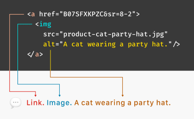
Alternative Descriptions
If you have low or no vision, and/or have difficulty understanding an image, HTML’s alt attribute (and not the title attribute) provides a mechanism to understand what the image is there for. The same principle applies for providing captions for video and audio content like podcasts.
Kenny Hitt mentions that when:
“…someone posts something on Twitter, if it’s just an unlabeled image, I don’t even take the time to participate in the conversation. When you start every conversation by asking what’s in the picture, it really derails things.”
Up until last week, the only way for Twitter to provide alternative descriptions for its images was to enable an option buried away in the subsection of a preference menu. Compare this to a platform like Mastodon, where the feature is enabled by default.
Soren Hamby, mentions Stitcher, a popular podcast app. “The onboarding was a lot of themed graphics, but the alt text for each one was ‘unselected’ and for the same image with a check over it was selected. I think it would be reasonable for them to say ‘sci-fi genre selected’ […] it’s such a small thing but it makes all the difference.”
Ensuring that alternate description content is concise and descriptive is just as important as including the ability to add it. Daniel Göransson, a developer for Axess Lab, has a great article on how to write them effectively.
Robust, accessible features can also be part of evaluation criteria, as well as a great method for building customer loyalty. Soren mentions that they are “often the deciding factor, especially between services.” In particular, they cite Netflix’s audio descriptions.
ARIA
One topic Daniel Göransson’s article on alternative descriptions mentions is to not over-describe things. This includes information like that it is an image, who the photographer is, and keyword stuffing.
The same principle applies for Accessible Rich Internet Applications (ARIA). ARIA is a set of attributes designed to extend HTML to fill in the gaps between interactive content and assistive technology. When ARIA is used to completely replace HTML, it oftentimes leads to an over-described experience.
Brian explains: “There seems to be a perception that more ARIA fixes accessibility and it can help, but too much either reads wrong things or just talks way too much. If on screen text of one or two words is good enough for everyone else, it is good enough for screen reader users too. We don’t need whole sentence or two descriptions of buttons or links i.e ‘link privacy policy’ is far better than something like ‘this link will open our privacy policy, this link will open in a new window’ when the on screen link text is ‘privacy policy.’”
The First Rule of ARIA Use advises us to only use it when a native element won’t suffice. You don’t need to describe what your interactive component is or how it works, the same way you don’t need to include the word “image” in your alternative description.
Provided that you use the appropriate native HTML element, assistive technology will handle all of that for you. Do more, more robustly, with less effort? Sounds great to me!
Unlike most of HTML, CSS, and JS, the success of implemented ARIA is contextual, variable, and largely invisible. In spite of this, we seem to be slathering ARIA onto everything without bothering to check not only if it actually works, but also what the people who actually use it think of it.
Support for ARIA is fragmented across operating systems, browsers, and assistive technology offerings, all their respective versions, and every possible permutation of all three. Simply put, writing ARIA and trusting it will work as intended isn’t enough.
If misconfigured and/or over-applied, ARIA can break. It may not report actual functionality, announce the wrong functionality, and (accurately or inaccurately) over-describe functionality. Obviously, these experiences aren’t equivalent.
Representation matters. To get a better understanding of how the ARIA code you wrote actually works, I recommend hiring people to tell you. Here are four such services that do exactly that:
Contrast
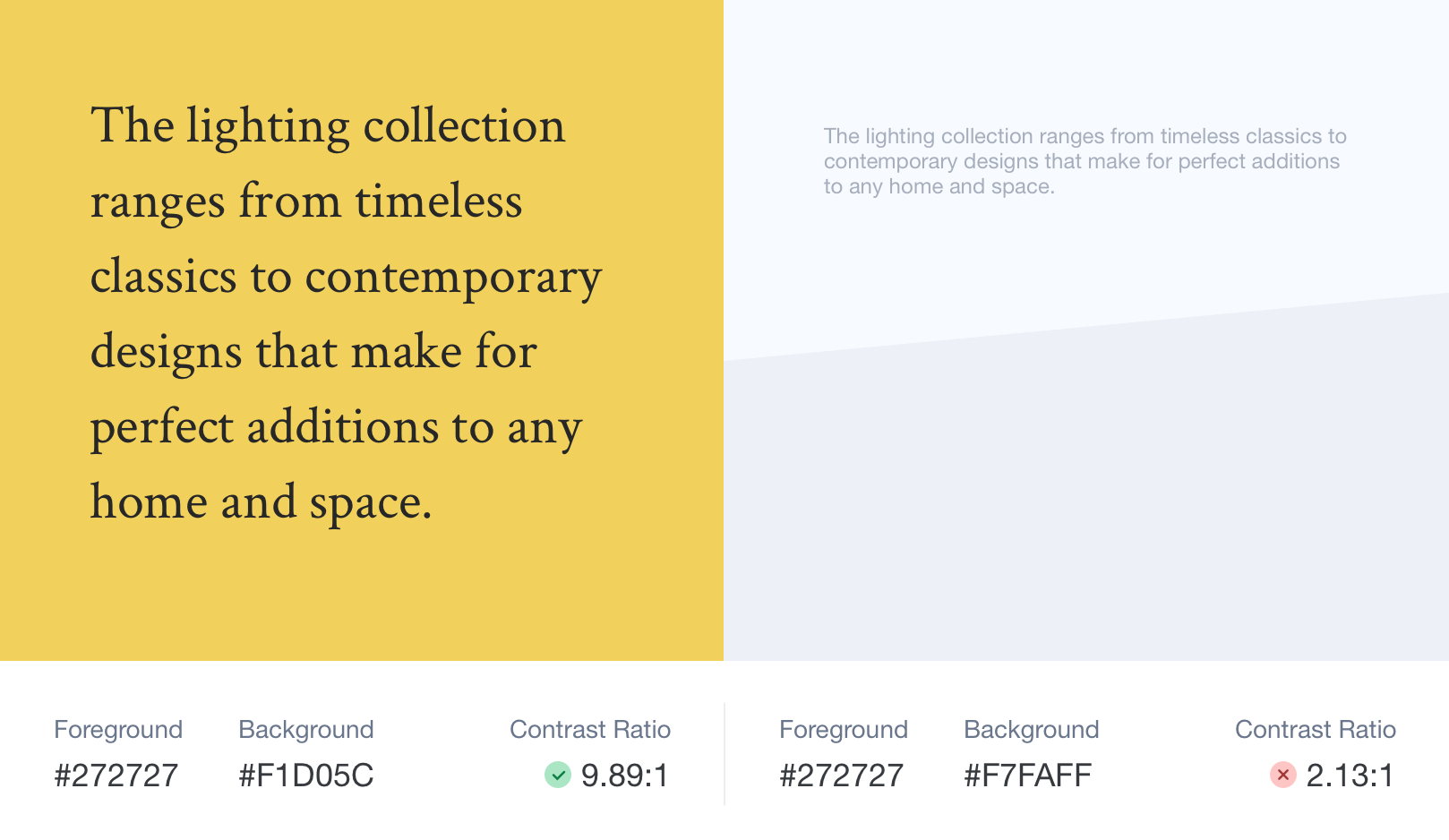
Color Contrast
Color contrast is another common issue, one whose severity often seems to be downplayed. If I could wager a guess, it’s because it’s easy to forget that other people’s vision might be different than your own. Regardless, it is a concern that affects a wide swath of the global population, and we should treat the issue with the seriousness it deserves.
The Click-Away Pound Survey tells us that out of the top issues faced by users with access needs, contrast and legibility weighs in as the fifth most significant issue. On top of that, it has increased as a concern, going from 44% of respondents in 2016 to 55% in 2019.
We live in an age where there’s more color contrast checking resources than I can count. Products like Stark can help designers audit their designs before it is translated into code. Tools like Eightshape’s Contrast Grid and Atul Varma’s Accessible color palette builder let you craft your design systems with robust, accessible color combinations out of the gate.
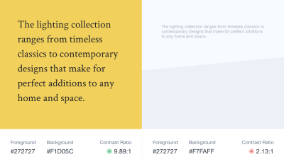
The somewhat ironic thing about color contrast is how, ah, visible it is. While some of the previous accessibility issues are invisible—hidden away as the underlying code—contrast is a pretty straightforward issue.
Mostly, contrast is a binary scenario, in that you either can or cannot see content. So, the next time you check your website or webapp with an automated accessibility checker such as Deque’s axe, don’t be so quick to downplay the color contrast errors it reports.
High Contrast
There are technology solutions for situations where even satisfactory color contrast ratios isn’t sufficient—namely, inverted colors mode and High Contrast Mode. Many participants I interviewed mentioned using these display modes during their daily computer use.
Provided you use semantic HTML, both of these modes don’t need much effort on the development end of things to work well. The important bit is to check out what you’re building in these two modes to make sure everything is working as intended.
Striving For Perfection
To quote Léonie Watson,
“Accessibility doesn’t have to be perfect, it just needs to be a little bit better than yesterday.”
By understanding both why, and how to improve your digital accessibility experiences in ways that directly address common barriers, you’re able to provide meaningful and enjoyable experiences to all.
Further Reading
- Accessibility For Teams (a project by Peter van Grieken)
- “One Of My Favourite Accessibility Testing Tools: The Tab Key,” Manuel Matuzović
- “These Are The Web Accessibility Standards Designers Need To Know,” Yichen He, The Next Web
- “Web Accessibility Standards: An Overview For Designers,” Yichen He, UX Collective
- “What A Year Of Learning And Teaching Accessibility Taught Me,” Sara Soueidan , 24 Accessibility
Thank you to Brian Moore, Damien Senger, Jim Kiely, Justin Yarbrough, Kenny Hitt, and Soren Hamby for sharing their insights and experiences.
(ra, il)
From our sponsors: Equivalent Experiences: Thinking Equivalently


