Archived
Can Data Visualization Improve The Mobile Web Experience?
Can Data Visualization Improve The Mobile Web Experience?
Suzanne Scacca 2020-05-19T11:30:00+00:00
2020-05-19T12:09:18+00:00
It can be tough to prioritize the mobile experience when it often feels like a compromise. Don’t include as much text. Remove some of your images. Stay away from features that get in the mobile visitor’s way. It’s kind of like a parent who tells you, “Go out and have a good time, but don’t do X, Y or Z!”
It’s not necessarily that a mobile visitor needs a shorter page, less text or fewer images to more easily consume content on a smartphone. They just need the content you give them to not feel like so much work.
If you look more closely at your pages, you may find that some of the written content can be converted into data visualizations. So, today we’re going to look at some things you can do to start converting more of your content into graphics and enhance mobile visitors’ experiences in the process.
Quantitative Data Tools
Many UX designers are somewhat afraid of data, believing it requires deep knowledge of statistics and math. Although that may be true for advanced data science, it is not true for the basic research data analysis required by most UX designers. →
1. Go Beyond Traditional Data Visualization Formats
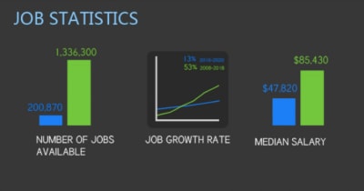
When you think about displaying data in a graphical format, what do you envision? Probably graphs and charts like this:
This screenshot comes from a Visual.ly infographic comparing web designers and developers. This particular piece of it deals with jobs-related statistical data, so it makes sense that it would be translated into bar graph and line chart formats.
As a writer, I’m a huge fan of this kind of data visualization because having to write out stats can be a major bummer. Like I know there’s a significant difference between the data points, but I can only use bold fonts and bulletpoints so many times before readers start to look for the next new interesting thing to focus on.
When strong data sets are designed rather than written, readers are less likely to skip over and unintentionally miss critical information. But it’s not just data that can be visualized. Take this other segment from the infographic, for example:

This could’ve been written as a paragraph (e.g. “_In general, web designers are right brain thinkers, leveraging intuition, creativity, blah blah blah…_”). It could’ve also been displayed as a table:
| Web Designer | Web Developer | |
| Brain Hemisphere | Right | Left |
| Driven By | Intuition | Logic |
| Approach | Creativity | Linear Thinking |
| Strength | Imagination | Technical |
While this would’ve perhaps been easier to read than a wall of text, it’s not nearly as interesting as the graphic above.
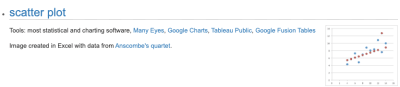
In order to identify different kinds of data worth turning into graphics, it’s going to require web designers to do some thinking outside the box. I’d recommend you start by acquainting yourself with the different kinds of data visualizations that exist. You can use The Duke University Library for that. It has an entire page that shows how different kinds of information can be translated into graphics, like this example of a scatter plot:
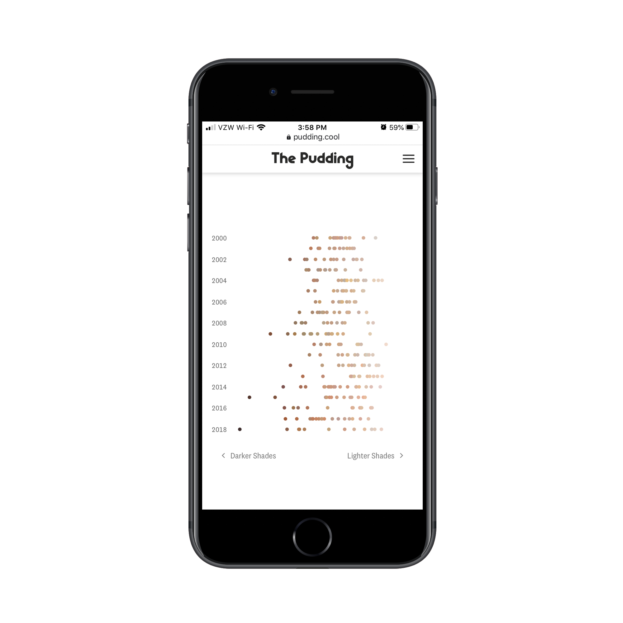
The Pudding took this basic concept of charting data points over time and turned it into something unique in its “Colorism in High Fashion” article.
This is a graphic that represents the spectrum of skin tones that have been represented on the cover of Vogue:

This is a much more effective and eye-catching way to relay this information than to have a writer say, “Over the magazine’s 200-plus issues, 75% of Vogue’s cover models tend more towards fairer skin tones.”
That said, this graphic on its own isn’t a scatter plot as it only depicts quantity and trends. However, scrolling does eventually turn it into a scatter plot:

Notice how each of the orbs has been pulled out onto a timeline, representing the faces of the models on the magazine covers. This is not the traditional way to use a scatter plot chart, but, in this case, it works really well. And, again, it does a much more effective job in getting the point across on mobile than a wall of text.
As you look for ways to do this in your own work, hone in on the following elements:
- Statistical data,
- Short bulleted lists,
- Highly complex topics,
- Step-by-step explainers,
- Page or topic summaries.
These present the best opportunities for turning essential data or topics into visualizations.
2. Design Your Data Visualizations To Be Filterable
Of course, you don’t want to overdo it. In your mission to preserve your website’s message on mobile, you don’t want to create so many graphics that it compromises page speed or that they start to feel overwhelming.
One solution to data visualization overload is to create a single graphic, but use filters to control which data sets are displayed. Not only does this enable you to deliver a ton of visual information in a smaller amount of space, but it can become a competitive edge, too. Let me show you an example.
The reason why a CDN is useful is because it puts your website geographically closer to your target audience. If the CDN doesn’t have the reach to do that, then it’s not worth the trouble. That’s why, of all the considerations people have to make when finding a provider, they have to look at where their points of presences actually are.
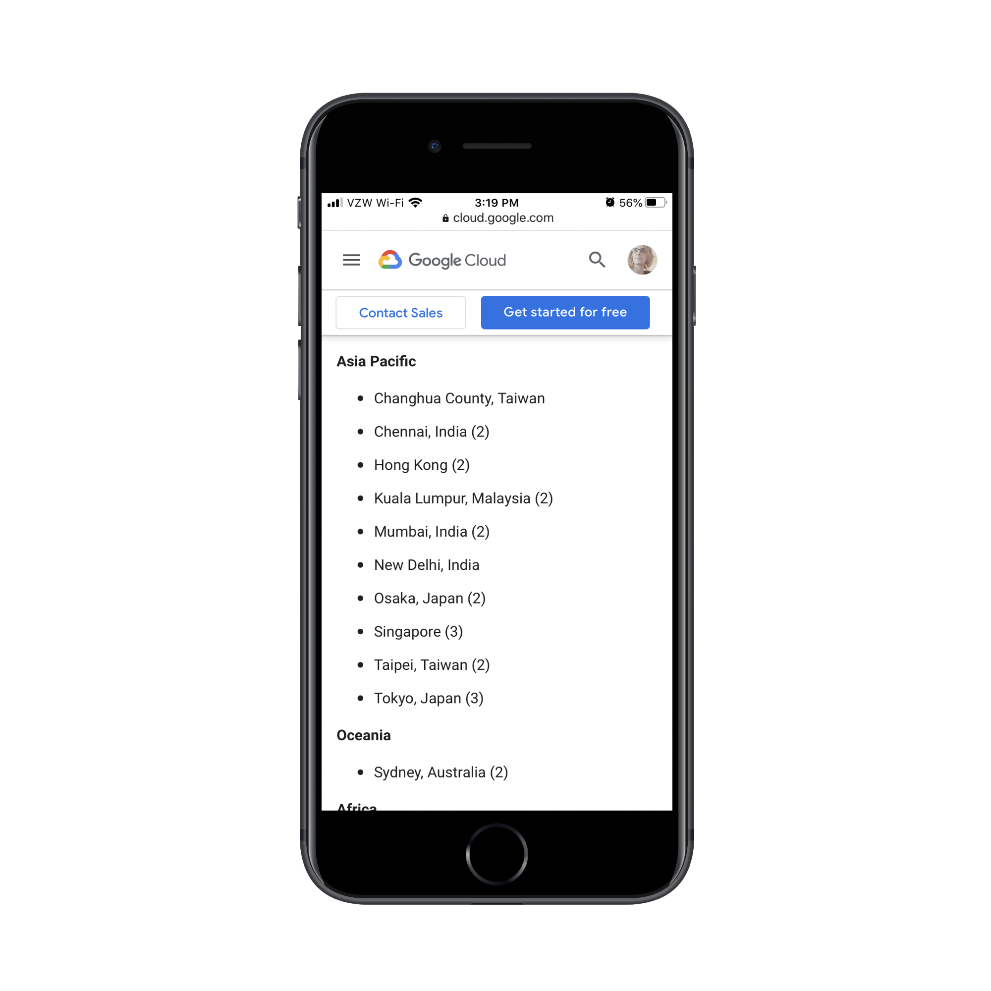
This is how Google Cloud displays this information for its content delivery network:

This is a great graphic as it shows where its cache locations are and how broad of an area the network covers. However, this is a static image, so what you see is what you get. Google has to use the rest of the page to list off all the major cities where it has a CDN presence:
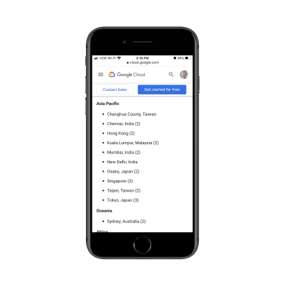
But this is what I’m talking about. This list should be part of the visualization.
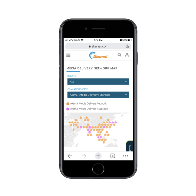
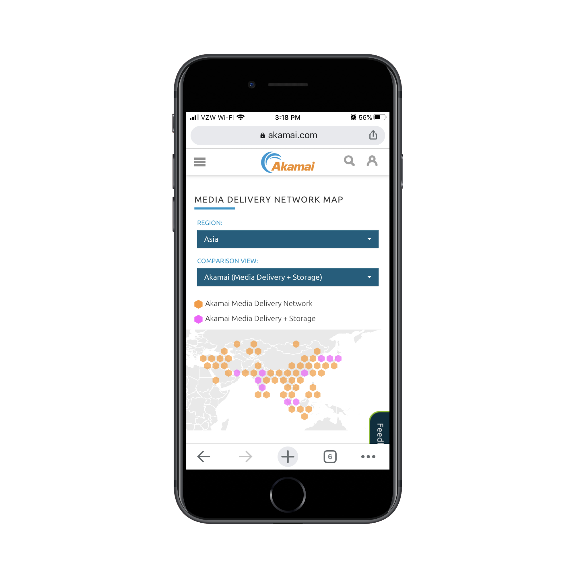
Akamai, a competitor to Google Cloud CDN, has designed its media network map this way:

On this map, you can see Akamai’s media delivery network (in orange) and its media and storage locations (in pink).
Prospective users interested in going deeper into the data can use the filters at the top of the page. For instance, this is what the map looks like when someone searches the Asia region:
And this is what they see when they choose to view Akamai’s storage network against its competitors:
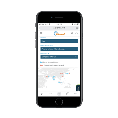
Not only does this data visualization design let visitors closely survey the data that’s most relevant to them, but it aids in their decision-making process, too.
This approach is really useful if you want to turn a whole bunch of data into a data visualization without having to overwhelm the page with it. And with this particular model of filtering, you can spare your visitors the trouble of having to pinch to zoom in and out of the graphic. They can customize the view on their own and get to the most relevant bits with ease.
3. Make Your Data Visualizations Interactive
Another thing you can do to pack a ton of information into a single graphic is to make your data visualizations interactive. Not only will this declutter your mobile UI, but it’ll get your visitors to pause and really take time to understand the information they’re being shown.
This is a recent post from Emojipedia. The article shares the results of a study they conducted on emoji usage during the coronavirus. It’s a fantastic read and it’s chock-full of data visualizations like this one:
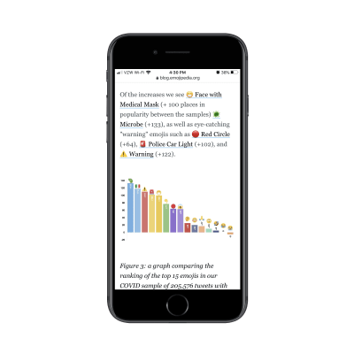
The design is certainly attractive, but it’s not easy to see all the details within the graphic on mobile. This is where interactivity would come in handy.
By making each of the bars in the graph clickable, people could get more information about the emoji, see the percentage increases clearly, and so on.
Something I didn’t show you in the last point is that the Akamai CDN map is interactive:

This is the exact approach I would suggest for the Emojipedia bar graph. By turning each data point into a clickable element, users don’t have to struggle to gain all the information they need nor do you have to overwhelm them with too much data within a single graphic.
What’s nice about interactivity is that you can apply it to a wide array of data visualizations, too.
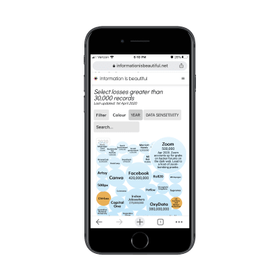
Here’s an example of a bubble chart from Information Is Beautiful:
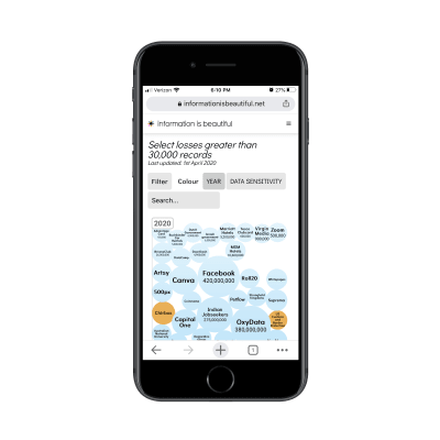
When visitors click on any of the bubbles, more information is revealed about the security breach:
One of the great things about prioritizing the mobile experience is that it allows us to find creative solutions to designing minimally. And interactions are a really good way to pull that off as the UI remains clear and easy to navigate, but tucked within it are juicy little nuggets waiting to be discovered.
Is Data Visualization The Key To A Better Mobile Experience?
There are a lot of things we can do to improve the mobile user’s experience. If you haven’t considered data visualization part of that strategy, now would be a good time to as it enables you to:
- Condense the amount of space and time it takes to get your point across,
- Design your pages to be more visually engaging,
- Preserve the full integrity of your copy for mobile and desktop visitors.
That, of course, doesn’t mean that you should stop looking for ways to reduce content on mobile. If it’s unnecessary or doesn’t add value, it should go. What remains can then be evaluated for a data visualization makeover.
(ra, il)
From our sponsors: Can Data Visualization Improve The Mobile Web Experience?


