Archived
Get Started With UI Design With These Tips To Speed Up Your Workflow

Get Started With UI Design With These Tips To Speed Up Your Workflow
Tomáš Čakloš 2019-12-04T10:00:00+00:00
2019-12-04T12:31:50+00:00
This article is about creating limits and rules to follow throughout the entire design process. There is an unlimited number of ways in which you can combine elements in a user interface — and so you’ll need to set some rules and boundaries, or else the design workflow might become an unpleasant chore. You might be struggling with all of the possibilities and trying to pick the best option among many “correct” options. By setting (and following) some basic rules, you will make your design look more consistent, too.
This article is intended for beginner UI designers. You don’t need a lot of experience in order to be able to follow the tips and tricks shared in it.
The Importance of Making Your User-Interface Design Consistent
Let’s start at the very beginning. You want your design to look good and trustworthy, and you need to avoid chaos at all costs. For this to happen, it’s very important to have a system for your design work.
Your developers will appreciate a system, too — they’ll love the fact that your design has order, and that you are making their work easier.
A System Of Resizing By A Predetermined Size
It doesn’t matter whether you want to resize a text block, resize an image, or adjust some white space. You need to decide how big each element will be. And I’ll bet you have been in this situation: Have you ever chosen a size for an element, and after five minutes, you change it, and then again, and maybe again and again?
Which size is perfect? It could be one of the ones you tried, right? You need to avoid this endless time-wasting trap!
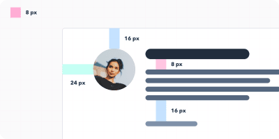
Start By Choosing The Basic Unit: The 8-Pixel Grid
To make the whole design look cleaner, it’s helpful to first set the measurement value that will then determine all of the sizes. It is completely up to you what value you choose, but quite often, the best option is to stick to a few proven rules. And one of these rules is to resize and move elements by exactly eight pixels. This rule will streamline your decision-making.
Aside on px versus dp: In addition to pixels (px), you may have heard of the term dp being used in screen design and prototyping. The dp unit is short for “density-independent pixel.” The unit is relative to a 160-dpi screen, so 1 dp is equal to 1 pixel on a 160-dpi screen, and equal 2 pixels on a 320-dpi screen, and so on. The numeric value formula is px = dp * (dpi/160).
Note: If you work with smaller elements or objects, it’s also OK to use 4-pixel increments, instead of 8 — occasionally, you can make further adjustments, when required.)
But Why Exactly 8 Pixels?
There are a few reasons why eight often works like a “magic number” here:
- Eight pixels is a sufficient minimum “jump”.
- Eight is a great number because it is divisible by four and two.
- If you use eight, you can easily resize any element without ending up with half pixels, as 8 / 2 = 4, 4 / 2 = 2, and 2 / 2 = 1. If, on the other hand, you start with 10, you’ll end up with 5 pixels, then 2.5 pixels, then 1.25 pixels. When designing for screen, you’d like to avoid half pixels as much as possible. By using whole pixels, elements in the design will align to precise pixel boundaries, and so will look crisper.
- Multiples of eight (8, 16, 24, 32, 40, 48, 56, 64, 72, 80, etc.) are intertwined with binary values (1, 2, 4, 8, 16, 32, 64, 128, 256, 512, etc.).
- Finally, the numbers are easy to remember.
What Are The Advantages Of Using An 8-Pixel Grid?
- As a designer, your decision time is precious. This will make you faster and more efficient.
- If you are working with a developer, you can create a system that will help you and your team. If the developer needs to make some quick changes, he can adjust the values by 8-pixel increments. This will ensure consistency and order.
- People using your website will feel comfortable when they visit it. They will trust the website, and it’ll be easier for them to use the interface.
Work With A Grid To Lay Out All Elements
Horizontal Harmony
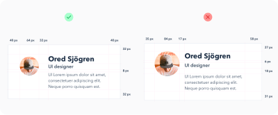
I’m sure you have already used a grid when designing websites. Using a grid helps you to accurately place all elements on the digital canvas.
The grid forms the skeleton of your interface and determines where you can place elements. The template holds the composition, and it defines clear boundaries so that your design will be more consistent. Now it will be easier for you to decide where to put the elements. As you gain more experience, you can update the boundaries as needed.
But how do you create this grid? We will cover the specifics next. Basically, the number and size of columns may be random and depends on your needs. The more detailed your design, the more columns the grid will require. If you’re hesitant, ask an experienced colleague for assistance.
Also, I recommend that you read “A Comprehensive Guide to UI Design”, which should help you understand user-interface design a bit more in depth.
Vertical Harmony
Similar to maintaining horizontal harmony, it is important to keep vertical distances consistent in a design as well. Like the rows in a spreadsheet, they help you to keep text at evenly spaced intervals.
How big should these rows be? Again, it’s up to you. However, I recommend using 8 pixels or multiples of 8 (such as 16). Redefine boundaries where elements or text are to be aligned.

Picking Font Sizes The Right Way
If you look at some well-crafted designs, you will see consistency in font sizes. This is for a reason.
Note: Keep in mind also that you need only two, maybe three, fonts in your design. However, selecting the right typefaces and making them work together is beyond the scope of this tutorial.
Begin by defining a few key font sizes to use throughout the project. (For example, it would be foolish to use 30, 31, and 32 pixels. Rather, combine these three very similar sizes into one.)
Standard Font Sizes Bring Two Benefits:
- Your design will be more consistent and more elegant.
- It will speed up the design process and make you more efficient.
Font Sizes
When you are defining font sizes, make sure not to increase sizes by the same increment. When you are enlarging text, it should be non-linear. This means that the larger the text you are creating, the larger the increment should be.

Let’s say you have a text block with a 12-pixel font size, and you want to enlarge it. You try 14 pixels, and you are satisfied. But then imagine that you have a large headline (40 pixels) and you want to make it bigger. Would you increase the size by only 2 pixels, from 40 to 42? Of course not. Optically, the text requires a much bigger change. You might need to increase it by 24 pixels, giving you a bigger 64-pixel headline.
In short, this means that the bigger you want the text to be, the larger the increment you will need to use. This very simple principle applies not only to text, but also to the size of buttons, white space, and everything else.
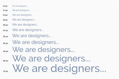
It is typically based on a geometric progression. Here is a very useful chart demonstrating font scale:
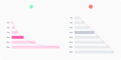
However, for typography, one proven scale is used with font sizes that you will want to stick with forever. The scale is 12, 14, 16, 18, 20, 24, 30, 36, 48, 60, and 72 pixels.
Text Line Height
Once you have defined all font sizes, you will want to take care of line spacing. For line height, use increments of 4 pixels again. For example, for 16-pixel text, let’s set the line height to 24 pixels. If you want the text to breathe more, then increase the row height by 4 pixels to 28.
Define Your Project’s Colors
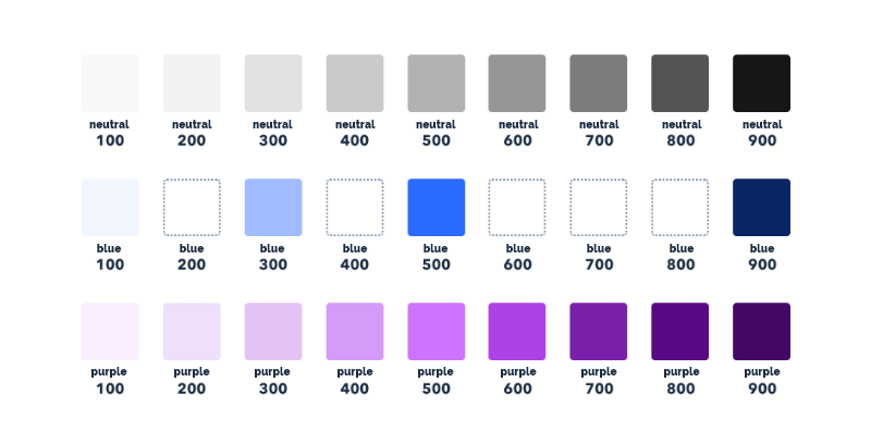
Do you know how many color combinations exist? A lot! You will waste too much time if you don’t predefine shades of color. You can’t limit yourself to black, white, and, say, blue. For each color, you will need other shades, and it is important to set them in advance, so that the shades are consistent throughout your design project. We don’t want to create chaos in the design. Aim for 5 to 10 shades for each color. I prefer to define 9 shades for each color.
Let’s take a closer look at color shades.
Why 9 Shades Of Each Color?
-
The first advantage is color naming. Whether you are using a graphics editor or CSS code, you will definitely benefit from this tip. Each shade would be assigned a number, such as 100, 200, 300, 400, 500, 600, 700, 800, and 900. (Why hundreds? Typically, this is how cuts of typefaces are also organized.)
-
Secondly, 9 is a handy number for defining colors. The best way to prepare these shades is to prepare a row of 9 squares and fill the squares with colors. The one in the middle will be the base color. Then, you define the lightest shade (at the far left) and the darkest shade (at the far right). The next step is to select the hues in between.

Prepare The Different Sizes, Types, And States Of Elements
When working on a design, you will usually work with a countless number of icons, buttons, and other components. Again, it’s a good idea to prepare in advance several sizes for them, and limit the options to as few as possible. During the design process, do not add other sizes, and don’t try to adjust the size of components to suit your needs. Instead, just use the ones you have already defined, and the whole design will be more consistent and clean.
Let’s look at buttons as an example. When you begin, you’ll need to define their hierarchical structure. To do so, make a button with a primary action, a button with a secondary action, and perhaps another button with a less important action. For each button, specify its status (active, inactive) and the color variant. Always try to reduce the number of elements to the most important ones.

Define Other Elements’ Properties
User interface designers often use shadows in their design work. However, for less-experienced designers, shadows can sometimes be a struggle. When creating a shadow, you must set the shadow’s distance along the x-axis and y-axis, and also the blur radius, color, and transparency. Shadows can take a lot of time to fine-tune, which is why you’ll want to prepare them before diving into the design. It is helpful to prepare a set of shadows (using the same method as for colors), and then just apply them throughout the design process.
Also, be aware of all the other properties of elements that you will be working with, such as corner radius, transparency, and color gradients.

White Space
Properly adjusting white space is important. Whether you offset elements from the outside (margin) or from the inside (padding), you should rely on the magic number of 8 again. Increase the offset by 8 pixels (4 for small elements). As with font size, the larger the gap you want, the larger the increment will have to be (again, you’ll need to define these increments in advance).
Conclusion
To make your designs clean and consistent, define some boundaries and a clear path through the process.
When working on each element of your design, keep in mind the following:
- See whether you have used it already somewhere in your design. If so, you can simply copy that element.
- Follow a horizontal and vertical rhythm, and adjust the size of elements using the steps that you defined at the very beginning.
- Avoid complicated decisions and never-ending battles with pixels. Have a system in place.
- Do not create the same element twice. If there is order in your design, your work will be better and more efficient, you will be able to iterate faster, and you will be able to communicate with the developers more easily. The developers will set variables that follow your styles, so define them clearly. You’ll get a clean design, and the developers will be able to create better and more sustainable code. Everyone will be happy.
Related Reading
- “Building Better UI Designs With Layout Grids,” Nick Babich, Smashing Magazine
- “What Is The Difference Between “px”, “dip”, “dp” And “sp”?,” Stack Overflow
- “Why UI Designers Are Using “dp” Instead Of “pixel” As The Unit To Design Mobile Apps?,” Kikahola, Medium
- “
font-weightCSS property,” Mozilla Developer Network web docs - “Step Up Your Design Game By Using Fewer Fonts,” Jacci Howard Bear, Lifewire
- “Creating UI Shadows That Don’t Suck,” Anastasia Kas, Medium
- “10 Golden Rules You Should Live By When Combining Fonts: Tips From A Designer,” Janie Kliever , Canva
- “Material Design: 8 dp Grid, 4 dp Grid,” Google Help
- “Why Some Designs Look Messy, And Others Don’t,” Reinoud Schuijers, UX Collective
(mb, il)
From our sponsors: Get Started With UI Design With These Tips To Speed Up Your Workflow


