A few days ago, I was having a chat with some friends, one of whom asked me the difference between
and in HTML. This is one of the eternal mysteries of web development, up there with “why is it white-space: nowrap, not white-space: no-wrap?” and “why is CSS ‘gray’ a darker color than ‘darkgray’?”.
I gave my usual answer: think of
not just as a newspaper article, or a blog post, but as an article of clothing — a discrete entity that can be reused in another context. So your trousers are an article, and you can wear them with a different outfit; your shirt is an article, and can be worn with different trousers; your knee-length patent leather stiletto boots are an article (you wouldn’t wear just one of them, would you?).
“The article element represents a complete, or self-contained, composition in a document, page, application, or site and that is, in principle, independently distributable or reusable, e.g. in syndication. This could be a forum post, a magazine or newspaper article, a blog entry, a user-submitted comment, an interactive widget or gadget, or any other independent item of content.”
So a homepage with a list of blog posts would be a element wrapping a series of
elements, one for each blog post. You would use the same structure for a list of videos (think YouTube) with each video being wrapped in an , a list of products (think Amazon) and so on. Any of those s is conceptually syndicatable — each could stand alone on its own dedicated page, in an advert on another page, as an entry in an RSS feed, and so on.
Apple’s WatchOS contains Reader which uses the
element to know the primary content of your page. Apple says:
“We’ve brought Reader to watchOS 5 where it automatically activates when following links to text-heavy web pages. It’s important to ensure that Reader draws out the key parts of your web page by using semantic markup to reinforce the meaning and purpose of elements in the document. Let’s walk through an example. First, we indicate which parts of the page are the most important by wrapping it in an article tag.”
with HTML5 microdata helps Reader construct the optimal display for small watch screens:
“Specifically, enclosing these header elements inside the article ensure that they all appear in Reader. Reader also styles each header element differently depending on the value of its itemprop attribute. Using itemprop, we’re able to ensure that the author, publication date, title, and subheading are prominently featured.”
So What About
?
My usual advice continues: don’t bother with
or worry about how it differs from . It was invented as a generic wrapper for headings so that the browser could determine the HTML5 document outline.
The what? The document outline algorithm is a way to use only one heading tag —
— and have it magically “become” the correct level of heading (e.g. turn into an , , etc.), depending on how deeply it’s nested in HTML5 sectioning elements:, , and so on.
So, for example, here’s what you’ve typed into your CMS:
<h1>My Fabulous article</h1>

<p>Lorem Ipsum Trondant Fnord</p>
This works brilliantly when shown as a standalone article. But what about on your homepage, which is a list of your latest articles?
<h1>My latest posts</p>

<article>

  <h1>My fabulous article</h1>

 <p>Lorem Ipsum Trondant Fnord</p>

</article>

<article>

  <h1>Another magnum opus</h1>

  <p>Magnum solero paddlepop</p>

</article>
In this example, according to the specification, the
s inside the elements “become” logical s, because , like , is a sectioning element.
. At one point, the JAWS screen reader attempted to implement the document outlining algorithm (in IE, but not on Firefox) but implemented it buggily. It seems that browser developers simply aren’t interested (more sordid details in the Further Reading section for true anoraks).
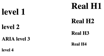
“But,” interjected another friend in the conversation, “now browsers display different sizes of font depending on how deeply the
is nested in s”, and proceeded to prove it. Mind blown!
s, nested in sections; the right column shows a, , , , with no nesting. The Firefox screenshot shows that the nested s default to the same font as the traditional … tags:
The results are the same in Chrome, Chromium derivatives such as Edge beta for Mac, and Safari on Mac.
So does this mean that we should all happily start using
as our only heading element, nesting it in s?
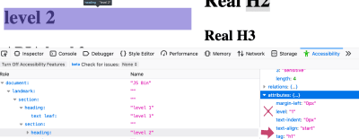
No. Because this is only a change in the visual styling of the h1s. If we crack open the Firefox Accessibility inspector in devtools, we can see that the text “level 2” is styled to look like an H2, but is still set at “level 1” — the Accessibility Tree hasn’t been changed to be level 2.
Firefox’s Accessibility Inspector shows that a nested
appears visually the same as an but its aria-level is incorrectly set to “1”, not “2” (Large preview)
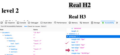
Compare this with the Real H2 in the right column:
Firefox’s Accessibility Inspector shows that a real
has a computed aria-level of “2”, which is correct (Large preview)
This shows the accessibility tree has been correctly informed that this is a level 2 heading. In fact, Mozilla did try communicating the computed level to the accessibility tree:
“We experimented a bit with that… but had to revert it because people in our a11y team complained about too many regressions (accidentally lowering
levels and such).”
For assistive technology users, a proper hierarchy of headings is vital. As the eighth WebAIM screenreader user survey shows,
“The usefulness of proper heading structures is very high, with 86.1% of respondents finding heading levels very or somewhat useful.”
Therefore, you should continue to use
until , and ignore section.
Never Say Never
“But..” you might now be spluttering indignantly, “there’s a
element right on this very page!”. And you would be right, dear reader. The “quick summary” is wrapped in a , for accessibility reasons. When screen reader user Léonie Watson gave her webinar “How A Screen Reader User Accesses The Web”, she pointed out an area where Smashing Magazine’s markup could be tweaked to make her experience better.
As you can see from the screenshot, Smashing articles are preceded by a quick summary, followed by a horizontal line separating the summary from the article proper.
The Smashing “Quick Summary” is separated from its full article by a horizontal line. (Large preview)
But the separator is purely decorative, so Léonie couldn’t tell where the summary ends and the article begins. She suggested a fix: we wrapped the summary in a
element:
<section aria-label="quick summary">

    Summary text

</section>
In most screen readers, a
element isn’t announced unless it has an accessible name. In this case, the text of the aria label. Now, her screen reader announced “Quick summary region”, and after the summary “Quick summary region end”. This simple markup also makes it possible for a screen reader user to jump over the summary if they want to.
“As a rule of thumb, if you label something via aria-label or aria-labelledby, make sure it has a proper widget or landmark role.”
So rather than use
, we chose as that has a built-in role of region and Bruce’s infallible law of ARIA™ applies: built-in beats bolt-on. Bigly.
Conclusion
Hopefully, you’ve come away with these take-homes:
Don’t use loads of s. Make the main heading of your page, then use , , , etc. in a proper hierarchy without skipping levels.
can be used with aria-label to signal to a screen reader user where a particular sub-part of an article begins and ends. Otherwise, forget about it, or use another element, such as or
.
, , and are very useful for screen reader users, and entirely transparent to those who don’t use assistive technology. So use them.
isn’t just for blog posts — it’s for any self-contained thing. It also helps WatchOS display your content properly.
I gratefully acknowledge Léonie Watson‘s help writing this article. Any errors are totally her fault.
Further Reading
“Headings And Sections,” HTML 5.2
W3C Recommendation (14 Dec. ’17)
Note its warning: “There are currently no known native implementations of the outline algorithm … Therefore the outline algorithm cannot be relied upon to convey document structure to users. Authors should use heading rank (h1-h6) to convey document structure.”


