Archived
When And How To Use CSS Multi-Column Layout

When And How To Use CSS Multi-Column Layout
When And How To Use CSS Multi-Column Layout
Rachel Andrew
2019-01-11T15:00:30+02:00
2019-01-11T15:32:41+00:00
In all of the excitement about CSS Grid Layout and Flexbox, another layout method is often overlooked. In this article I’m going to take a look at Multi-column Layout — often referred to as multicol or sometimes “CSS Columns”. You’ll find out which tasks it is suited for, and some of the things to watch out for when making columns.
What Is Multicol?
The basic idea of multicol, is that you can take a chunk of content and flow it into multiple columns, as in a newspaper. You do this by using one of two properties. The column-count property specifies the number of columns that you would like the content to break into. The column-width property specifies the ideal width, leaving the browser to figure out how many columns will fit.
It doesn’t matter which elements are inside the content that you turn into a multicol container, everything remains in normal flow, but broken into columns. This makes multicol unlike other layout methods that we have in browsers today. Flexbox and Grid for example, take the child elements of the container and those items then participate in a flex or grid layout. With multicol, you still have normal flow, except inside a column.
In the below example I am using column-width, to display columns of at least 14em. Multicol assigns as many 14em columns as will fit and then shares out the remaining space between the columns. Columns will be at least 14em, unless we can only display one column in which case it may be smaller. Multicol was the first time that we saw this kind of behavior in CSS, columns being created which were essentialy responsive by default. You do not need to add Media Queries and change the number of columns for various breakpoints, instead we specify an optimal width and the browser will work it out.
See the Pen Smashing Multicol: column-width by Rachel Andrew (@rachelandrew) on CodePen.
Front-end is messy and complicated these days. That’s why we publish articles, printed books and webinars with useful techniques to improve your work. Even better: Smashing Membership with a growing selection of front-end & UX goodies. So you get your work done, better and faster.
Explore Smashing Membership ↬
Styling Columns
The column boxes created when you use one of the column properties can’t be targeted. You can’t address them with JavaScript, nor can you style an individual box to give it a background color or adjust the padding and margins. All of the column boxes will be the same size. The only thing you can do is add a rule between columns, using the column-rule property, which acts like border. You can also control the gap between columns using the column-gap property, which has a default value of 1em however you can change it to any valid length unit.
See the Pen Smashing Multicol: column styling by Rachel Andrew (@rachelandrew) on CodePen.
That is the basic functionality of multicol. You can take a chunk of content and split it into columns. Content will fill the columns in turn, creating columns in the inline direction. You can control the gaps between columns and add a rule, with the same possible values as border. So far so good, and all of the above is very well supported in browsers and has been for a long time, making this spec very safe to use in terms of backwards compatibility.
There are some further things you might want to consider with your columns, and some potential issues to be aware of when using columns on the web.
Spanning Columns
Sometimes you might like to break some content into columns, but then cause one element to span across the column boxes. Applying the column-span property to a descendent of the multicol container achieves this.
In the example below, I have caused a element to span across my columns. Note that when you do this, the content breaks into a set of boxes above the span, then starts a new set of column boxes below. The content doesn’t jump across the spanned element.
The column-span property is currently being implemented in Firefox and is behind a feature flag.
See the Pen Smashing Multicol: column-span by Rachel Andrew (@rachelandrew) on CodePen.
Be aware that in the current spec, the values for column-span are either all or none. You can’t span just some of the columns, but you can get the kind of layout you might see in a newspaper by combining multicol with other layout methods. In this next example, I have a grid container with two column tracks. The left-hand track is 2fr, the right-hand track 1fr. The article in the left-hand track I have turned into a multicol container with two tracks, it also has a spanning element.
On the right, we have an aside which goes into the second Grid column track. By playing around with the various layout methods available to us, we can figure out exactly which layout method suits the job at hand — don’t be afraid to mix and match!
See the Pen Smashing Multicol: mixing layout methods by Rachel Andrew (@rachelandrew) on CodePen.
Controlling Content Breaks
If you have content containing headings, then you probably want to avoid the situation where a heading ends up as the last thing in a column with the content going into the next column. If you have images with captions then the ideal situation would be for the image and caption to stay as one unit, not becoming split across columns. To deal with these problems CSS has properties to control where the content breaks.
When you split your content into columns, you perform what is known as fragmentation. The same is true if you split your content between pages, such as when you create a stylesheet for a print context. Therefore, multicol is closest to Paged Media than it is to other layout methods on the web. Because of this, for several years the way to control breaks in the content has been to use the page-break- properties which were part of CSS2.1.
page-break-beforepage-break-afterpage-break-inside
More recently the CSS Fragmentation specification has defined properties for fragmentation which are designed for any fragmented context, the spec includes details for Paged Media, multicol and the stalled Regions spec; Regions also fragments a continuous piece of content. By making these properties generic they can apply to any future fragmented context to, in the same way that the alignment properties from Flexbox were moved into the Box Alignment spec in order that they could be used in Grid and Block layout.
break-beforebreak-afterbreak-inside
As an example, I have used break-inside avoid on the element, to prevent the caption being detached from the image. A supporting browser should keep the figure together even if that causes the columns to look unbalanced.
See the Pen Smashing Multicol: break-inside by Rachel Andrew (@rachelandrew) on CodePen.
Unfortunately, support for these properties in multicol is pretty patchy. Even where supported they should be seen as a suggestion due to the fact that it would be possible to make so many requests while trying to control breaking, that essentially the browser can’t really break anywhere. The spec does define priorities in this case, however it is probably more useful for you to control only the most important cases.
The Problem Of Columns On the Web
One reason why we don’t see multicol used much on the web is the fact that it would be very easy to end up with a reading experience which made the reader scroll in the block dimension. That would mean scrolling up and down vertically for those of us using English or another vertical writing mode. This is not a good reading experience!
If you fix the height of the container, for example by using the viewport unit vh, and there is too much content, then overflow will happen in the inline direction and so you get a horizontal scrollbar instead.
See the Pen Smashing Multicol: overflow columns by Rachel Andrew (@rachelandrew) on CodePen.
Neither of these things are ideal, and making use of multicol on the web is something we need to think about very carefully in terms of the amount of content we might be aiming to flow into our columns.
Block Overflow Columns
For Level 2 of the specification, we are considering how to enable a method by which overflow columns, those which currently end up causing the horizontal scrollbar, could instead be created in the block direction. This would mean that you could have a multicol container with a height, and once the content had made columns which filled that container, a new set of columns would be created below. This would look a little like our spanning example above, however, instead of having a spanner causing the new column boxes to start, it would be the overflow caused by a container with a restriction in the block dimension.
This feature would make multicol far more useful for the web. While we are a little way off right now, you can keep an eye on the issue in the CSS Working Group repo. If you have additional use cases for this feature do post them, it can really help when designing the new feature.
What Is Multicol Useful For Today?
With the current specification, splitting all of your content into columns without consideration for the problems of scrolling isn’t advised. However, there are some cases where multicol is ideal on the web. There are enough uses cases to make it something you should consider when looking at design patterns.
Collapsing Small UI Or Text Elements
Multicol can be useful in any place where you have a small list of items that you want to take up less space. For example a simple listing of checkboxes, or a list of names. Often in these scenarios, the visitor is not reading down one column and then going back to the top of the next, but scanning the content for a checkbox to click or an item to select. Even if you do create a scrolled experience, it may not be an issue.
You can see an example of multicol used in this way by Sander de Jong on the DonarMuseum
website.
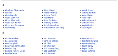
On DonarMuseum, we can see multicol used to display lists of names. (Image source) (Large preview)
Known Small Amounts Of Content
There are times when we design a site where we know that some piece of content is relatively small, and will fit on the majority of screens without causing unwanted scrolling. I’ve used multicol on Notist presentation pages, for the introduction to a talk.
Andy Clarke designed a lovely example for the Equfund website.

On the Equfund website, you can see how different HTML elements remain in normal flow while displayed inside columns. (Image source) (Large preview)
To avoid the possibility of very small screens causing scrolling, remember that you can use media queries to check for height as well as width (or in a logical world, block as well as inline). If you only enable columns at a breakpoint which has a min-height large enough for their content, this can save users of very small devices having a poor scrolling experience.
Masonry-Like Display Of Content
Another place where Multiple-column Layout works beautifully is if you want to create a Masonry type of display of content. Multicol is the only layout method that will currently create this kind of layout with unequal height items. Grid would either leave a gap, or stretch the items to make a strict two-dimensional grid.
Veerle Pieters has a beautiful example of using multicol in this way on her inspiration page.
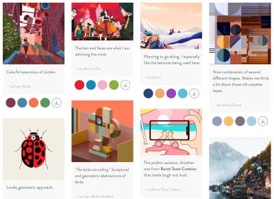
In this design by Veerle Pieters, multicol is used to layout multiple boxes or cards as columns. (Large preview)
Grid And Flexbox Fallbacks
The column- properties can also be used as a fallback for Grid and Flex layout. If you specify one of the properties on a container, then turn that container into a Flex or Grid layout by using display: flex or display: grid any column behavior will be removed. If you have, for example, a cards layout that uses Grid Layout, and the layout would be readable if it ran in columns rather than across the page, you could use multicol as a simple fallback. Browsers that do not support Grid will get the multicol display, those which support Grid will get the Grid Layout.
Don’t Forget Multicol!
Fairly frequently I answer Grid and Flexbox questions where the answer is to not use Grid or Flexbox, but instead to look at Multicol. You probably won’t use it on every site, but when you come across a use case it can be really helpful. Over at MDN there are useful resources for multicol and the related fragmentation properties.
If you have used multicol on a project, perhaps drop a note in the comments, to share other ways in which we can use the feature.
(il)
From our sponsors: When And How To Use CSS Multi-Column Layout


