Archived
Webflow: The Web Development Platform Of The Future
Webflow: The Web Development Platform Of The Future
Webflow: The Web Development Platform Of The Future
Nick Babich
2019-09-10T12:30:59+02:00
2019-09-10T12:36:15+00:00
(This is a sponsored article.) Time-to-market plays a crucial role in modern web design. Most product teams want to minimize the time required to go from the idea to a ready-to-use product without sacrificing the quality of the design along the way.
When it comes to creating a website, teams often use a few different tools: one tool for graphics and visual design, another for prototyping, and another for coding. Webflow attempts to simplify the process of web design by enabling you to design and develop at the same time.
Typical Problems That Web Designers Face
It’s important to start with understanding what challenges web design teams face when they create websites:
- A disconnection between visual design and coding.
Visual designers create mocks/prototypes in a visual tool (like Sketch) and hand them off to developers who need to code them. It creates an extra round of back-and-forth since developers have to go through an extra iteration of coding. - It’s hard to code complex interactions (especially animated transitions).
Designers can introduce beautiful effects in hi-fi prototypes, but developers will have a hard time reproducing the same layout or effect in code. - Optimizing designs for various screens.
Your designs should be responsive right from the start.
What Is Webflow?
Webflow is an in-browser design tool that gives you the power to design, build, and launch responsive websites visually. It’s basically an all-in-one design platform that you can use to go from the initial idea to ready-to-use product.
Here are a few things that make Webflow different:
- The visual design and code are not separated.
What you create in the visual editor is powered by HTML, CSS, and JavaScript. - It allows you to reuse CSS classes.
Once defined, you can use a class for any elements that should have the same styling or use it as a starting point for a variation (base class). - It is a platform and as such, it offers hosting plans.
For $12 per month, it allows you to connect a custom domain and host your HTML site. And for an additional $4 per month, you can use the Webflow CMS.
Building A One-Page Website Using Webflow
The best way to understand what the tool is capable of is to build a real product with it. For this review, I will use Webflow to create a simple landing page for a fictional smart speaker device.
Define The Structure Of The Future Page
While it’s possible to use Webflow to create a structure of your layout, it’s better to use another tool for that. Why? Because you need to experiment and try various approaches before finding the one that you think is the best. It’s better to use a sheet of paper or any prototyping tool to define the bones of your page.
It’s also crucial to have a clear understanding of what you’re trying to achieve. Find an example of what you want and sketch it on paper or in your favorite design tool.
Tip: You don’t need to create a high-fidelity design all of the time. In many cases, it’s possible to use lo-fi wireframes. The idea is to use a sketch/prototype as a reference when you work on your website.
(Large preview)
For our website, we will need the following structure:
- A hero section with a large product image, copy, and a call-to-action button.
- A section with the benefits of using our product. We will use a zig-zag layout (this layout pairs images with text sections).
- A section with quick voice commands which will provide a better sense of how to interact with a device.
- A section with contact information. To make contact inquiries easier for visitors, we’ll provide a contact form instead of a regular email address.
Create A New Project In Webflow
When you open the Webflow dashboard for the first time, you immediately notice a funny illustration with a short but helpful line of text. It is an excellent example of an empty state that is used to guide users and create the right mood from the start. It’s hard to resist the temptation to click “New Project.”

(Large preview)
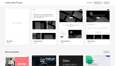
When you click “New Project,” Webflow will offer you a few options to start with: a blank site, three common presets, and an impressive list of ready-to-use templates. Some of the templates that you find on this page are integrated with the CMS which means that you can create CMS-based content in Webflow.
(Large preview)
Templates are great when you want to get up and running very quickly, but since our goal is to learn how to create the design ourselves, we will choose “Blank Site.”
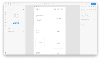
As soon as you create a new project, we will see Webflow’s front-end design interface. Webflow provides a series of quick how-to videos. They are handy for anyone who’s using Webflow for the first time.

(Large preview)
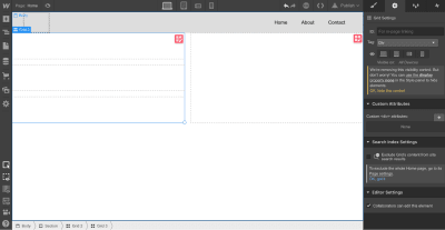
Once you’ve finished going through the introduction videos, you will see a blank canvas with menus on both sides of the canvas. The left panel contains elements that will help you define your layout’s structure and add functional elements. The right panel contains styling settings for the elements.
(Large preview)
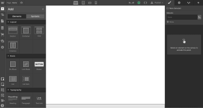
Let’s define the structure of our page first. The top left button with a plus (+) sign is used to add elements or symbols to the canvas. All we have to do to introduce an element/visual block is to drag the proper item to the canvas.
(Large preview)
While elements should be familiar for anyone who builds websites, Symbols can still be a new concept for many people. Symbols are analogous to features of other popular design tools, like the components in Figma and XD. Symbols turn any element (including its children) into a reusable component. Anytime you change one instance of a Symbol, the other instances will update too. Symbols are great if you have something like a navigation menu that you want to reuse constantly through the site.
Webflow provides a few elements that allow us to define the structure of the layout:
- Sections. Sections divide up distinct parts of your page. When we design a page, we usually tend to think in terms of sections. For instance, you can use Sections for a hero area, for a body area, and a footer area.
- Grid, columns, div block, and containers are used to divide the areas within Sections.
- Components. Some elements (e.g. navigation bar) are provided in ready-to-use components.
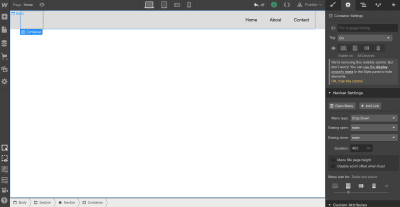
Let’s add a top menu using the premade component Navbar which contains three navigation options and placeholders for the site’s logo:
(Large preview)
Let’s create a Symbol for our navigation menu so we can reuse it. We can do that by going to “Symbols” and clicking “Create New Symbol.” We will give it the name “Navigation.”
Notice that the section color turned to green. We also see how many times it’s used in a project (1 instance). Now when we need a menu on a newly created page, we can go to the Symbols panel and select a ready-to-use “Navigation.” If we decide to introduce a change to the Symbol (i.e., rename a menu option), all instances will have this change automatically.

(Large preview)
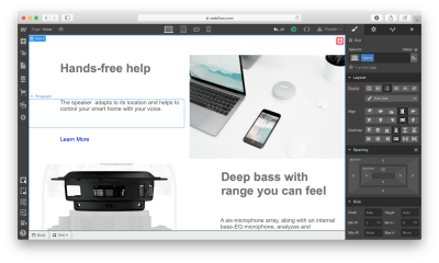
Next, we need to define the structure of our hero section. Let’s use Grid for that. Webflow has a very powerful Grid editor that simplifies the process of creating the right grid — you can customize the number of columns and rows, as well as a gap between every cell. Webflow also supports nested grid structure, i.e. one grid inside the other. We will use a nested grid for a hero section: a parent grid will define the image, while the child grid will be used for the Heading, text paragraph, and call-to-action button.
(Large preview)
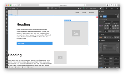
Now let’s place the elements in the cells. We need to use Heading, Paragraph, Button, and Image elements. By default, the elements will automatically fill out the available cells as you drag and drop them into the grid.
(Large preview)
While it’s possible to customize the styling for text and images and add real content instead of dummy placeholders, we will skip this step and move to the other parts of the layout: the zig-zag layout.
For this layout, we will use a 2×3 grid (2 columns × 3 rows) in which every cell that contains text will be divided into 3 rows. We can easily create the first cell with a 3-row grid, but when it comes to using the same structure for the third cell of the master grid, we have a problem. Since Webflow automatically fills the empty cells with a new element, it will try to apply the 3-row child grid to the third element. To change this behavior, we need to use Manual. After setting the grid selection to Manual, we will be able to create the correct layout.

(Large preview)
Similar to the hero section, we will add the dummy context to the grid sections. We will change the data after we finish with the visual layout.
(Large preview)
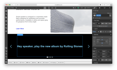
Now we need to define a section with voice commands. To save space, we will use a carousel. Webflow has a special element for that purpose: Slider.
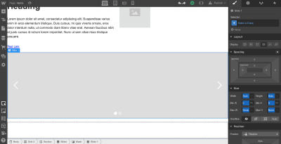
(Large preview)
Once we have all the required elements in place, we can create a vertical rhythm by adjusting the position of every item that we use. First, we need to adjust the spacing of elements in grids. Change the margin and paddings and Align self for the image in order to place it in the center of the cell.
(Large preview)
Now it’s time to replace the dummy content with real content. To start adding images, we’ll need to click on the gear icon for the Image element and select the image of our choice.
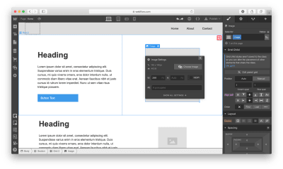
(Large preview)
Notice that Webflow stores all images in a special area called Assets. Any media we add, whether it’s a video or image, goes straight to that area.
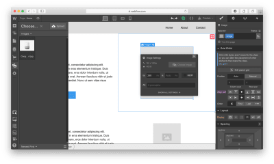
(Large preview)
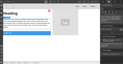
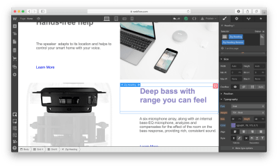
After we introduce an image to the layout, we need to modify the Heading and Text sections.

(Large preview)
Webflow provides a visual style for every element we use in our design. Let’s take a Heading section as an example: It’s possible to play with font color, font, weight, spacing, shadows, and other visual properties of this object. Here is what we will have when adding real copy and playing with font color.

(Large preview)
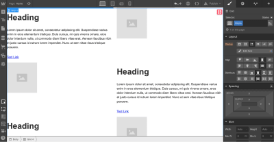
Once we have a nice and clean hero section, we can add content to our zig-zag layout.
Notice that every time we style something, we give it a Selector (a class), so Webflow will know that the style should be applied specifically for this element. We can use the same class to style other elements. In our case, we need the same style for images, headings, descriptions, and links that we have in the zig-zag layout.

Applying the same “benefit” style for all images in the zig-zag section. (Large preview)
Webflow also allows creating combo classes — when one class is used as a base class, and another class is used to override the styling options of the base class. In the example below, we override the default font color of the Heading using the class “Zig-Heading-Second.” Combo classes can save you a lot of time because you won’t need to create a style from scratch.
Using a combo class for the Heading. The orange indicator is used to highlight the properties that were inherited from the base class. (Large preview)
Here is how our layout will look like after the changes:
(Large preview)
Webflow provides a very helpful feature for aligning content named “guide overlay” which can be located in the left menu panel. When you enable the guide, you will see the elements that are breaking the grid.

(Large preview)
After finishing with a zig-zag layout, we need to add information on voice commands in the Slider. Add a Heading section in a relevant slide and change the visual styling options of this object.
(Large preview)
It’s that simple!
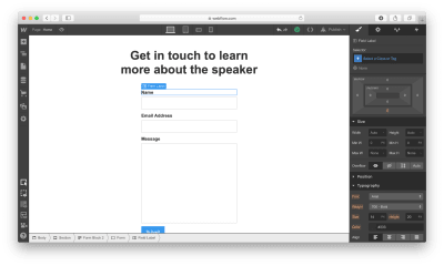
Last but not least, we need to add a contact form to our website. Let’s add a section right underneath of Slider.
There are two ways we can add a form to the page. First, Webflow has a special element for web forms called Form Block. A form created using Form Block has three elements: Name, Email Address, and a Submit button. For our form, we will need a Message field. We can easily create one by duplicating the element Email Address and renaming it. By default, the Form Block has 100% width alignment, meaning it will take the entire width of the container. We will use the Grid settings to adjust the form width.
(Large preview)
Secondly, Webflow allows integrating custom code right in the page. It means that we can create a form in a tool like Typeform, copy the embed code it provides and place it to the component called Embed that we placed to the section. Note that embeds will only appear once the site has been published or exported — not while you’re designing the site.

(Large preview)
Once all elements are in place, we need to optimize our design for mobile. Almost half of the users (globally) access websites on mobile. What you can do within Webflow is to resize the browser window so that you can see how your design looks like with different breakpoints.
Let’s change our view to Mobile by clicking on the Mobile – Portrait icon.
(Large preview)
As you can see, the design looks bad on mobile. But it’s relatively easy to optimize the design using Webflow: It allows you to change the order of elements, the spacing between elements, as well as other visual settings to make the design look great on mobile.
(Large preview)
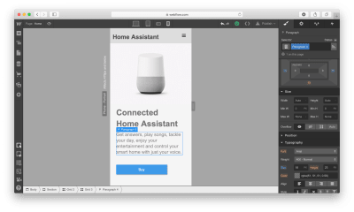
After we’re done making changes to our design, we have two options: we can export the design and use it on our own web hosting (i.e., integrate it into your existing CMS) or we can use Webflow’s own hosting provided. If we decide to use the second option, we need to click the Publish button and select the relevant publishing options, i.e. either publish it on the webflow.io domain or on a custom domain.
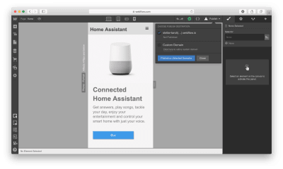
(Large preview)
If you decide to export the code, Webflow will prepare a full zip with HTML, CSS, and all the assets you’ve used to create your design. The exported code will help you build a solid foundation for your product.
Conclusion
Webflow is an excellent tool for building high-fidelity prototypes and inviting feedback from team members and stakeholders. People who will review your prototype won’t need to imagine how the finished product will behave and look — they can experience it instead!
The tool simplifies the transition from a prototype into a fully finished UI because you’re designing products with real code, as opposed to creating clickable mocks in Sketch or any other prototyping tool. You won’t waste time by using one piece of software to build prototypes and another to turning those prototypes into real products. Webflow solves this problem for you.
(ms, ra, il)
From our sponsors: Webflow: The Web Development Platform Of The Future


