Archived
Overflow And Data Loss In CSS

Overflow And Data Loss In CSS
Overflow And Data Loss In CSS
Rachel Andrew
2019-09-04T12:30:59+02:00
2019-09-04T12:35:19+00:00
CSS is designed to keep your content readable. If you consider an HTML document that is marked up with headings and paragraphs (with no CSS applied), it displays in the browser in a readable way. The headings are large and bold, and the paragraphs have space between them which is controlled by the browser default stylesheet. As soon as you want to change the layout of your page, however, you start to take some of the control into your own hands. In some cases, this will mean that you give yourself the job of dealing with overflow.
In this article, I’m going to take a look at the different ways we encounter overflow on the web. We’ll see how new layout methods and new values in CSS can help us to deal with overflow and create less fragile designs. I’ll also explain one of the fundamental concepts behind the design of CSS — that of avoiding data loss.
CSS Lists, Markers, And Counters
There is more to styling lists in CSS than you might think. Let’s take a look at lists in CSS, and moving onto some interesting features defined in the CSS Lists specification: markers and counters. →
What Do We Mean By Overflow?
If we look back a few years (before the advent of layout methods such as Flexbox and Grid Layout), then consider being handed a design like the one below. A very simple layout of three boxes, different amounts of content in each, but the bottom of those boxes needs to line up:
A neat set of boxes (Large preview)
With a floated layout, such a seemingly straightforward task was impossible. When floated, each box has no relationship to its neighbor; this means that has no way to know that the next door box is taller and to grow to match the height.

The box bottoms do not align (Large preview)
Sometimes, in an attempt to make things line up, designers would then restrict the height of the boxes by second-guessing the amount of content in order to make the boxes tall enough to match. Of course, things are never that simple on the web and when the amount of content differed, or the text size was larger, the text would start to poke out of the bottom of the box. It would overflow.

Overflow caused by fixing the box heights (Large preview)
This would sometimes lead to people asking how they could prevent too much content getting into the site. I’ve had people in support for my own CMS product asking how to restrict content for this very reason. They tell me that this extra content is “breaking the design”. For those of us who understood that not knowing how tall things were was a fundamental nature of web design, we would create designs that hid the lack of equal height boxes. A common pattern would have a gradient fading away — to mask the unevenness. We would avoid using background colors and borders on boxes. Or, we would use techniques such as faux columns to create the look of full-height columns.
This inability to control the height of things in relationship to other things therefore influenced web design — a technical limitation changing the way we designed. (I enjoy the fact that with Flexbox and Grid.) Not only did this problem disappear but the default behavior of these new layout methods is to stretch the boxes to the same height. The initial value of align-items is stretch, which causes the boxes to stretch to the height of the grid area or flex container.
See the Pen [Equal Height Boxes](https://codepen.io/rachelandrew/pen/VwZzxjV) by Rachel Andrew.
See the Pen Equal Height Boxes by Rachel Andrew.
In addition, CSS Grid gives us a nice way to ask for things to be at least a certain size, but grow larger if they need to. If you set a track size using the minmax() function, you can see a minimum and maximum size for the track. Setting rows to minmax(200px, auto) means that the track will always be at least 200 pixels in the block dimension — even if the grid items are empty. If, however, the content of a grid item means that it will be larger than 200 pixels, with the max set to auto it can grow. You can see this in the example below: The first row is 200 pixels as there are no items making it larger. The second row has a grid item with more content in than will fit, and so auto is being used and the track has grown larger than 200 pixels.
See the Pen [Minmax()](https://codepen.io/rachelandrew/pen/zYOdjKP) by Rachel Andrew.
See the Pen Minmax() by Rachel Andrew.
The minmax() function gives you the ability to create designs that look as if they have that perfect fixed size. In an ideal world (when the amount of content is pretty much as you expected), you will get those nice uniform rows. However, if additional content is added, there will be no overflow as there would be if you had fixed the height of the rows to 200 pixels. The row will expand; it might not be exactly what you wanted as a designer, but it will not be unreadable.
Inline Overflow
The potential for overflow happens whenever we restrict the size of things. In the above example, I am describing restriction in the block dimension, which horizontal language users will think of as height. However, we can also end up with overflow in the inline direction if we restrict the inline size or width of a box. This is something that we see in the “CSS is Awesome” meme:
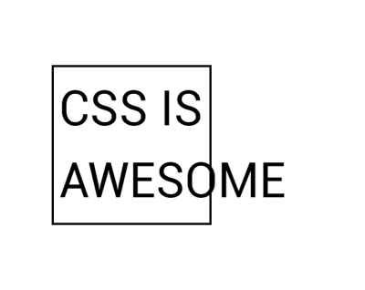
The ‘CSS Is Awesome’ meme (Large preview)
The author of this meme commented on a CSS-Tricks post about it saying,
“I do have a slightly better grasp on the concept of overflow now, but at the time it just blew my mind that someone thought the default behavior should be to just have the text honk right out of the box, instead of just making the box bigger like my nice, sensible tables had always done.”
So why does CSS make the text “honk right out of the box” rather than grow the box?
In the meme, you have overflow in the inline direction. The word “awesome” is larger than the width applied to the box, and so it overflows. CSS fairly reasonably assumes that if you have made the box a certain width, you want the box that width. Perhaps it needs to fit into a layout which would break if boxes suddenly became larger than set.
That particular issue (i.e. the need to set sizes on everything in a layout and making sure they did not total more than the available inline size of the container) is something that our modern layout methods have addressed for us. If we imagine that our box had that absolute inline size so that it could fit in a line with other boxes in a float-based grid, today you might choose to approach that layout using Flexbox.
With the floated layout, you have to set the sizing on each item — potentially before you know what the content will be. You will then have big things forced into small containers and small things left with a lot of space around them.
Items in a floated layout need to have a width set (Large preview)
However, if we use Flexbox, we can allow the browser to work out how much space to assign each item. Flexbox will then ensure that bigger things get assigned more space while smaller things get less. This squishy sizing means that the box that contains the word “awesome” will grow to contain the box, and the text won’t honk right out or overlap anything else. Overflow issue solved; this behavior is really what Flexbox was designed for. Flexbox excels at taking a bunch of unevenly sized stuff and returning the most useful layout for those things.
Flexbox distributes space between the items (Large preview)
Outside of Flexbox, it is possible to tell our box to be as big as is needed for the content and no more. The min-content keyword can be used as a value for width or inline-size if working with flow-relative logical properties. Set width: min-content and the box grows just as big as is needed to contain the word “awesome”:
See the Pen [Awesome with min-content](https://codepen.io/rachelandrew/pen/LYPjmbJ) by Rachel Andrew.
See the Pen Awesome with min-content by Rachel Andrew.
Avoiding Data Loss
The reason that the box overflows as it does (with the word escaping from the border of the box), is that the default value for the overflow property is visible. You could (if you wanted) manage that overflow in a different way. For example, using overflow: auto or overflow: scroll would give your box scrollbars. This is probably not something you want in this scenario, but there are design patterns where a scrolling box is appropriate.
Another possibility would be to decide that you are happy to crop the overflow by using overflow: hidden. Perhaps you might think that hiding the overflow would have been a better default, however, the fact that CSS chooses to make the overflow visible by default (and not hidden) is a clue to a core value of designing CSS. In CSS (as in most places), we try to avoid data loss. When we talk about data loss in CSS, we are typically describing some of your content going missing. In the case of overflow: hidden, the overflowing content disappears. This means that we have no way to get to it to see what we have missed out on.
In some cases, this could be a real problem. If you have managed to create a design so fragile that the button of your form is in the cropped-off area, your user has no ability to complete the form. If the final paragraph is trimmed off, we never know how the story ends! Also, the problem with things vanishing is that it isn’t always obvious that they have gone. As the designer, you may not spot the problem, especially if it only happens in certain viewport sizes in a responsive design. Your users may not spot the problem — they just don’t see the call to action, or think it is somehow their problem they can’t place their order and so go away. However, if things overflow messily, you will tend to spot it. Or, at worse, someone using the site will spot it and let you know.
So this is why CSS overflows in a messy, visible way. By showing you the overflow, you are more likely to get a chance to fix it than if it hides the overflow. With the overflow property, however, you get a chance to make the decision yourself about what should happen. If you would prefer the overflow be cropped (which may be the right decision in some cases), use overflow: hidden.
Data Loss And Alignment
The better alignment abilities we have gained in recent years also have the potential for data loss. Consider a column of flex items that are up against the edge of the viewport and with different sizes. Aligned to flex-start, the items all stick out more to the right. Aligned to center, however, the longer item would actually end up off the side of the viewport. Alignment could therefore cause data loss.
To prevent accidental data loss caused by alignment, CSS now has some new keywords which can be used along with the alignment properties. These are specified in the Box Alignment specification — the specification which deals with alignment across all layout methods including Grid and Flexbox. They are currently only supported in Firefox. In our example above, if we set align-items: safe center, then the final item would become aligned to start rather than forcing the content to be centered. This would prevent the data loss caused by the item being centered and therefore pushed off the side of the viewport.
If you do want the alignment (even if it would cause overflow), then you can specify unsafe center. You’ve then requested that the browser does your chosen alignment no matter what then happens to the content. If you have Firefox, then you can see the two examples: one with safe and the second with unsafe alignment.
See the Pen [Safe and unsafe alignment](https://codepen.io/rachelandrew/pen/QWLMrpE) by Rachel Andrew.
See the Pen Safe and unsafe alignment by Rachel Andrew.
In the talk on which I based this article, I described web design as being a constant battle against overflow. One of the truths of designing for the web is that it’s very hard to know how tall or how large (in the block dimension any element that contains text will be. However, as I have shown above, we have never had so many ways to manage overflow or the potential of overflow. This means that our designs can be far more resilient, and we can create patterns that will work with varying amounts of content. These might seem like small shifts in our capabilities, but I think the possibilities they open up to us are huge.
(il)
From our sponsors: Overflow And Data Loss In CSS


