Archived
Common CSS Issues For Front-End Projects

Common CSS Issues For Front-End Projects
Common CSS Issues For Front-End Projects
Ahmad Shadeed
2018-12-27T13:30:11+01:00
2018-12-27T12:44:54+00:00
When implementing a user interface in a browser, it’s good to minimize those differences and issues wherever you can, so that the UI is predictable. Keeping track of all of those differences is hard, so I’ve put together a list of common issues, with their solutions, as a handy reference guide for when you’re working on a new project.
Let’s begin.
1. Reset The Backgrounds Of button And input Elements
When adding a button, reset its background, or else it will look different across browsers. In the example below, the same button is shown in Chrome and in Safari. The latter adds a default gray background.
(Large preview)
Resetting the background will solve this issue:
button {
  appearance: none;
  background: transparent;
  /* Other styles */
}
See the Pen Button and Inputs by Ahmad Shadeed (@shadeed) on CodePen.
Front-end is messy and complicated these days. That’s why we publish articles, printed books and webinars with useful techniques to improve your work. Even better: Smashing Membership with a growing selection of front-end & UX goodies. So you get your work done, better and faster.
Explore Smashing Membership ↬
2. Overflow: scroll vs. auto
To limit the height of an element and allow the user to scroll within it, add overflow: scroll-y. This will look good in Chrome on macOS. However, on Chrome Windows, the scroll bar is always there (even if the content is short). This is because scroll-y will show a scroll bar regardless of the content, whereas overflow: auto will show a scroll bar only when needed.
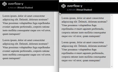
Left: Chrome on macOS. Right: Chrome on Windows. (Large preview)
.element {
    height: 300px;
    overflow-y: auto;
}
See the Pen overflow-y by Ahmad Shadeed (@shadeed) on CodePen.
3. Add flex-wrap
Make an element behave as a flex container simply by adding display: flex. However, when the screen size shrinks, the browser will display a horizontal scroll bar in case flex-wrap is not added.
<div class="wrapper">
  <div class="item"></div>
  <div class="item"></div>
  <div class="item"></div>
  <div class="item"></div>
  <div class="item"></div>
  <div class="item"></div>
</div>
.wrapper {
  display: flex;
}

.item {
  flex: 0 0 120px;
  height: 100px;
}
The example above will work great on big screens. On mobile, the browser will show a horizontal scroll bar.

Left: A horizontal scroll bar is shown, and the items aren’t wrapped. Right: The items are wrapped onto two rows. (Large preview)
The solution is quite easy. The wrapper should know that when space is not available, it should wrap the items.
.wrapper {
    display: flex;
    flex-wrap: wrap;
}
See the Pen flex-wrap by Ahmad Shadeed (@shadeed) on CodePen.
4. Don’t Use justify-content: space-between When The Number Of Flex Items Is Dynamic
When justify-content: space-between is applied to a flex container, it will distribute the elements and leave an equal amount of space between them. Our example has eight card items, and they look good. What if, for some reason, the number of items was seven? The second row of elements would look different than the first one.

The wrapper with eight items. (Large preview)

The wrapper with seven items. (Large preview)
See the Pen justify-content by Ahmad Shadeed (@shadeed) on CodePen.
In this case, using CSS grid would be more suitable.
5. Long Words And Links
When an article is being viewed on a mobile screen, a long word or inline link might cause a horizontal scroll bar to appear. Using CSS’ word-break will prevent that from happening.
Large preview
.article-content p {
    word-break: break-all;
}
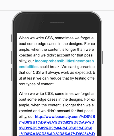
(Large preview)
Check out CSS-Tricks for the details.
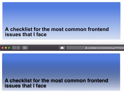
6. Transparent Gradients
When adding gradient with a transparent start and end point, it will look black-ish in Safari. That’s because Safari doesn’t recognize the keyword transparent. By substituting it with rgba(0, 0, 0, 0), it will work as expected. Note the below screenshot:
Top: Chrome 70. Bottom: Safari 12. (Large preview)
.section-hero {
  background: linear-gradient(transparent, #d7e0ef), #527ee0;
  /*Other styles*/
}
This should instead be:
.section-hero {
  background: linear-gradient(rgba(0, 0, 0,0), #d7e0ef), #527ee0;
  /*Other styles*/
}
7. The Misconception About The Difference Between auto-fit And auto-fill In CSS Grid
In CSS grid, the repeat function can create a responsive column layout without requiring the use of media queries. To achieve that, use either auto-fill or auto-fit.
.wrapper {
    grid-template-columns: repeat(auto-fill, minmax(100px, 1fr));
}

(Large preview)
In short, auto-fill will arrange the columns without expanding their widths, whereas auto-fit will collapse them to zero width but only if you have empty columns. Sara Soueidan has written an excellent article on the topic.
8. Fixing Elements To The Top Of The Screen When The Viewport Is Not Tall Enough
If you fix an element to the top of the screen, what happens if the viewport is not tall enough? Simple: It will take up screen space, and, as a result, the vertical area available for the user to browse the website will be small and uncomfortable, which will detract from the experience.
@media (min-height: 500px) {
    .site-header {
        position: sticky;
        top: 0;
        /*other styles*/
    }
}
In the snippet above, we’re telling the browser to fix the header to the top only if the viewport’s height is equal to or greater than 500 pixels.
Also important: When you use position: sticky, it won’t work unless you specify the top property.
 Large preview
See the Pen Vertical media queries: Fixed Header by Ahmad Shadeed (@shadeed) on CodePen.
9. Setting max-width For Images
When adding an image, define max-width: 100%, so that the image resizes when the screen is small. Otherwise, the browser will show a horizontal scroll bar.
img {
    max-width: 100%;
}
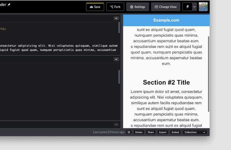
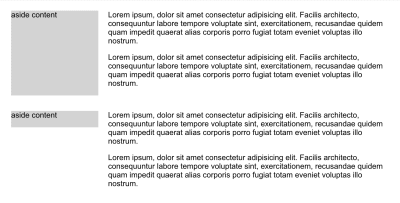
10. Using CSS Grid To Define main And aside Elements
CSS grid can be used to define the main and aside sections of a layout, which is a perfect use for grid. As a result, the aside section’s height will be equal to that of the main element, even if it’s empty.
To fix this, align the aside element to the start of its parent, so that its height doesn’t expand.
.wrapper {
  display: grid;
  grid-template-columns: repeat(12, minmax(0, 1fr));
  grid-gap: 20px;
}

// align-self will tell the aside element to align itself with the start of its parent.
aside {
  grid-column: 1 / 4;
  grid-row: 1;
  align-self: start;
}

main {
  grid-column: 4 / 13;
}
(Large preview)
See the Pen main and aside by Ahmad Shadeed (@shadeed) on CodePen.
11. Adding fill To An SVG
Sometimes, while working with SVGs, fill won’t work as expected if the fill attribute has been added inline in the SVG. To solve this, either to remove the fill attribute from the SVG itself or override fill: color.
Take this example:
.some-icon {
    fill: #137cbf;
}
This won’t work if the SVG has an inline fill. It should be this instead:
.some-icon path {
    fill: #137cbf;
}
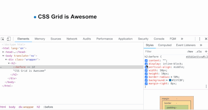
12. Working With Pseudo-Elements
I love to use pseudo-elements whenever I can. They provide us with a way to create fake elements, mostly for decorative purposes, without adding them to the HTML.
When working with them, the author might forget to do one of the following:
- add the
content: ""property, - set the
widthandheightwithout defining thedisplayproperty for it.
In the example below, we have a title with a badge as a pseudo-element. The content: "" property should be added. Also, the element should have display: inline-block set in order for the width and height to work as expected.
 Large preview
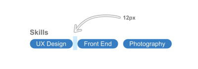
13. The Weird Space When Using display: inline-block
Setting two or more elements to display: inline-block or display: inline will create a tiny space between each one. The space is added because the browser is interpreting the elements as words, and so it’s adding a character space between each one.
In the example below, each item has a space of 8px on the right side, but the tiny space caused by using display: inline-block is making it 12px, which is not the desired result.
li:not(:last-child) {
  margin-right: 8px;
}
(Large preview)
A simple fix for this is to set font-size: 0 on the parent element.
ul {
    font-size: 0;
}

li {
    font-size: 16px; /*The font size should be reassigned here because it will inherit `font-size: 0` from its parent.*/
}

(Large preview)
See the Pen Inline Block Spacing by Ahmad Shadeed (@shadeed) on CodePen.
14. Add for="ID" When Assigning A Label Element To An Input
When working with form elements, make sure that all label elements have an ID assigned to them. This will make them more accessible, and when they’re clicked, the associated input will get focus.
<label for="emailAddress">Email address:</label>
<input type="email" id="emailAddress">
 Large preview
15. Fonts Not Working With Interactive HTML Elements
When assigning fonts to the whole document, they won’t be applied to elements such as input, button, select and textarea. They don’t inherit by default because the browser applies the default system font to them.
To fix this, assign the font property manually:
input, button, select, textarea {
  font-family: your-awesome-font-name;
}
16. Horizontal Scroll Bar
Some elements will cause a horizontal scroll bar to appear, due to the width of those elements.
The easiest way to find the cause of this issue is to use CSS outline. Addy Osmani has shared a very handy script that can be added to the browser console to outline every element on the page.
[].forEach.call($$("*"), function(a) {
  a.style.outline =
"1px solid #" + (~~(Math.random() * (1 
(Large preview)
17. Compressed Or Stretched Images
When you resize an image in CSS, it could be compressed or stretched if the aspect ratio is not consistent with the width and height of the image.
The solution is simple: Use CSS’ object-fit. Its functionality is similar to that of background-size: cover for background images.
img {
    object-fit: cover;
}

(Large preview)
Using object-fit won’t be the perfect solution in all cases. Some images need to appear without cropping or resizing, and some platforms force the user to upload or crop an image at a defined size. For example, Dribbble accepts thumbnails uploads at 800 by 600 pixels.
18. Add The Correct type For input.
Use the correct type for an input field. This will enhance the user experience in mobile browsers and make it more accessible to users.
Here is some HTML:
<form action="">
  <p>
    <label for="name">Full name</label>
    <input type="text" id="name">
  </p>
  <p>
    <label for="email">Email</label>
    <input type="email" id="email">
  </p>
  <p>
    <label for="phone">Phone</label>
    <input type="tel" id="phone">
  </p>
</form>
This is how each input will look once it’s focused:
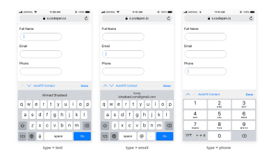
(Large preview)
19. Phone Numbers In RTL Layouts
When adding a phone number like + 972-123555777 in a right-to-left layout, the plus symbol will be positioned at the end of the number. To fix that, reassign the direction of the phone number.
p {
    direction: ltr;
}
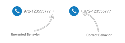
(Large preview)
Conclusion
All of the issues mentioned here are among the most common ones I’ve faced in my front-end development work. My goal is to keep a list to check regularly while working on a web project.
Do you have an issue that you always face in CSS? Let us know in the comments!
(dm, ra, al, yk, il)
From our sponsors: Common CSS Issues For Front-End Projects


