Archived
Designing Complex Responsive Tables In WordPress

Designing Complex Responsive Tables In WordPress
Suzanne Scacca 2019-09-24T13:00:59+02:00
2019-09-24T12:36:35+00:00
(This is a sponsored article.) Mobile devices can be problematic for displaying complex tables and charts that would otherwise stretch the entire width of a laptop or desktop screen. This may leave some of you wondering whether it’s even worth showing tables to mobile and tablet visitors of your website.
But that doesn’t make sense. In many cases, a table isn’t some stylistic choice for displaying content on a website. Tables are critical elements for gathering, organizing and sharing large quantities of complex and valuable data. Without them, your mobile visitors’ experience will be compromised.
You can’t afford to leave out the data. So, what do you do about it?
This requires a more strategic solution. This means understanding what purpose the data serves and then designing the complex web table in a way that makes sense for mobile consumption.
A WordPress table plugin called wpDataTables has made light work of designing both desktop and mobile compatible tables, so I’ve included examples of these complex tables throughout this post. Keep reading to explore the possibilities.
The Most Common Use Cases For Tables On The Web
There’s a lot of value in presenting data in a table format on a website.
Your writers could probably find a way to tackle each data point one-by-one or to provide a high-level summary of the data as a whole. However, when data is handled this way, your visitors are left with too much work to do, which will only hinder the decision-making process.
On the other hand, tables are great for organizing large quantities of data while also giving visitors an easier way to sift through the data on their own.
As such, your visitors would greatly benefit from having complex data sets presented as tables — across a wide variety of use cases, too.
Feature Lists
There are a couple of ways to use tables to show off product features.
For e-commerce sites, the product inventory is broken up by its most pertinent features, allowing visitors to filter their results based on what’s most important to them:
This would be great for any large vendor that has dozens or hundreds of similar-looking products they want customers to be able to filter and sort through.
You could also use a table to compare your product’s features directly against the competition’s. This would be better for a third-party marketplace where vendors sell their goods.
Amazon includes these kinds of tables:
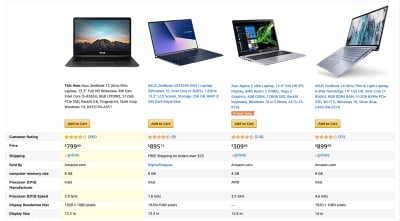
By displaying the data in this format, customers can quickly do a side-by-side comparison of similar products to find the one that checks off all their requirements.
Pricing Tables
If you’re designing a website where services or memberships are sold instead of products, you can still use tables to display the information.
You’ll find a good example of this on the BuzzSumo website:

Even though there’s less data to compile, you can see how the structure of the table and the stacking of the services side-by-side really help visitors make a more well-informed and easier buying decision.
Catalogs
A catalog is useful for providing visitors with an alphabetized or numerically ordered list. You might use one to organize a physical or digital inventory as this example demonstrates:
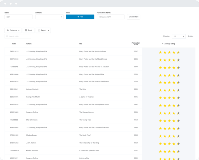
This would be good for bookstores, libraries and websites that have their own repository of reference material or content.
You might also use a catalog to help customers improve the accuracy of their orders:
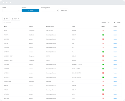
This type of table provides customers with key specifications of available products to ensure they’re ordering the right kinds of parts or equipment.
Best Of Lists
There are tons of resources online that provide rundowns of the “Top” winners or “Best Of” lists. Tables are a useful way to summarize the findings of the article or report before readers scroll down to learn more.
This is something that websites like PC Mag (and, really, any tech or product review site) do really well:
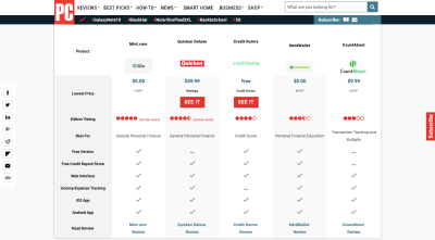
This helps readers get a sense for what’s to come. It also allows those who are short on time to make a faster decision.
Directory Tables
Directory websites have ever-growing and regularly updated lists of data. These are your real estate listing sites, travel sites, professional directories and other sites containing high volumes of complex data that really shouldn’t be consumed without a filterable table.
Case in point: this list of available apartments:
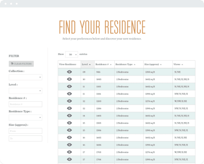
This makes it much easier for visitors to see all options in a single glance, rather than have to go one-by-one through individual entries that matched a search query.
General Data
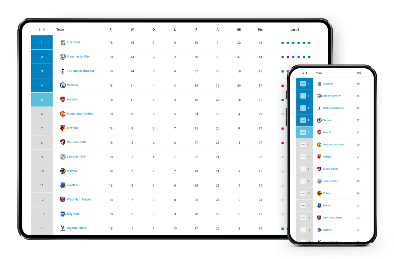
There are other data lists that are just too complex to handle as loose text. Sports data, for instance, should always be presented in this format:

You can see how this keeps all data in one place and in a searchable list. Whether visitors are looking for their home team’s stats, or want to compare the performance of different teams from their fantasy sports league, it’s all right there.
How To Design Complex Responsive Tables
Regardless of what type of data you’re tasked with presenting on a website, the goal is to do so in a clear fashion so visitors can take quicker action.
Now, it’s time to figure out how to best format this data for mobile visitors.
Delete, Delete, Delete
If your client has pulled their data from an automated report, they may not have taken time to clean up the results. So, before you start any design work on the table, I would suggest reviewing the data they’ve given you.
First, ask yourself: Is there enough data that it warrants a table?
If it’s a simple and small enough list, it might make more sense to ditch the table.
Then, go over each column: Is each of these useful?
You may find that some of the columns included aren’t necessary and can be stripped out altogether.
You may also find that some columns, while an essential part of each item’s individual specifications list, won’t help visitors make a decision within the table. This would be the case if the column contains an identical data point for every item.
Finally, talk to your writer or data manager: Is there any way to shorten the columns?
The table’s labels and data may have been written in full, but your writer may have a way to simplify the responses without compromising on comprehension.
When possible, have them work their magic to shrink up the text so that columns don’t take up as much space and more can be revealed on mobile. Don’t just do this for mobile users either. Even on desktop and tablet screens where more screen real estate is available, the shortening of labels can help conserve space.
It may be as simple as changing the word “Rank” to the number symbol (#) and abbreviating “Points” as “Pts”.

While it might not seem like one word will make much of a difference, it adds up the more complex and lengthier your tables are.
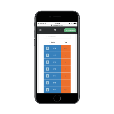
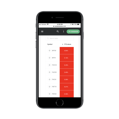
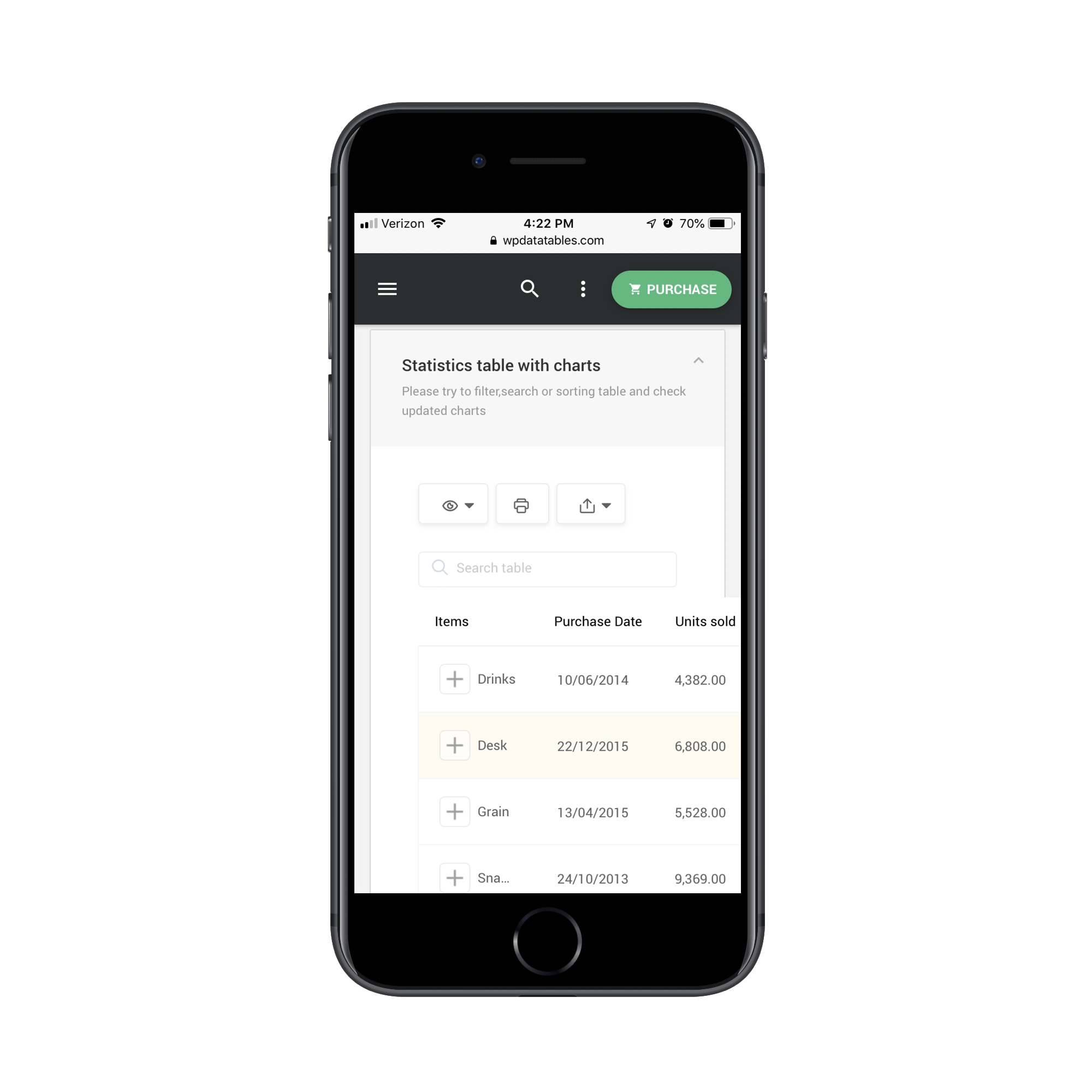
Start With Two Columns
By default, mobile tables should always start with two columns. It’s about all the screen’s width will allow for without compromising the readability of the data within, so it’s best to start with the basics.
When you contrast a full-screen table on desktop against its counterpart on mobile, you can see how easy it is to identify the two columns to include. For example, a mobile statistics table includes a column for item type and one for the profits earned from each:
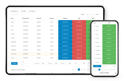
This doesn’t mean that all other data is lost on mobile. You just need to let visitors know how they can expand the table’s view.
In this example, when visitors select the eyeball icon above the table, they have the option to add more columns to the table:

In allowing for this option on mobile, your visitors can control how they consume data while also selecting only the data points that are most important to them.
The result will then look like this:

While users will have to scroll right to see the rest of the table, the control they wield over column views helps keep this a reasonable task. With just one scroll right, they’ll see the rest of the table:
This is a good option to have for lists of products where the side-by-side comparison is useful in expediting the decision-making process.
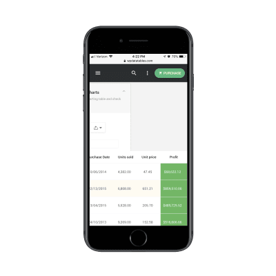
Use An Accordion For Standalone Entries
There’s another option you can include which will give visitors more control over how they view table content.
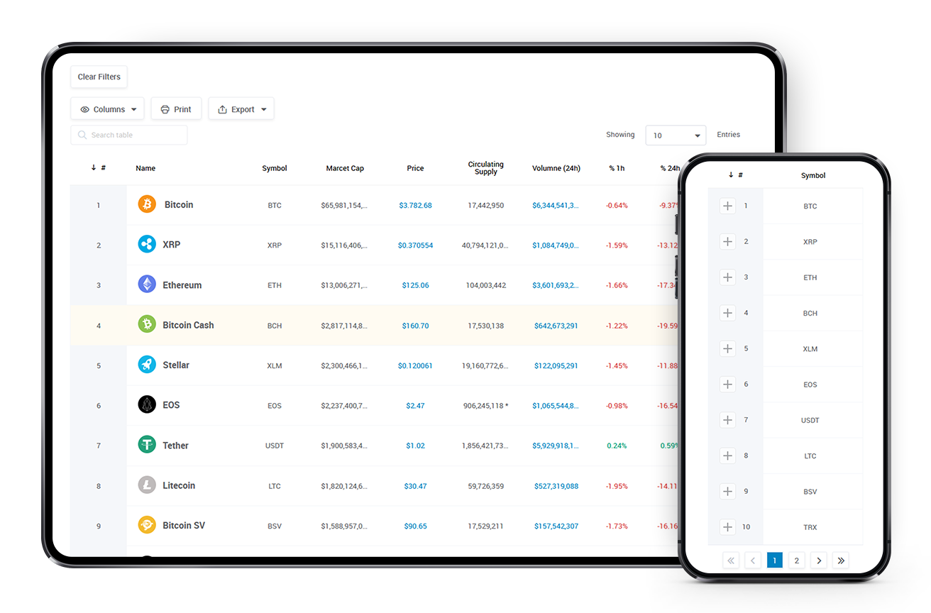
For this example, we’ll look at a list of available cryptocurrencies:

As you can see, the default here is still to only show two columns. In this case, though, a click of the plus-sign (+) will reveal a new way to view the table:

When open, all of the data that would otherwise force visitors to scroll right is now visible within a single screenful.
While you can certainly include an expandable accordion in any responsive table you create, it would be best suited to ones where a direct side-by-side comparison between products or services isn’t necessary.
Keep Vertical Scrolling To A Minimum
Just as you want to prevent your visitors from having to scroll past the horizontal boundaries of the mobile website’s pages, you should limit how much vertical scrolling they have to do as well.
Data consumption, in general, isn’t always an easy task, so the more you can minimize the work they have to do to get to it, the better.
One way to limit how much vertical scrolling your visitors do is by breaking a table with dozens or hundreds of rows into pages.
Just remember to make it easy for visitors to scroll through the pages. A well-designed set of pagination controls either at the top or bottom of the table would be useful:

This would be especially useful for a handful of pages. Anything more than that and the pagination process may become tedious.
You can also include a table search function directly above it:
This allows for a quick shortcut when your users have a good idea of what they’re looking for and want to jump straight to it.
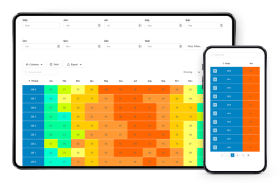
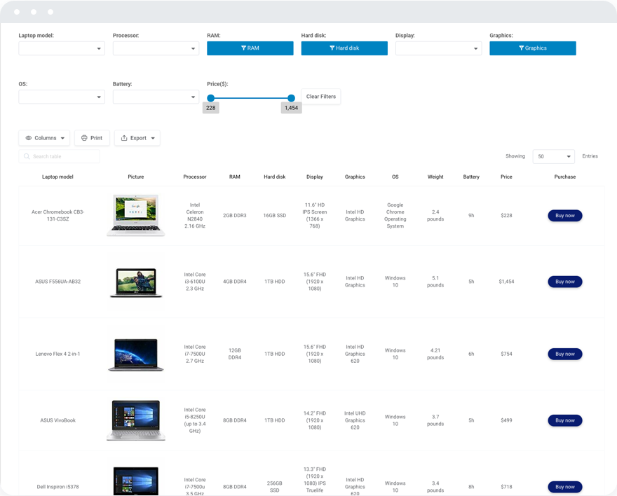
Include Both Filtering And Sorting For Larger Data Sets
So, let’s say that you have a very extensive list of data. You don’t want to force users to scroll through dozens of table pages, but you also can’t afford to remove any of the data sets. It’s all pertinent.
In that case, you’re going to hand some of the control back to your visitors. This way, their choices will determine how much of the table they end up seeing.
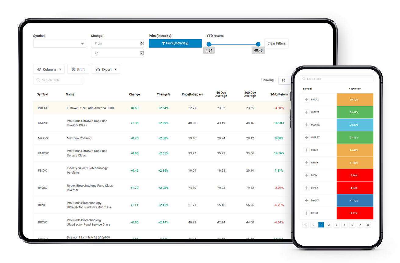
Let’s use this list of mutual funds as an example:
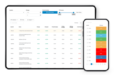
The image above is the default view visitors would see if they scrolled immediately to the table. However, they might find it to be intimidating and decide that filtering out bad results will improve the view:

What’s nice about including filters on mobile tables is that they function the same way your mobile contact forms do. So, visitors should have an easy time filling in and moving between fields, which will get them quicker to the results they want to see.
Another way to improve how their results are displayed is by using the sorting feature. When they click on the top label of any column, it will automatically sort the column in descending order. Another click will reverse it.
These two features are a must-have for any table you build, though they’re especially important for mobile visitors that don’t have as much time or attention to give to your tables.
Wrapping Up
You’re here because you want a better way to present complex tables to your mobile visitors.
The key to doing this right is by first familiarizing yourself with the kinds of tables you can create. Even if mobile devices limit how much can be seen at first glance, that doesn’t make it impossible to share that kind of data with them.
Next, you need to build user control into your tables, so that visitors can decide what they see and how they see it.
And, finally, you’d do well to find a tool built specifically for this complex task. For those of you building websites with WordPress, wpDataTables is a WordPress table plugin that’s able to create responsive tables and charts. It doesn’t matter how large your data set, or what use case it’s for, it will enable you to quickly and effectively organize and display responsive tables on your WordPress website.
(ms, yk, il)
From our sponsors: Designing Complex Responsive Tables In WordPress


