Archived
Bottom Navigation Pattern On Mobile Web Pages: A Better Alternative?
Bottom Navigation Pattern On Mobile Web Pages: A Better Alternative?
Bottom Navigation Pattern On Mobile Web Pages: A Better Alternative?
Arthur Leonov
2019-08-29T13:30:59+02:00
2019-08-29T12:35:26+00:00
Whenever you hear of “mobile navigation”, what’s the first thing that comes to mind? My guess would be the hamburger slide-out menu. This design pattern had been in use since the first responsive design days, and even though a lot has changed since then, this particular pattern has not. Why is that?
How did we start using the top navigation with the hamburger menu in the first place? Is there a better alternative? In this article, I will try to explore these questions.
The History Of The Top Navigation And The Hamburger
The first hamburger menu icons started appearing in the ‘80s. It was designed by Norm Cox for the Xerox Star — the world’s first graphical user interface. He also designed the document icon for the same interface. This piece of history was uncovered by Geof Allday (who actually emailed Norm Cox). You can read the whole email response by clicking here. Later, it was seen on Windows 1 &
and DOS.
The current mobile navigation — as we know it — was popularized by Ethan Marcotte’s “Responsive Web Design” book back in 2011. Since then, the top navigation and the hamburger became the industry’s standard.
The Mobile Phone Screen Size Doubled In 10 Years
Since the original iPhone, mobile sales have been increasing year after year. 2019 is the first year that the market reached saturation point and the sales have started to decrease. But that doesn’t mean people are not using phones. By 2020, we will spend 80% of our time on the Internet on mobile phones, reports Quartz and Ciodive. Compare that to 2010, when only a fourth of Internet users were phone-based.
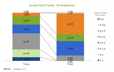
As phone sales increased, screen sizes have more than doubled, too. The average screen size of smartphones has increased from 3.2 inches all the way to 5.5 inches. In 2017, device makers started to adopt the taller 18:9 aspect ratio with 5.7-inch and 6-inch 18:9 displays. Now, we are starting to see 6-inch 18:9 displays become the new standard in flagships as well as in the mid-range price segments, as they have more screen area than 5.5-inch 16:9 displays, XDA-Developers reports.
An overview of how the mobile screen sizes have changed (Image source: Scientamobile) (Large preview)
Basically, the mobile phone screen size is getting bigger and bigger. That’s fine, but how do we adapt our design patterns to reflect these changes?
Thumb-Driven Design
I first heard of the term “thumb-driven design” from Vitaly Friedman. It’s based on the Steven Hoober’s and Josh Clark’s research on how people hold their devices.
The gist of it is that in nearly every case, three basic grips were most common. 49% held their phones with a one-handed grip, 36% cradled the phone in one hand and jabbed with the finger or thumb of the other, and the remaining 15% adopted the two-handed BlackBerry-prayer posture, tapping away with both thumbs, states Josh Clark. Steven Hoober had found that 75% of users touch the screen with only one thumb. Hence, the term thumb-driven design.
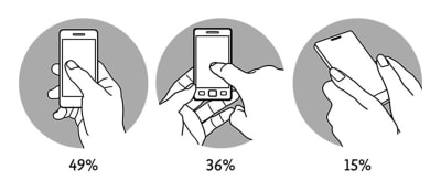
There are three main ways in which we hold our phones. (Large preview)
In 2016, Samantha Ingram wrote an article named “The Thumb Zone: Designing For Mobile Users” which further explores these ideas. She defined easy-to-reach, hard-to-reach and in-between areas.
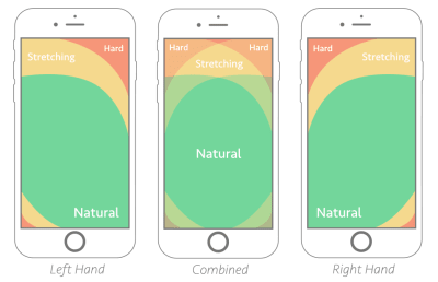
Thumb-zone mapping explained by Samantha Ingram (Large preview)
However, I would argue, that with increasing phone sizes, the mapping has shifted a bit:
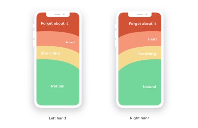
New thumb-zone mapping adjusted to larger screen sizes (Large preview)
When the phones were small, most areas were easy to reach. As our screens got bigger, the top part became virtually impossible to touch without adjusting your phone. From the example above, we can see where the most expensive screen real estate is. Yet, it’s often neglected on web pages. How can we fix this?
Bottom Navigation Pattern
Every now and then, bottom navigation pattern pops up on the web. The idea itself is quite simple: move the navigation bar further down.
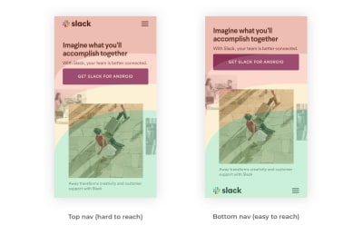
Slack web page navigation reimagined with new thumb-zone mapping (Large preview)
Positioning the navigation bar at the bottom makes it easier for users to click on the menu icon, while secondary items can be moved to the top. Basically, you simply switch the order. Mobile apps have been using this logic with the tap bar pattern. It’s not a new idea in itself, but it’s still not as popular in web design as it is in app design.
This is not a foolproof solution since it raises a few critical questions, but it’s a worthy alternative. Let’s explore some of the questions that may come up.
Primary And Secondary Items
As the top of the screen is becoming hard to reach, placing the primary menu items closer to the bottom is a better alternative. But what about the other things that are just as important?
I propose two ideas to tackle this problem:
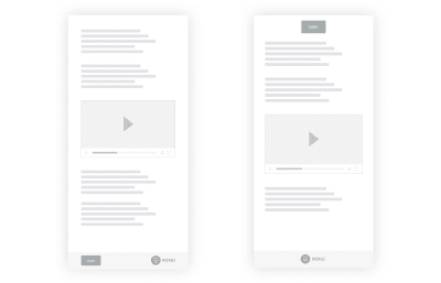
A wireframe of reimagined primary and secondary navigation items (Large preview)
How Will This Affect Scrolling With Large Menus?
Some websites have extensive menus, submenus and everything in between. Naturally, there will be scrolling involved. How does flipping the primary/secondary items work in this scenario?
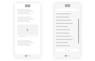
A wireframe of a reimagined large menu (Large preview)
Make the primary and secondary items (menu link, logo, search input) fixed while leaving the menu list scrollable. That way, your users will be able to reach the critical things they need.
Where Do You Place The Logo?
You might have concerns about the logo placement. There are two ways to go about it:
- Placing the logo at the bottom might be a bit awkward, however, the thumb will most likely not obstruct it. It can be missed, though, as we tend to scan top to bottom.
- A more reasonable option is to keep the logo at the top of the page, but not to have it fixed. Make it a part of the content so it goes away as you scroll. That way, people will still be able to see it perfectly.
As you can see, I used the menu label in the wireframe. Kevin Robinson had found that putting a label next to the icon increased engagement by 75%:
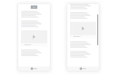
A wireframe of the logo placed at the top while the menu can be found at the bottom. (Large preview)
How Does This Work With Handlebars?
Some operating systems and browsers tend to use the bottom area of the screen for their own purposes. iOS handlebars can get in the way of bottom navigation. Make sure the navigation is spacious enough to accommodate the iOS safe area.
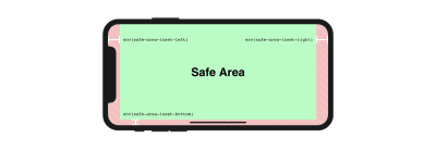
iOS Handlebars and safe areas (Large preview)
If you place the logo dead in the center, the link might clash with the handlebar functionality. A bit of padding will do the trick.
Will The Users Adjust To This Pattern Or Find It Disorentating?
As I was writing this article, I kept thinking of whether this would turn out into a big redesign or a simple usability improvement for users navigating through your website. After all, according to Jakob’s Law, users spend most of their time on other sites. This means that users prefer your site to work the same way as all the other sites they’re already familiar with.
As a counter-argument to Jakob’s Law, I would like to propose Fitts Law. It argues that the time to acquire a target is a function of the distance and size of the target. Basically, the smaller and further away the target is, the higher the interaction cost. NN/g has a wonderful video explaining this in more detail:
“A bottom hamburger menu icon will have a much lower interaction cost compared to the top menu icon because it’s closer. By placing the menu CTA near the thumb, we are allowing the user to reach it’s end goal faster. Would the users find the feature disorientating if it lowers their interaction cost? Probably not.”
How Will This Integrate With The Tap Bar Pattern?
A tap bar patterns lists three to five most common first-level actions to click on a single row. You may have seen it in popular apps and some websites:
Tap bar design by Mengyuan Sun (Large preview)
Hamburger menus have sparked a lot of controversy over the years. Just take a few moments to read this article, and this one, and this one, and most importantly, this one. You’ll then understand why the tap bar became the preferred navigation pattern in mobile app design.
Nielsen argues that hidden navigation (hamburger menu) significantly decreases user experience both on mobile and desktop. On mobile, people used the hidden navigation in 57% of the cases, and the combo navigation in 86% of the cases, i.e. 1.5 times more! The combo navigation that Nielsen refers to is a tab bar pattern combined with a hamburger menu — here’s an example:
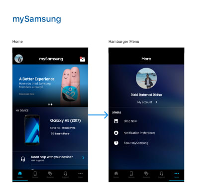
The Samsung app example from Rizki Rahmat Ridha for Muzli (Large preview)
It might seem like the tap bar is the perfect solution, but it has its problems too. Fabian Sebastian raised a good point that it only works on top-level views. It does not work with secondary navigation items. To solve this problem, a hamburger/tap bar hybrid was born. If you pay attention to the Samsung app, you’ll see that the last item on the menu is the “*More*” button which calls up the hamburger menu.
In essence, the bottom navigation pattern integrates quite well into the tap bar pattern if you want to combine both of them. The best place to look for good examples is in the mobile app world.
Some Popular Websites Reimagined
I opened up Photoshop and did a quick mockup of a few popular websites in order to explain that changing the navbar to go bottom-up is not that difficult.
Let’s first take a look at Bloomberg:
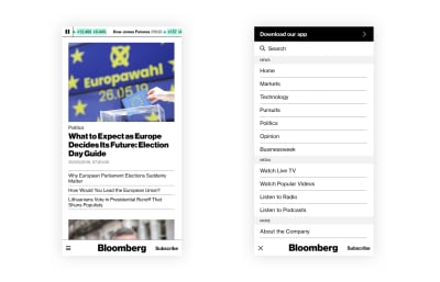
The Bloomberg website with a reimagined bottom navigation (Large preview)
Next, let’s take a look at Invision:
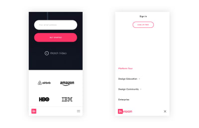
The Invision website with a reimagined bottom navigation (Large preview)
Last but not least, the good ol’ Reddit:
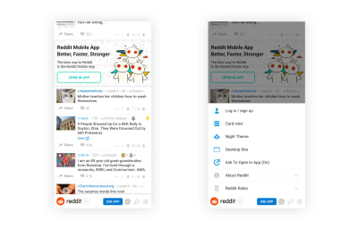
The Reddit website with a reimagined bottom navigation (Large preview)
Yes, this idea does raise questions, but it’s simple enough to be adapted to the web. It does make a usability difference as the interaction cost is much lower.
That Sounds Great, But How Do I Convince My Clients?
You, as the designer, might see the potential of this pattern, but what if your client or your boss doesn’t? I would answer this problem with a couple of arguments:
- Mobile apps have been placing valuable menu items to the bottom for years already. Just send them these two articles for starters:
- “The Golden Rules Of Bottom Navigation Design,” written by Nick Babich
- “Basic Patterns For Mobile Navigation: A Primer,” written by Raluca Budiu
- I had noticed cases in which popular mobile apps started to shift important bits to the bottom. A good example is Uber. For them, the search bar is one of the most important items on the screen. In the old design, its position was at the top. Now, they’ve shifted it to the bottom. Could we be on to something here?
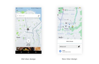
The old and new Uber search bar design (Large preview)
Shifting important navigation items to the bottom is not a new thing in mobile app design. It’s just that — for some reason — the web industry has not caught up on this just yet.
Summary
The facts are quite clear: Phones are getting bigger, and some parts of the screen are easier to interact with than others. Having the hamburger menu at the top provides too big of an interaction cost, and we have a large number of amazing mobile app designs that utilize the bottom part of the screen. Maybe it’s time for the web design world to start using these ideas on websites as well?
I understand that all of this is not a foolproof solution for all use cases, but it’s worth a shot. It helps make the experience just a tad bit better. I’m interested in hearing your thoughts below!
Useful Reading Resources
- “Why Not Have The Hamburger Menu At The Bottom?,” Stack Overflow (Nov. 2014)
- “The Genius — And Potential Dangers — Of The Hamburger Icon (Flyout Menu),” Jesse Rand, Vital Design
- “To Hamburger Or Not To Hamburger?,” Dan Nessler, Medium
- “A Brief History Of The Hamburger Icon,” Antonio, Placeit blog
- “Design For Fingers, Touch And People (Part 1),” Steven Hoober, UXMatters
- “Designing For Thumbs: The Thumb Zone,” Oliver McGough, Usabilla blog
- “One-Handed Mobile Interface,” Konstantin Savchenko, Medium
- “How Do Users Really Hold Mobile Devices?,” Steven Hoober, UXmatters
- “Facebook Paper’s Gestural Hell,” Scott Hurff
- “Designing For Large Screen Smartphones,” Luke Wroblewski
Further Related Resources
- Windows1 (1985) PC XT Hercules, the hamburger menu on Windows 1 (video)
- Hamburger menu in DOS, as tweeted by Paul Ford
- “Check The Thumb”, created by Nicolás J. Engler and Antonela Debiasi
(cc, il)
From our sponsors: Bottom Navigation Pattern On Mobile Web Pages: A Better Alternative?


