Archived
Styling In Modern Web Apps
Styling In Modern Web Apps
Styling In Modern Web Apps
Ajay NS
2019-06-10T14:00:59+02:00
2019-06-11T12:35:15+00:00
If you search for how to style apps for the web, you’ll come across many different approaches and libraries, some even changing day by day. Block Element Modifier (BEM); preprocessors such as Less and SCSS; CSS-in-JS libraries, including JSS and styled-components; and, lately, design systems. You come across all of these in articles and blogs, tutorials and talks, and — of course — debates on Twitter.
How do we choose between them? Why do so many approaches exist in the first place? If you’re already comfortable with one method, why even consider moving to another?
In this article, I’m going to take a look at the tools I have used for production apps and sites I’ve worked on, comparing features from what I’ve actually encountered rather than summarizing the content from their readmes. This is my journey through BEM, SCSS, styled-components, and design systems in particular; but note that even if you use different libraries, the basic principles and approach remain the same for each of them.
CSS Back In The Day
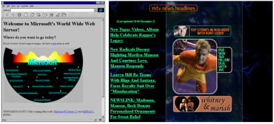
When websites were just getting popular, CSS was primarily used to add funky designs to catch the user’s attention, such as neon billboards on a busy street:
Microsoft’s first site (left) and MTV’s site from the early 2000s. (Large preview)
Its use wasn’t for layout, sizing, or any of the basic needs we routinely use CSS for today, but as an optional add-on to make things fancy and eye-catching. As features were added to CSS, newer browsers supporting a whole new range of functionality and features appeared, and the standard for websites and user interfaces evolved — CSS became an essential part of web development.
It’s rare to find websites without a minimum of a couple hundred lines of custom styling or a CSS framework (at least, sites that don’t look generic or out of date):
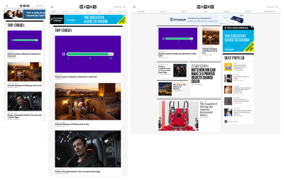
Wired’s modern responsive site from InVision’s responsive web design examples post. (Large preview)
What came next is quite predictable. The complexity of user interfaces kept on increasing, along with the use of CSS; but without any guidelines suggested and with a lot of flexibility, styling became complicated and dirty. Developers had their own ways of doing things, with it all coming down to somehow getting things to look the way the design said it was supposed to be.
This, in turn, led to a number of common issues that many developers faced, like managing big teams on a project, or maintaining a project over a long period of time, while having no clear guides. One of the main reasons this happens even now, sadly, is that CSS is still often dismissed as unimportant and not worth paying much attention to.
CSS Is Not Easy To Manage
There’s nothing built into CSS for maintenance and management when it comes to large projects with teams, and so the common problems faced with CSS are:
- Lack of code structure or standards greatly reduces readability;
- Maintainability as project size increases;
- Specificity issues due to code not being readable in the first place.
If you’ve worked with Bootstrap, you’ll have noticed you’re unable to override the default styles and you might have fixed this by adding !important or considering the specificity of selectors. Think of a big project’s style sheets, with their large number of classes and styles applied to each element. Working with Bootstrap would be fine because it has great documentation and it aims to be used as a solid framework for styling. This obviously won’t be the case for most internal style sheets, and you’ll be lost in a world of cascaded styles.
In projects, this would be like a couple thousand lines of CSS in a single file, with comments if you’re lucky. You could also see a couple of !important used to finally get certain styles to work overriding others.
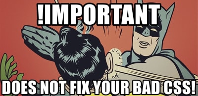
!important does not fix bad CSS. (Large preview)
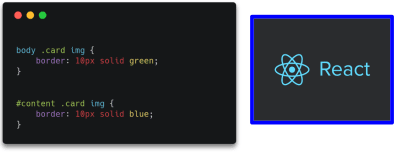
You may have faced specificity issues but not understood how specificity works. Let’s take a look.
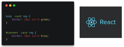
(Large preview)
Which of the styles applied to the same element would be applied to the image on the right, assuming they both point to it?
What is the order of weight of selectors such as inline styles, IDs, classes, attributes, and elements? Okay, I made it easy there; they’re in order of weight:
Start at 0; add 1,000 for a style attribute; add 100 for each id; add 10 for each attribute, class or pseudo-class; add 1 for each element name or pseudo-element.
This is a simplified way of calculating and representing specificity which works in usual cases, but do note that the real representation would look like: (0,0,0,0). Here, the first number signifies the style attribute, second the ID, and so on. Each selector can actually have a value greater than 9 and it’s only when there is an equal number of selectors of highest weight that selectors of lower weight are considered.
So, for instance, taking the above example:
(Large preview)
(Large preview)
Do you see why the second example was the correct answer? The id selector clearly has far more weight than element selectors. This is essentially the reason why your CSS rule sometimes doesn’t seem to apply. You can read about this in detail in Vitaly Friedman’s article, “CSS Specificity: Things You Should Know”.
The larger the codebase, the greater the number of classes. These might even apply to or override different styles based on specificity, so you can see how quickly it can become difficult to deal with. Over and above this we deal with code structure and maintainability: it’s the same as the code in any language. We have atomic design, web components, templating engines; there’s a need for the same in CSS, and so we’ve got a couple of different approaches that attempt to solve these different problems.
Block Element Modifier (BEM)
“BEM is a design methodology that helps you to create reusable components and code sharing in front-end development.”
— getbem.com
The idea behind BEM is to create components out of parts of apps that are reused or are independent. Diving in, the design process is similar to atomic design: modularize things and think of each of them as a reusable component.
I chose to start out managing styles with BEM as it was very similar the way React (that I was already familiar with) breaks down apps into reusable components.
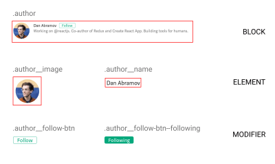
(Large preview)
Using BEM
BEM is nothing more than a guide: no new framework or language to learn, just CSS with a naming convention to organize things better. Following this methodology, you can implement the patterns you’ve already been using, but in a more structured manner. You can also quite easily do progressive enhancements to your existing codebase as it requires no additional tooling configuration or any other complexities.
Advantages
- At its heart BEM manages reusable components, preventing random global styles overriding others. In the end, we have more predictable code, which solves a lot of our specificity problems.
- There’s not much of a learning curve; it is just the same old CSS with a couple of guides to improve maintainability. It is an easy way of making code modular by using CSS itself.
Drawbacks
- While promoting reusability and maintainability, a side effect of the BEM naming principle is making naming the classes difficult and time-consuming.
- The more nested your component is in the block, the longer and more unreadable the class names become. Deeply nested or grandchild selectors often face this issue.
<div class="card__body">
  <p class="card__body__content">Lorem ipsum lorem</p>
  <div class="card__body__links">
    <!-- Grandchild elements -->
    <a href="#" class="card__body__links__link--active">Link</a>
  </div>
</div>
That was just a quick intro to BEM and how it solves our problems. If you’d like to take a deeper look into its implementation, check out “BEM For Beginners” published here in Smashing Magazine.
Sassy CSS (SCSS)
Put blandly, SCSS is CSS on steroids. Additional functionality such as variables, nesting selectors, reusable mixins, and imports help SCSS make CSS more of a programming language. For me, SCSS was fairly easy to pick up (go through the docs if you haven’t already) and once I got to grips with the additional features, I’d always prefer to use it over CSS just for the convenience it provided. SCSS is a preprocessor, meaning the compiled result is a plain old CSS file; the only thing you need to set up is tooling to compile down to CSS in the build process.
Super handy features
- Imports help you split style sheets into multiple files for each component/section, or whichever makes readability easier.
// main.scss
@import "_variables.scss";
@import "_mixins.scss";

@import "_global.scss";
@import "_navbar.scss";
@import "_hero.scss";
- Mixins, loops, and variables help with the DRY principle and also make the process of writing CSS easier.
@mixin flex-center($direction) {
  display: flex;
  align-items: center;
  justify-content: center;
  flex-direction: $direction;
}

.box {
  @include flex-center(row);
}
Note: SCSS mixin: Check out more handy SCSS features over here.
- Nesting of selectors improves readability as it works the same way HTML elements are arranged: in a nested fashion. This approach helps you recognize hierarchy at a glance.
BEM With SCSS
It is possible to group the code for components into blocks, and this greatly improves readability and helps in ease of writing BEM with SCSS:

This code is relatively less heavy and complicated as opposed to nesting multiple layers. (Large preview)
Note: For further reading on how this would work, check out Victor Jeman’s “BEM with Sass” tutorial.
Styled-Components
This is one of the most widely used CSS-in-JS libraries. Without endorsing this particular library, it has worked well for me, and I’ve found its features quite useful for my requirements. Take your time in exploring other libraries out there and pick the one that best matches your needs.
I figured a good way to get to know styled-components was to compare the code to plain CSS. Here’s a quick look at how to use styled-components and what it’s all about:
Instead of adding classes to elements, each element with a class is made into a component. The code does look neater than the long class names we have with BEM.
Interestingly, what styled-components does under the hood is take up the job of adding relevant classes to elements as per what’s specified. This is essentially what we do in style sheets (note that it is in no way related to inline styling).
import styled from 'styled-components';

const Button = styled.button`
  background-color: palevioletred;
  color: papayawhip;
`;

// Output
<style>
  .dRUXBm {
    background-color: palevioletred;
    color: papayawhip;
  }
</style>

<button class="dRUXBm" />
Note: Styled-components under the hood: read more about inline styling vs CSS-in-JS in “Writing your styles in JS ≠ writing inline styles” by Max Stoiber.
Why Are Styled-Components One Of The Widely Used CSS-In-JS Libraries?
For styling, here we’re just using template literals with normal CSS syntax. This allows you to use the full power of JavaScript to handle the styling for you: conditionals, properties passed in as arguments (using an approach similar to React), and essentially all the functionality that can be implemented by JavaScript.
While SCSS has variables, mixins, nesting, and other features, styled-components only adds on, making it even more powerful. Its approach, based heavily on components, might seem daunting at first since it’s different from traditional CSS. But as you get used to the principles and techniques, you’ll notice that everything possible with SCSS can be done in styled-components, as well as a lot more. You just use JavaScript instead.
const getDimensions = size => {
  switch(size) {
    case 'small': return 32;
    case 'large': return 64;
    default: return 48;
  }
}

const Avatar = styled.img`
  border-radius: 50%;
  width: ${props => getDimensions(props.size)}px;
  height: ${props => getDimensions(props.size)}px;
`;

const AvatarComponent = ({ src }) => (
  <Avatar src={src} size="large" />
);
Note: Template literals in styled-components allow you to use JS directly for conditional styling and more.
Another thing to note is how perfectly this fits into the world of web components. A React component has its own functionality with JavaScript, JSX template, and now CSS-in-JS for styling: it’s fully functional all by itself and handles everything required internally.
Without us realizing, that was the answer to a problem we’ve been talking about for too long: specificity. While BEM was a guideline to enforce component-based structure for elements and styles but still relying on classes, styled-components impose it for you.
Styled-components has a couple of additional features I’ve found especially useful: themes, which can configure a global prop (variable) passed down to each styled-component; automatic vendor prefixing; and automatic clean-up of unused code. The amazingly supportive and active community is just the icing on the cake.
Note: There’s a lot more to check out and take advantage of. Read more in the styled-components docs.
Quick Recap On Features
- Template literals are used for syntax, the same as traditional CSS.
- It imposes modular design.
- It solves specificity issues by handling class names for you.
- Everything that can be done with SCSS and more, implemented with JS.
Why It Might Not Be For You
- It obviously relies on JavaScript, which means without it the styles don’t load, resulting in a cluttered mess.
- Previously readable class names are replaced with hashes that really have no meaning.
- The concept of components rather than cascading classes might be a bit hard to wrap your head around, especially since this affects the way you arrange things a lot.
Design Systems
As usage of web components increases, as well as the need for atomic design (basically breaking down UI into basic building blocks), many companies are choosing to create component libraries and design systems. Unlike the technologies or approaches on how to handle styling mentioned above, design systems represent an organizational approach to handling components and consistent design across whole platforms or apps.
It’s possible to use an approach we’ve discussed within a design system to organize styles, while the design system itself focuses on the building blocks of the apps rather than internal implementations.
“Design systems are essentially collections of rules, constraints, and principles implemented in design and code.”
Design systems and component libraries are aimed at whole ecosystems spanning different platforms and media, and can determine the overall outlook of the company itself.
“A design system is an amalgamation of style, components, and voice.”
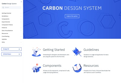
IBM’s Carbon design system (Large preview)
Once they gain momentum, tech businesses sometimes have to scale up extremely fast, and it can be hard for the design and development teams to keep up. Different apps, new features and flows, constant reevaluation, changes, and enhancements are to be shipped as rapidly as possible when the business requires them.
Take the case of a simple modal; for instance, one screen has a confirmation modal which simply accepts a negative or positive action. This is worked on by Developer A. Then the design team ships another screen that has a modal comprising a small form with a few inputs — Developer B takes this up. Developers A and B work separately and have no idea that both of them are working on the same pattern, building two different components that are essentially the same at base level. If different developers worked on the different screens we might even see UI inconsistencies committed to the codebase.
Now imagine a large company of multiple designers and developers — you could end up with a whole collection of components and flows that are supposed to be consistent, but instead are distinct components existing independently.
The main principle of design systems is to help meet business requirements: build and ship new features, functionality, and even full apps while maintaining standards, quality, and consistency of design.
Here are some examples of popular design systems:
- Shopify Polaris
- IBM’s Carbon
- Alibaba’s Ant D
- Mailchimp Design
When talking about styling in particular, we’d be specifically interested in the component library part, although the design system itself is far more than just a collection of components. A component handles its functionality, template, and styling internally. A developer working on the app needn’t be aware of all of the internal working of the components, but would just need to know how to put them together within the app.
Now imagine a couple of these components that are further made reusable and maintainable, and then organized into a library. Developing apps could be almost as simple as drag-and-drop (well, not exactly, but a component could be pulled in without worrying about any internal aspects of its working). That’s essentially what a component library does.

(Large preview)
(Large preview)
Why You Might Want To Think About Building A Design System
- As mentioned earlier, it helps the engineering and design teams keep up with rapidly changing business needs while maintaining standards and quality.
- It ensures consistency of design and code throughout, helping considerably with maintainability over a long period of time.
- One of the greatest features of design systems is that they bring the design and development teams closer, making work more of a continuous collaboration. Rather than whole pages of mock-ups given to developers to work on from scratch, components and their behaviors are well-defined first. It’s a whole different approach, but a better and faster way to develop consistent interfaces.
Why It Might Not Be The Best Fit For You
- Design systems require a lot of time and effort up front to plan things out and organize from scratch — both code- and design-wise. Unless really required, it might not be worth delaying the development process to focus on building the design system at first.
- If a project is relatively small, a design system can add unnecessary complexity and end up a waste of effort when what was actually required was just a couple of standards or guidelines to ensure consistency. Because several high-profile companies have adopted design systems, the hype can influence developers into thinking this is the always best approach, without analyzing the requirements and ensuring this could actually be practical.
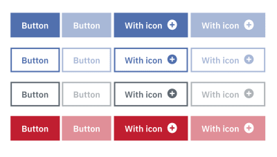
Different appearances of a button (Large preview)
Conclusion
Styling applications is a world in itself, one not often given the importance and attention it deserves. With complex modern user interfaces, it’s only matter of time before your app becomes a mess of unordered styles, reducing consistency and making it harder for new code to be added or changes made to the existing codebase.
Distilling what we’ve discussed so far: BEM, along with SCSS, could help you organize your style sheets better, take a programming approach to CSS, and create meaningful structured class names for cleaner code with minimal configuration. Building over a front-end framework like React or Vue, you might it find it convenient to hand class naming to a CSS-in-JS library if you’re comfortable with a component-based approach, putting an end to all your specificity issues, along with a couple of other benefits. For larger applications and multiple platforms, you might even consider building a design system in combination with one of the other methods, to boost development speeds while maintaining consistency.
Essentially, depending on your requirements and the size and scale of your software, it’s important to spend time determining your best approach to styling.
(dm, og, yk, il)
From our sponsors: Styling In Modern Web Apps


